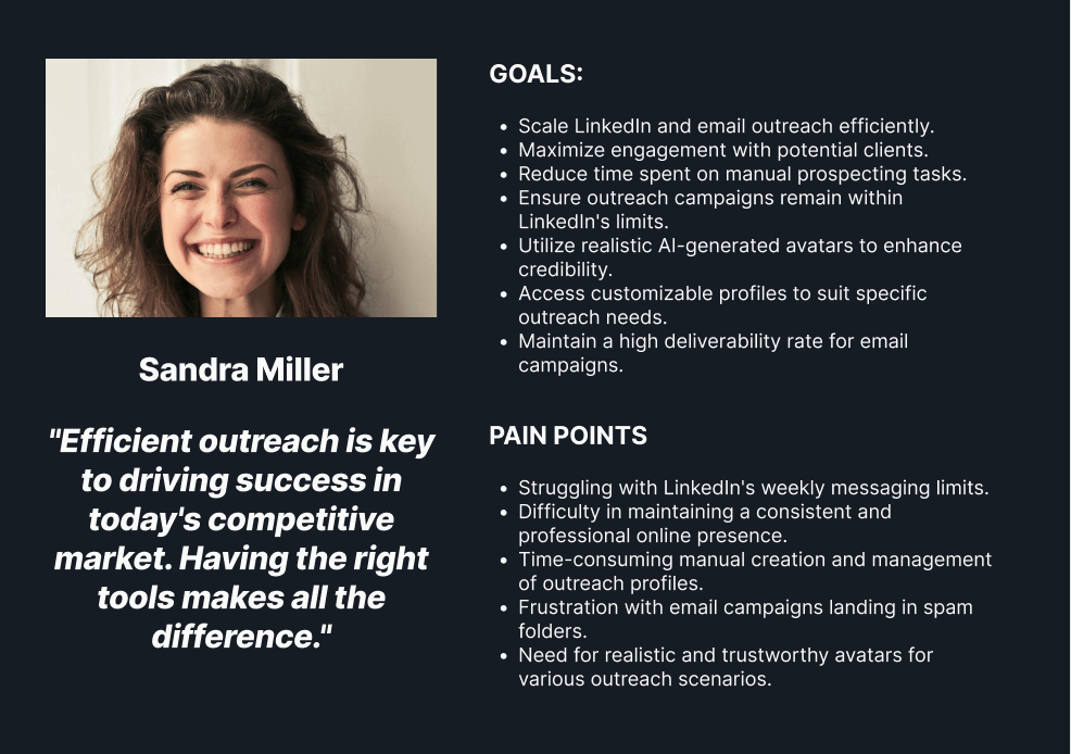
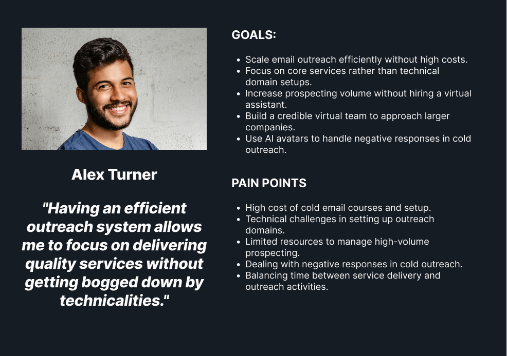
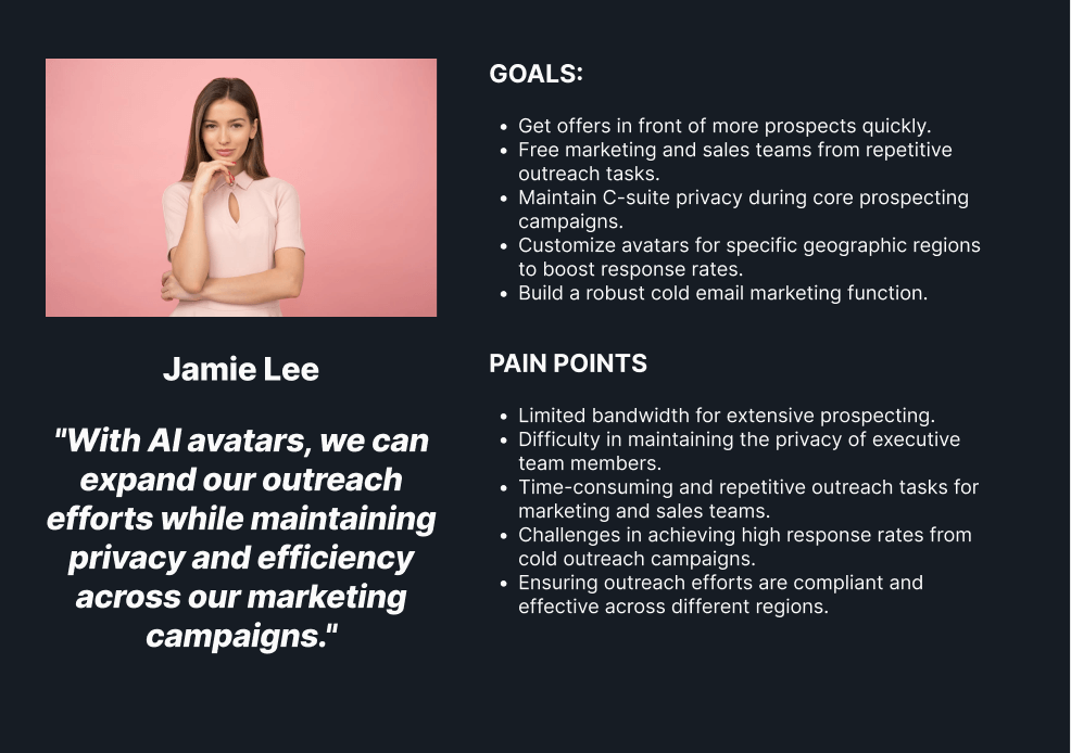
GetAIA serves multiple complex demographics and customer segments ranging from small businesses to large enterprises and lead-gen agencies looking to scale LinkedIn outreach without the risks. Each of these audiences had their own unique dynamics in terms of goals, motivations, and pain points. We conducted multiple stakeholder interviews and discovery sessions to understand these customer segments inside and out and to ultimately ensure the final site reflected these perspectives.
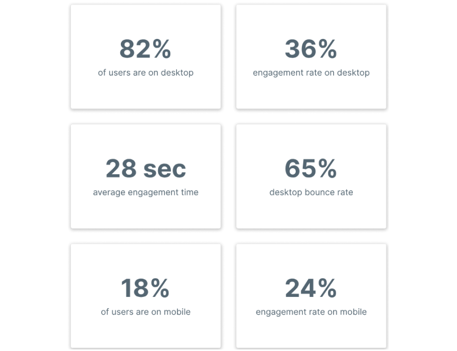
In order to better understand how users interact with the website, we compiled an overview of the main KPIs that helped drive all of our decisions for the redesign. Some high-level insights included the fact that the majority of traffic was from desktop, representing 82% of users. The average engagement time on the website was less than half the industry average of 52 seconds. Lastly, they had a very low engagement rate of only 36% on desktop and 24% on mobile.
Our team analyzed hundreds of user recordings on the old website to identify usability issues as well as areas of opportunity. Some of the patterns observed included multiple dead clicks on elements that appeared clickable but were in fact not, having to constantly scroll up to access the navigation menu even though it was a 1 page site (each menu item scrolled you down), large blocks of content which users completely skimmed by, etc.
As with all websites we do, the first several weeks of our engagement was purely dedicated to a deep dive data audit. We set up a series of heatmaps, scrollmaps, and clickmaps on high traffic pages to determine areas of opportunity to increase conversions.
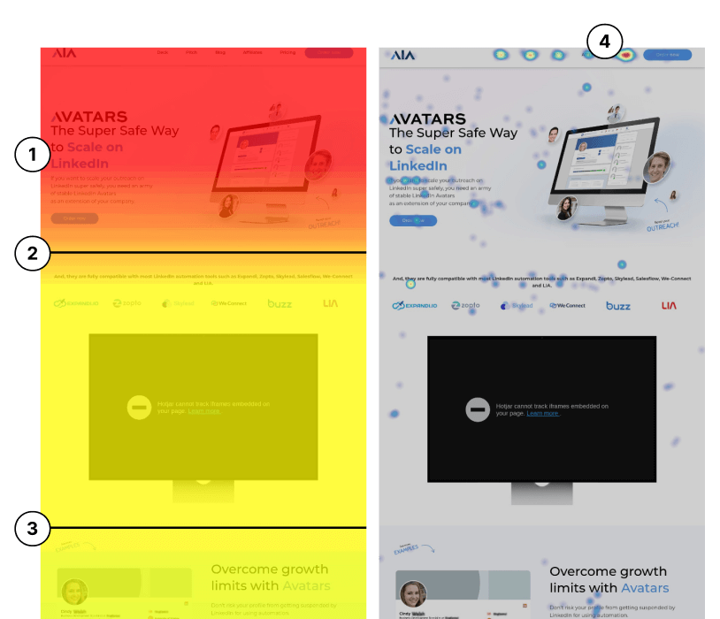
1) The old site clearly explained ‘what’s in it for me’ and the core value proposition of GetAIA, which is to scale outreach safely. The part that was missing was clearly explaining who they are and what they do. Since there were few or no competitors in the market and this was a novel concept, further education was required to explain what a LinkedIn avatar was and handle objections upfront. CTA was also not benefit-oriented.
2) The average fold is indicated by the black line. Social proof is not within the above-the-fold view, missing a low-hanging fruit opportunity to build immediate trust by removing empty space.
4) The “Pricing” tab had a 12.33% clickthrough rate compared to other key CTAs, which hovered between 1-3%. The key question was: how do we encourage more clickthroughs on the primary CTA buttons?
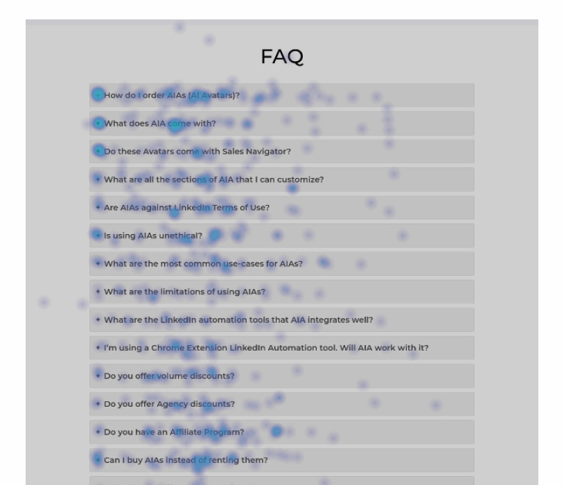
1) There was a lot of movement and clicks registered around the FAQ dropdowns, which was abnormal for most websites. Several recordings of users also show lots of clicks on not just one FAQ dropdown, but often 4-5+.
FAQs are designed to be additional opportunities to address
objections and are not meant to be the primary area where objections
are handled. The assumption from this data was that there were still a lot of
uncertainties surrounding the use of avatars and what implications
that has for one’s business. There needed to be additional context for
users to clear up confusion around how this all works earlier in the
journey, not in the FAQ section where less than 50% of users were
reaching according to our HotJar scroll maps.
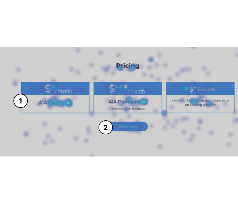
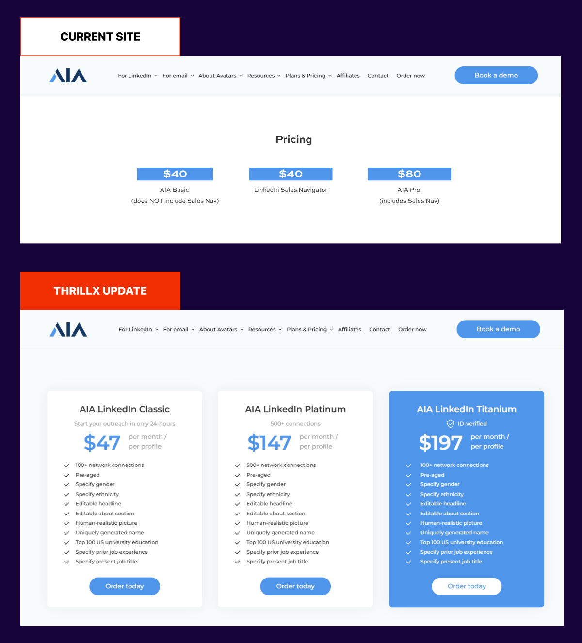
1) The pricing section was arguably the most critical action point of the website for conversions. Yet, there was very little information given to users at this stage of the journey. The distinction between the three pricing options was not apparently clear, as was what you get with each option. We noticed in several recordings that users clicked on the boxes themselves but not on the order now button (the order now button only had a 1% CTR, whereas the boxes have 2-3% accumulated).
2) There are three pricing options available, yet only one ‘Order Now’ button. Which option are users ordering? Can they select an option now, or do they select it later in the journey? The user experience of the pricing section needed to be further optimized to provide clarity for users.
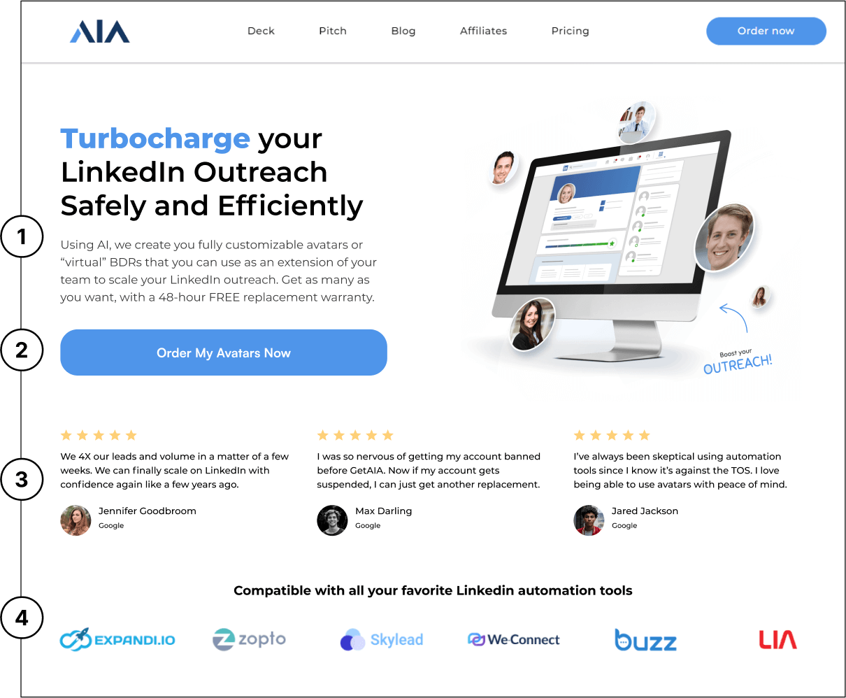
1) Main headline now speaks directly to the user and has a more compelling explanation of the value prop. Sub headline provides
more context about what avatars actually are and reduces
uncertainty by highlighting the 48-hour warranty period upfront.
4) High-level overview of compatible softwares to give people a sense of trust.
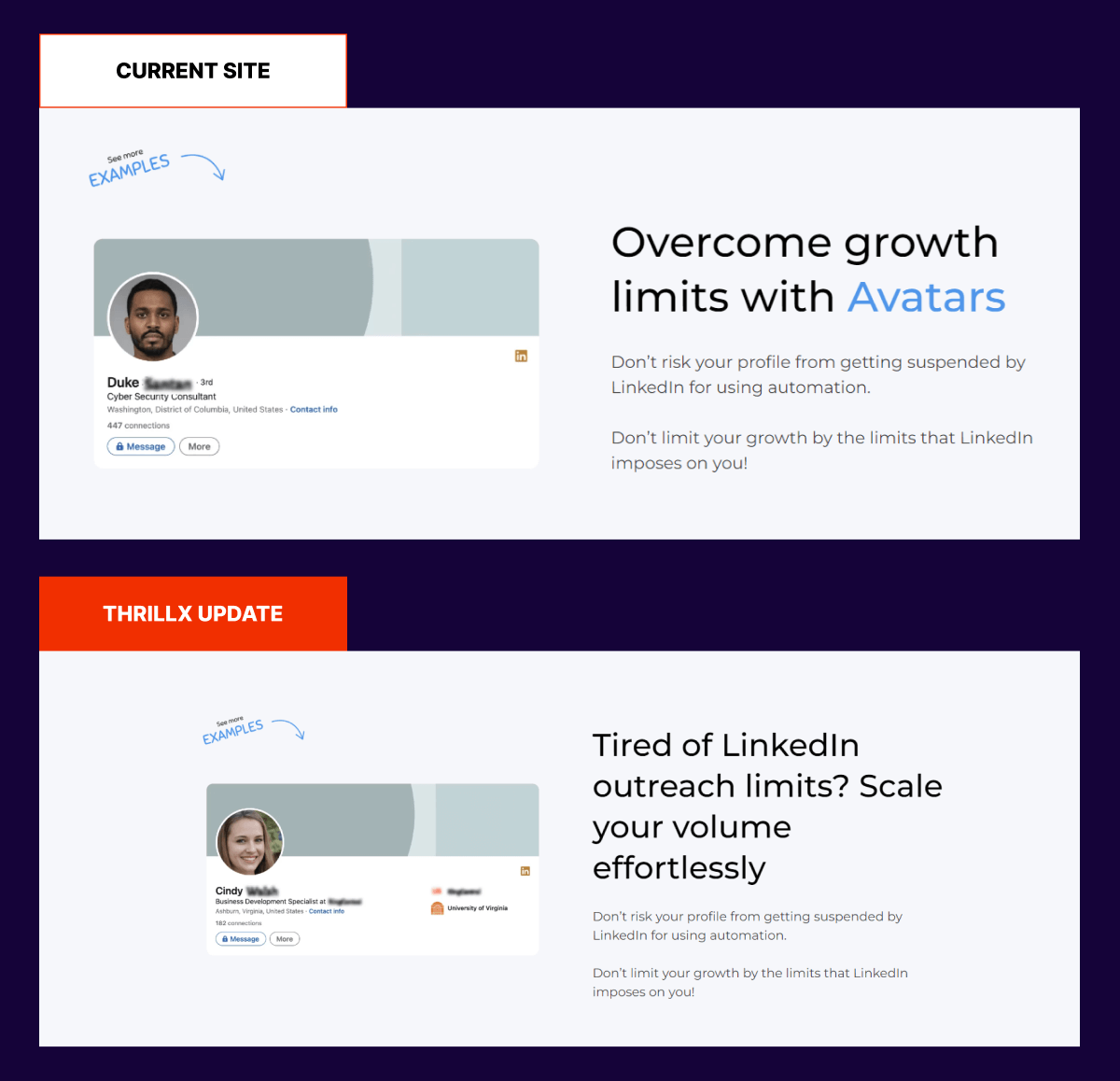
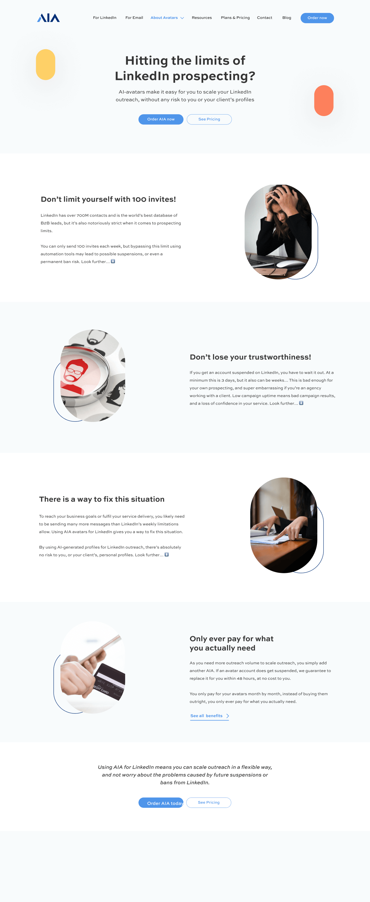
We made the messaging more pain focused and emotional. ‘Tired of
Linkedin outreach limits?’ is speaking directly to a user and
addressing their biggest pain points.
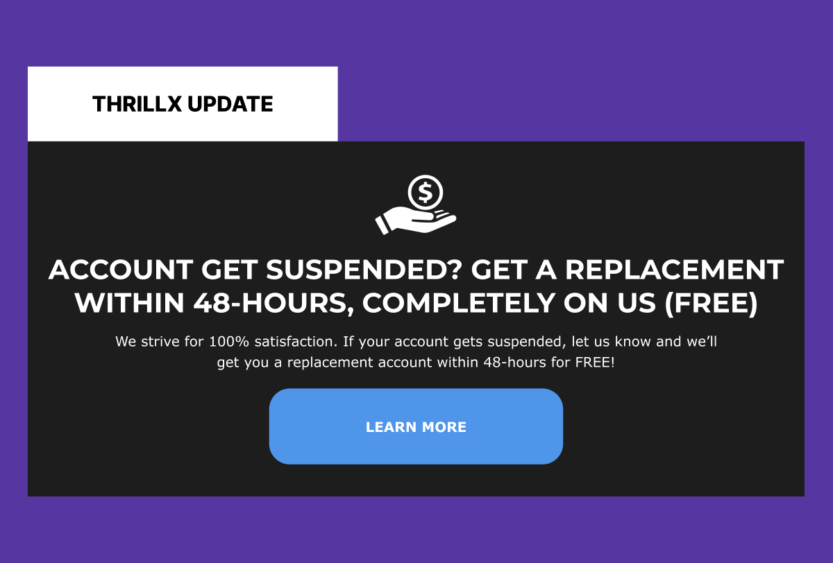
Given the type of market solution that AIA was in in a space where there are a lot of risks associated with LinkedIn automation software, we needed to reduce fear, uncertainty, and doubts throughout several critical sections of the website. We implemented a banner above or below the pricing section that highlights the guarantee.
The pricing section is arguably the most critical action point of the website for conversions. Yet, there is very little information given to users at this stage of the journey. We implemented a clear pricing tier system, each with a single CTA button per tier that provides clarity to the user on which option they are ordering. Each tier also provides a checklist of items that are included, as opposed to the previous version, where they were offered similar features and benefits.
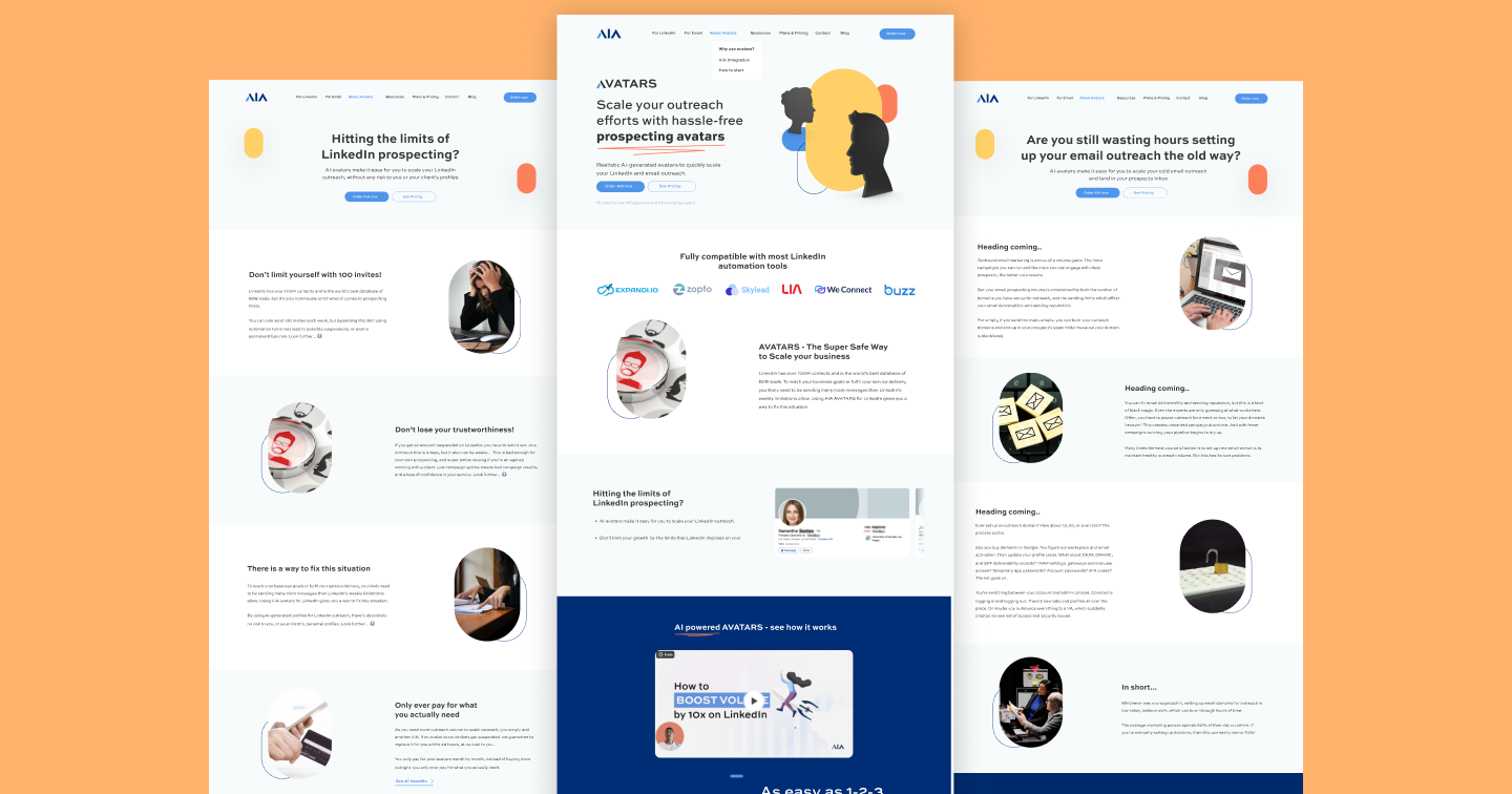
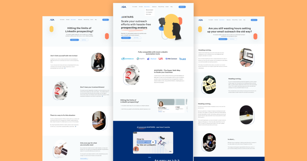
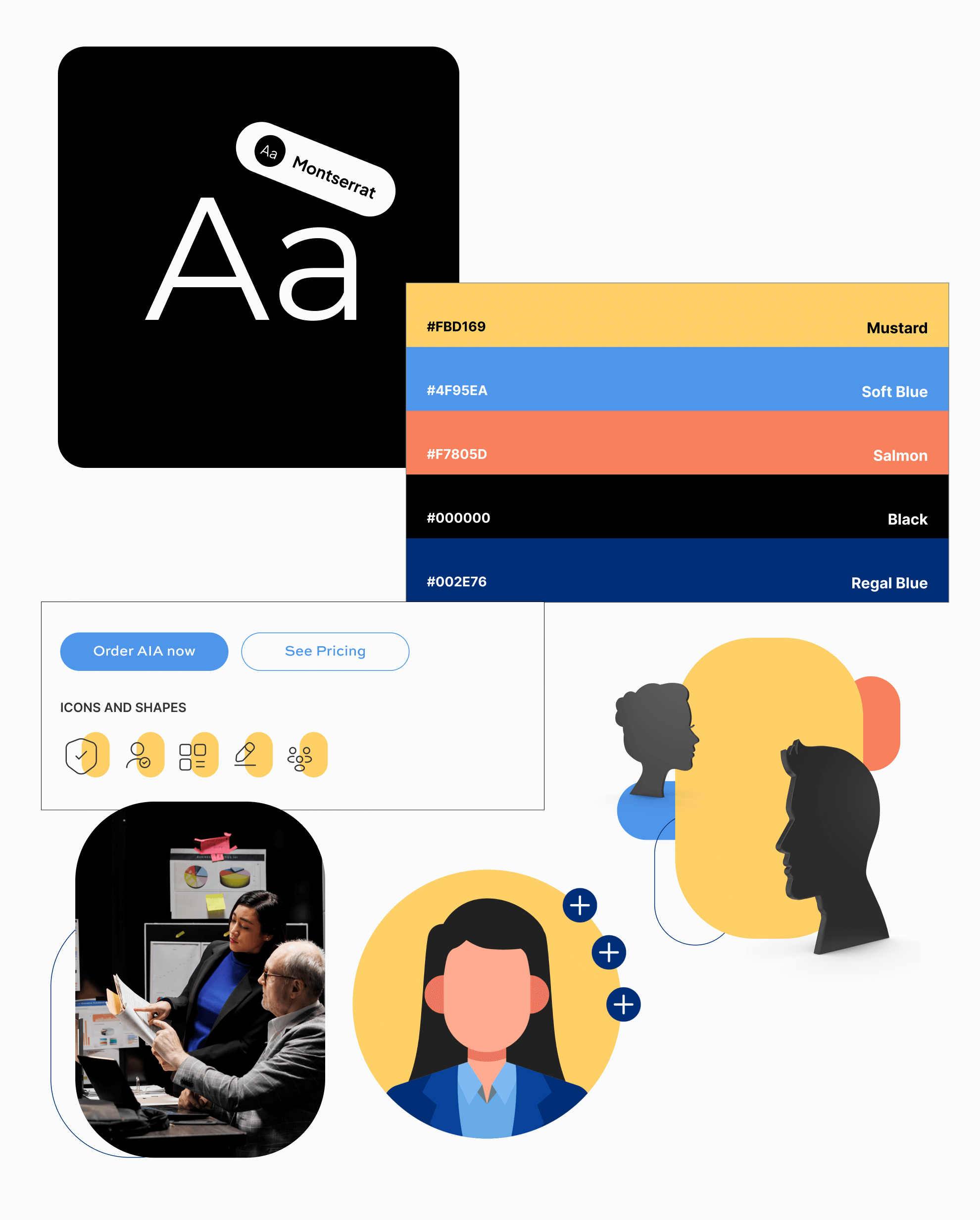
GetAIA wanted the core brand value of innovation and high-tech, forward-thinking software to be expressed throughout the site. We leveraged playful tones of yellow and salmon mixed with dark and professional tones of black and blue to convey those emotions. We also featured custom illustrations and graphics on the website to add a higher level of personality and elevation.
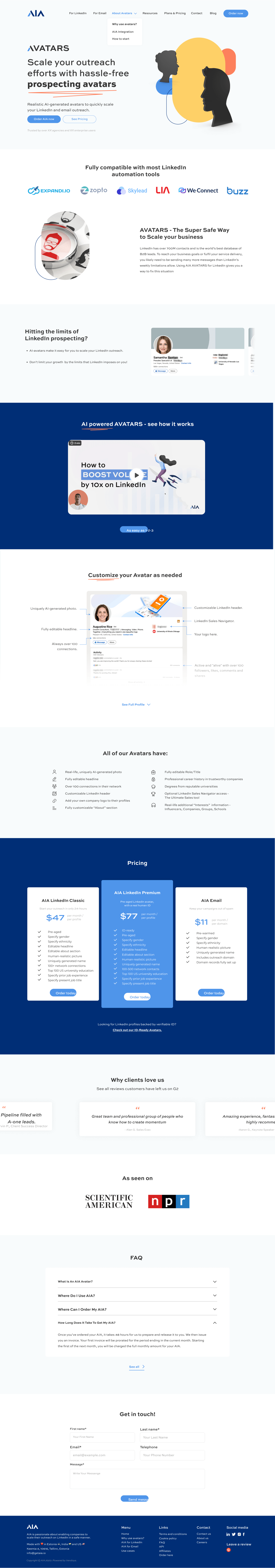
The revamped homepage started off with a bang with a super-optimized hero section. The value proposition of “scaling outreach hassle-free” resonated and drove substantial CTA clickthroughs. This was quickly followed by social proof to build trust and credibility. Throughout the page, you can see hyper-benefit-driven copy that pulled people in and motivated them to take action.
On the why use avatars page, we focused on highlighting the core pain points that users face when using traditional methods of outreach as well as their end goal state or deepest desires. The page features beautiful illustrations and graphics to amplify the conversion-focused elements.
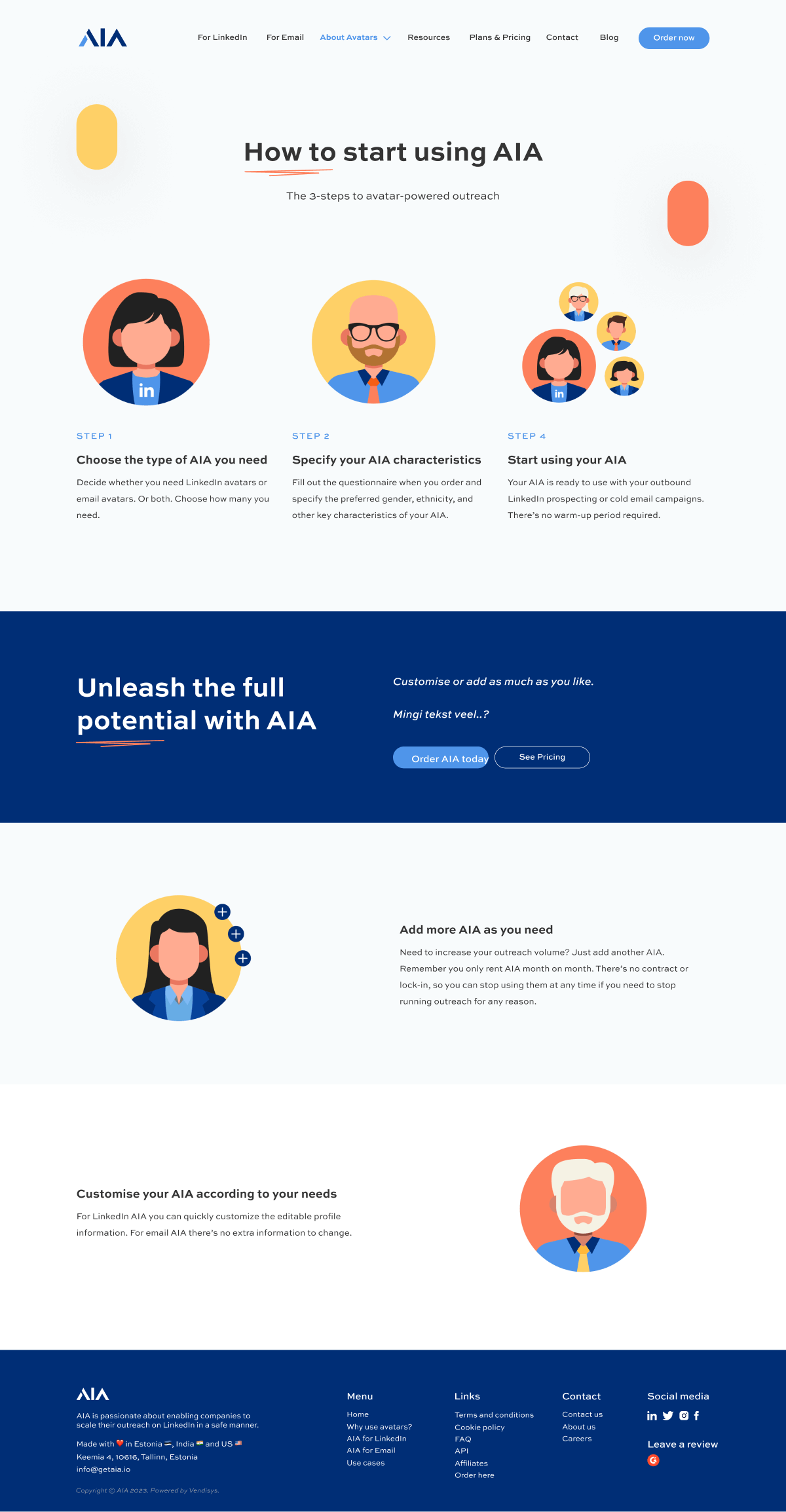
The how it works page features a step-by-step guide on what people can expect as part of the onboarding process. The page features beautiful “avatar” and profile-type graphics, synonymous with the whole concept of the business, which is built around LinkedIn avatars.
GetAIA slowly went from purely relying on cold outbound to gradually building a thought leadership hub in-house on their website and SEO optimized pages that brought them substantial traffic, leads, and revenue.