
The 7 Product Page Features Shoppers Actually Trust
Trust-building features on product pages directly impact conversion rates, with 81% of shoppers prioritizing free shipping and 88% trusting online reviews as much as personal recommendations.
Professional visual design with consistent branding and fast loading times creates immediate credibility—53% of mobile users abandon sites taking over 3 seconds to load
Comprehensive product information including specs, dimensions, and clear variant explanations prevents abandonment by answering shopper questions upfront
Authentic customer reviews with demographic context and helpfulness voting build social proof—97% of millennials read reviews before purchasing
User-generated content like real customer photos increases purchase likelihood by 137% compared to professional photography alone
Transparent pricing with no hidden fees and easily accessible return policies addresses the 48% cart abandonment rate caused by unexpected costs
Live chat support and visible trust badges reduce purchase anxiety—Q&A sections can boost conversion rates by 157.1%
These seven features work synergistically to transform hesitant browsers into confident buyers by addressing fundamental trust concerns throughout the shopping journey.
Trust drives ecommerce product page best practices more than almost anything else. Research shows that 81% of online shoppers call free shipping their top checkout priority. Additionally, 88% of customers trust online reviews as much as personal recommendations. These statistics demonstrate why product page optimization goes beyond esthetics to build credibility.
Shopper psychology plays a crucial role in product page best practices. The data reveals that 89% of consumers read return policies before buying, while 49% rely heavily on reviews to make purchase decisions. Our analysis of ecommerce product pages found that customers actively use reviews to gather more product details. They look for quick summaries that help them assess quality fast.
Your product pages need seven key trust-building features that I’ll explain next. These product detail page best practices will reshape the scene by helping you convert browsers into buyers. You’ll learn exactly what makes shoppers confident enough to click “Add to Cart” – whether you’re starting a new store or improving existing pages.
1. Visual Design That Feels Professional and Reliable
What makes a product page look trustworthy at first glance?
A trustworthy product page uses consistent branding, a clean layout, and fast loading times. Professional visuals, clear typography, and responsive design signal credibility within seconds and reduce bounce rates, especially on mobile devices.
Visual design is your digital storefront’s first impression. Shoppers form opinions in mere seconds. Your product photography, branding elements, and overall esthetic work together to build confidence in your brand.
Consistent branding across product pages
A consistent brand identity boosts both recognition and customer loyalty. Research shows that legacy brands like Nike have spent decades cementing their image through consistency in how they appear across all touchpoints. This reliability creates trust that makes shoppers more comfortable completing purchases.
Your own e-commerce store needs consistency in:
Color palette across all marketing and sales channels
Typography and font hierarchy throughout the shopping experience
Logo placement and sizing on every page
Visual style for product and lifestyle photography
Using an asset management system helps you organize these visual elements. The core team can follow style guidelines more easily. This consistency goes beyond your product pages to social media profiles, packaging, and even in-store displays.
Your brand builds loyalty over time when shoppers recognize it everywhere and have positive experiences. Their trust deepens with each interaction.
Clean layout and easy-to-use UI
Product page layout is one of the most important elements of e-commerce design. Yet over half of sites perform at a “mediocre” level or worse in this area. So there’s room to improve how most stores organize their product information.
Complete studies analyzing thousands of product pages show certain design approaches work better than others. To cite an instance, horizontal tabs for organizing product information don’t work well—up to 21% of participants in usability tests missed critical information in tabs, even while actively searching for that exact content.
A clean, organized layout reduces distractions and decision fatigue. White space has a purpose—it boosts readability and keeps focus on your products. High-resolution images, clear typography, and easy navigation contribute to a professional impression that builds credibility.
Many successful e-commerce product pages use:
Prominent, high-quality product images with zoom capabilities
Clear visual hierarchy guiding attention to key information
Minimal pop-ups or interruptions
Thumb-friendly navigation for mobile users
Forrester’s reports show that a well-designed UI can raise conversion rates by 200%. This proves how much visual design affects purchasing behavior.
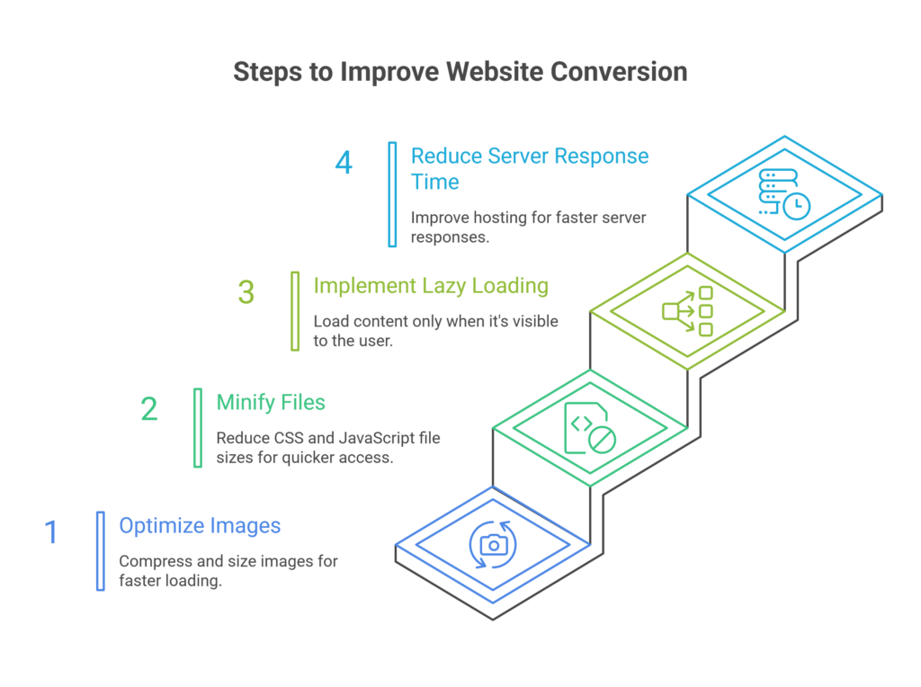
Fast-loading and responsive design
Page speed is often overlooked but vital for professional design. Data shows 53% of mobile users leave a site that takes more than 3 seconds to load. Website conversion rates drop by 4.42% with each extra second of loading time between 0-5 seconds.
Fast-loading pages build trust beyond technical benefits. Sites that respond instantly feel natural and encourage visitors to explore more. Users see this speed as proof that the site has a resilient infrastructure and will handle their data securely.
Your site must work perfectly across all devices. Mobile shopping continues to rise, making responsive design essential. Pages should adapt to different screen sizes with large, tappable buttons that prevent misclicks and thumb-friendly navigation.
Loading indicators play a psychological role in building trust. Progress bars, skeleton screens, or thoughtful loading animations show users that something is happening. This reduces the chance they’ll leave during loading. This small design element can change how users see your site.
The best visual design builds trust through consistency, clarity, and performance. These elements create a professional impression that makes shoppers confident about buying from your store.
2. Detailed Product Information That Answers Questions
Why is detailed product information critical for conversions?
Detailed product information builds trust by answering buyer questions upfront. Clear specs, dimensions, use cases, and well-explained variations reduce uncertainty and prevent abandonment caused by missing or unclear details.
Complete product information serves as the foundation of any successful ecommerce page. Visual elements catch shoppers’ attention first, but they stay and buy based on how well your product details address their questions. Research shows that 98% of retailers who give good answers to customer questions see better conversion rates. This happens because detailed information creates trust and eliminates buying hesitation.
Include specs, dimensions, and use cases
Customers visit product pages looking for specific answers before buying. Those who know exactly what they want pay less attention to product details—yet they still need to confirm they’ve found the right item.
Your product pages should include:
Complete technical specifications with measurements and dimensions
Materials composition and care instructions
Clear explanations of features and benefits
Practical use cases and applications
Downloadable documentation where relevant
Many websites provide insufficient product details and leave potential customers with questions. This uncertainty makes them abandon their purchase. The answer? Give thorough but concise descriptions. Customers don’t want marketing fluff—they need substantial details about how the product works, its appearance, and its function.
The specifications need a scannable format. Some websites turn even short spec sheets into a “wall of specs.” Users might miss crucial details buried among other measurements. Logical groupings with clear subheadings make specifications much easier to understand.

Explain product variations clearly
Product variations create major challenges for ecommerce stores of all sizes. A single product style could have many variations across multiple attributes. To name just one example, a fashion retailer selling a premium cotton t-shirt might offer five sizes, eight colors, three fabric weights, and two fits—creating 240 unique SKUs for one product style. An apparel brand with 500 product styles could manage 120,000 SKUs!
Years of research point to a simple rule: different products should have different listings; product variations should appear under a single listing. When stores ignore this principle, shoppers face major usability problems:
They can’t compare items that should be shown together
They miss available variations completely
They waste time moving between multiple product pages
Customers should spot the differences between product variants right away. Each variant needs clear, detailed information and visual representations when possible. Text descriptions become crucial if the variant isn’t visible (like storage capacity differences).
Good variant organization creates backend efficiencies too. Unstructured approaches force merchandising teams to copy product descriptions, brand stories, and base images across every variant. Updates require manual changes to hundreds of records, which leads to inconsistent information.
Use comparison tables where needed
Comparison tables are a great way to get visual insights for products with technical specifications or multiple variants. These tables show multiple products side by side, with products as columns and key features as rows.
Tables work best when shoppers need to:
Evaluate multiple versions of your product
Choose between different models or configurations
Understand technical differences
About 57% of ecommerce sites perform poorly when showing specification sheets. The biggest issue comes from inconsistent spec sheets for similar products—like different brands of refrigerators using different measurement units. Shoppers give up when forced to convert values mentally.
Product comparisons don’t need to cover everything. Customers want quick visual comparisons, not endless feature lists. Too much information scares buyers away, so focus on features your customers care about most in comparison charts.
These product information best practices help create ecommerce pages that build trust through clarity and thoroughness. They turn browsers into confident buyers by
3. Authentic Customer Reviews and Ratings
What pricing information do shoppers need before adding to cart?
Shoppers need full price transparency before checkout, including shipping costs, taxes, and return terms. Clear pricing and visible policies reduce anxiety and address one of the biggest causes of cart abandonment: unexpected fees.
Customer reviews have become a game-changer for product pages. A whopping 97% of millennials check online reviews before buying anything, and 89% consider these reviews trustworthy. The best ecommerce product pages know this and put real customer feedback front and center because it drives buying decisions.
Show reviewer demographics when relevant
Knowing who wrote a review helps shoppers decide if it applies to them. Different age groups care about different things when they shop. A newer study, published in 2023 by researchers shows that young buyers (ages 18-34) really value photos and videos during their shopping trip. Older shoppers (55+) trust written customer reviews more and usually ignore social media ads and influencer content.
The quickest way to add demographic details:
Show age ranges for age-specific products
Include body types or sizes for clothes and accessories
List experience level for technical products
Add location info for region-specific items like furniture
It’s worth mentioning that you should be careful with personal information. The goal isn’t to invade privacy but to help potential buyers connect with reviewers in similar situations.
Emphasize most helpful reviews
Products with hundreds of reviews can overwhelm shoppers. People don’t have time to read every single opinion—they need quick access to valuable feedback. That’s why platforms like Amazon and Yelp let you sort by “Most Helpful First”.
Smart review systems now use natural language processing to pull key insights from customer feedback. These review highlights sort feedback into pros and cons using industry-specific sentiment analysis. This feature alone showed a 3.6% bump in sales and an 11.9% boost in how much people participate.
To get the most from reviews on your product pages:
Put a review summary at the top of the section
Add sorting options by rating, date, and relevance
Create a separate tab for reviews with photos or videos
Showcase reviews that address common buyer concerns
Your responses to reviews, especially negative ones, should stay professional and offer solutions. Shoppers watch how you handle feedback—good responses can turn tough situations into examples of great customer service.
Allow users to vote on review helpfulness
Review voting serves as the life-blood of feedback on ecommerce sites. Most big platforms now ask “Was this review useful?” after each review. This lets the community push the best opinions to the top.
This approach works well for several reasons:
The system tackles information overload naturally. New reviews need time to collect helpful votes, but the helpfulness score creates a natural ranking of trusted opinions over time. The largest longitudinal study of 1.67 million reviews with 5.18 million votes showed that helpfulness-based prediction models worked better than other ways to check review quality.
Shoppers feel more confident too. Research shows 68% of people trust reviews more when they see both good and bad ratings. About 30% get suspicious when there are no negative reviews at all. Here’s something interesting – people who look for negative reviews are 67% more likely to buy. This suggests that thorough researchers are usually more invested in their purchase decision.
The system cuts down uncertainty. Customers use reviews to confirm purchases, so helping them find the most useful feedback makes decisions easier.
To set up review voting the right way, ask users if reviews helped them, show vote counts next to each review, and put highly-voted reviews at the top. On top of that, it helps to add helpfulness score filters so shoppers can find the best feedback quickly.
These authentic customer review features are the foundations of effective ecommerce product pages. They create an open shopping environment where real social proof builds trust.
4. User-Generated Content That Adds Realism
Customer photos and videos have become a significant trust factor on product pages, going beyond just reviews and ratings. Buyers just need authentic visual proof before making purchase decisions. Yotpo’s data reveals that 77% of shoppers prefer customer photos over professional ones. This shows a fundamental change in consumer behavior – people trust their peers more than brands.
Photos and videos from real customers
Visual user-generated content (UGC) significantly affects purchasing decisions. About 79% of consumers check this form of social proof before buying anything. UGC’s power lies in its authenticity. Customer photos show how items look in everyday settings, unlike professional photography that displays products in ideal conditions.
Customer photos on product pages offer these benefits:
They build immediate trust through visual social proof
They show how products look on different body types or in various settings
They showcase uses not captured in brand photography
They create an emotional connection through relatable imagery
Shoppers are 137% more likely to buy a product after seeing customer photos of it. This impressive conversion boost happens because UGC bridges the reality gap in online shopping. Customers can picture themselves using the product when they see others like them enjoying it.

Tagging and filtering by use case
Note that organization comes first to make UGC work effectively. Even excellent customer content becomes overwhelming without proper tagging and filtering systems. Smart categorization helps shoppers find what they need among hundreds of photos and videos.
Eddie Bauer shows this approach perfectly. Their site displays UGC that shows a yellow raincoat’s appearance on different people in various situations. Shoppers can understand the product’s versatility while seeing how it fits various body types.
These filtering options work well:
Product use case (casual wear, formal events, outdoor activities)
Customer demographics (body type, age range, skin tone)
Environment (indoor, outdoor, specific settings)
Product features being highlighted
Product-specific attributes should be your filtering system’s focus, not your entire catalog. Showing photos from your whole catalog when someone looks at a specific product creates decision fatigue instead of confidence.
5. Seamless and Secure Checkout Experience
The checkout experience makes or breaks ecommerce stores—this is where all your trust-building efforts either convert or collapse. Studies show that almost half of all customers (48%) abandon their orders during checkout when extra costs are too high. A quarter of consumers won’t complete purchases due to slow delivery, complex processes, or websites that look untrustworthy. Your product page success depends on getting this final step right.
No forced account creation
Forcing customers to create accounts is the fastest way to lose a sale. Most shoppers don’t want to commit to a relationship before their first purchase. You can avoid this friction point:
Make guest checkout a clear option
Put the “Continue as guest” button front and center
Let users create accounts after they complete their purchase
The numbers back this up – 37% of users prefer guest checkout over account creation. This approach reduces cart abandonment and creates a better first impression. The goal is simple: remove barriers, don’t create them. Customers who have a good first experience with your brand are more likely to create an account for future purchases.
Display stock availability and shipping info
Clear information about product availability and delivery times builds purchase confidence. Most platforms just show if a product is “In Stock,” but the best ecommerce product pages do more:
Display real inventory numbers when it makes sense
Show delivery dates based on location
Present shipping costs early in the buying process
Made-to-order or replenished items need estimated shipping or restock dates (like “Ships in 2-3 weeks”). This keeps buyers informed and prevents lost sales from uncertainty. Customers hate last-minute surprises—a major reason for checkout abandonment. Make shipping times and return policies clear before the checkout page.
On top of that, shipping information can boost sales. Free shipping thresholds help increase average order value and give customers a reason to buy more. This turns a potential objection into a way to drive sales.
Sticky CTA buttons and confirmation messages
Mobile devices have limited screen space, so sticky call-to-action buttons keep important options visible as users browse. These buttons stay in view while customers scroll through product details, reminding them they can buy right from their current screen.
Here’s how to make these buttons work better:
Show sticky buttons after users see key information
Add review counts or star ratings near the button
Use different button colors or text for scrolling up versus down
Order confirmations work as receipts and build trust. These emails get opened more than any other brand message because customers actively look for them. A good confirmation should show:
Order number and transaction details
Item summary with thumbnail images
Complete pricing breakdown
Expected delivery date or tracking information
Ways to contact customer support
Speed and clarity matter most in checkout design. Build for mobile with big, easy-to-tap buttons, minimal typing, and clean layouts that work on all screens. Add trust signals like security badges and clear return policies throughout to reassure careful shoppers.
These checkout improvements turn your product pages into powerful conversion tools that customers trust.
6. Transparent Policies and Pricing
Pricing transparency is the foundation of customer trust in ecommerce. Research shows that 82% of consumers want to see all fees clearly when they shop online. This vital expectation shapes how shoppers see your brand’s honesty and ended up influencing their buying decisions.
Easy-to-find return and refund policies
Your return policy should be front and center, not buried in fine print. Many regions require detailed return policies by law. Companies that don’t follow these rules face fines, legal issues, or forced refunds with extra costs.
My experience shows that putting return policy links in key spots boosts customer confidence:
Website footer
Product pages (near the buy button)
Order confirmation emails
FAQ pages
Shopping cart
Burying your policy in hard-to-find places breaks trust with potential customers. In stark comparison to this, a policy that’s easy to find before purchase prevents confusion and shows your steadfast dedication to transparency. This direct approach matters even more with mobile devices, where people make most buying decisions today.
No hidden costs or surprise fees
Unexpected costs top the list of reasons why shoppers abandon their carts. About 48% of retailers who added surprise return fees saw more customer complaints, while 40% lost sales, and all but one of these businesses lost customers completely.
Hidden fees show up in several ways:
Unexpected shipping charges
Restocking fees
Service or “kitchen” fees (1.5% to 20%)
Credit card processing fees (1.5% to 3%)
These surprise costs add up to more than $64 billion each year—over $500 per household. Looking at these numbers, showing all costs upfront becomes vital to keep customer trust.
To create clear pricing, I suggest showing detailed breakdowns of:
Base product price
Shipping fees (with options clearly shown)
Taxes and regulatory fees
Any extra service charges
This clear approach removes doubt from buying. It tells customers your brand values honesty above all.
Use of product detail page best practices
A good product detail page includes several clear pricing elements that create trust. The current price should stand out near your call-to-action button, with all currency conversions, taxes, and shipping costs visible.
Your promotional pricing should catch attention quickly. When you offer a discount, display both old and new prices to show savings. Use different colors to highlight the discount. Add expiration dates or countdown timers for limited-time deals to create urgency.
Stock availability should always be clear. Let customers know if products are in stock or sold out, and tell them when to expect delivery. This clarity removes doubt during purchase—one of the main reasons carts get abandoned.
Return policies should be easy to find on product pages. Studies reveal that almost half of online shoppers look at return policies before buying. Making return terms clear builds trust that leads to first-time sales and repeat business.
These product page practices don’t just meet customer expectations—they help your brand stand out in a busy market. Clear pricing turns a simple transaction into the start of a lasting relationship.
7. Support and Social Proof That Builds Trust
How does on-page support improve product page conversions?
On-page support such as live chat, Q&A sections, and trust badges reduces purchase hesitation. Immediate answers and visible security signals reassure shoppers at the moment of decision, significantly increasing conversion rates.
Customer confidence needs more than just great products. Research shows that 90% of shoppers read reviews before making a purchase, and 49% see missing trust badges as a warning sign of fraud. These numbers show why supporting customers throughout their experience has become the life-blood of e-commerce product page best practices.
Live chat or Q&A sections
Live support makes a huge difference in purchase decisions. Customers who get confused or have questions can quickly reconnect through live chat that guides them to purchase. About 56% of consumers want answers to their questions within 24 hours, while 21% expect responses in four hours or less.
Adding live chat to product pages brings several benefits:
Team members connect directly with visitors based on their browsing context
Teams can customize availability, behavior, and appearance
Customers see typical reply time estimates
Q&A sections pack just as much punch, with 99% of consumers reading them sometimes and 72% who read them often. Better yet, Q&A sections can boost conversion rates by 157.1%. This happens because they address specific concerns that product descriptions might miss.
Visible social media presence
Social media on product pages works as powerful social proof. Customers trust brands more when they see active conversations between companies and their customers. Studies show 73% of users expect social media responses within 24 hours, and they’ll switch to competitors if brands don’t respond.
Social feeds on your website can boost campaign engagement by 50%. Real engagement like replying to comments and answering questions helps grow your social following and builds customer loyalty.
The numbers tell the story: 64% of social users are more likely to buy from brands that work with influencers they trust. These numbers go up with younger buyers: 76% for Gen Z and 74% for millennials.
Trust badges and verified reviews
Security badges tackle shoppers’ online safety concerns head-on. Credit card theft worries 31% of customers the most when shopping online. Trust badges come in several types:
SSL certificates that show encrypted connections
Payment processor logos for secure transactions
Money-back guarantee badges that reduce risk
Third-party endorsements from trusted authorities
Review verification carries substantial weight. About 94% of shoppers value answers from verified buyers who’ve purchased the product. That’s nowhere near the 18% who trust answers from unverified consumers.
Product detail pages that include these trust-building elements create a shopping experience where customers feel confident from their first click to their final purchase.
Conclusion
Trust is the foundation of successful ecommerce product pages. In this piece, we’ve looked at seven key features that turn hesitant browsers into confident buyers. These elements help answer the basic question every shopper asks: “Can I trust this store with my money and expectations?”
Your digital storefront’s first impression comes from professional visual design, while detailed product information answers significant pre-purchase questions. Customer reviews offer social proof, particularly when they include relevant demographic details and helpful voting systems. User-generated content builds authenticity by showing real people using your products in everyday situations.
The final steps of the buying trip matter equally. Uninterrupted checkout processes stop last-minute abandonment, while clear pricing policies eliminate surprises. On top of that, visible support options and trust indicators show shoppers they’ll get help after purchasing.
Today’s shoppers need more than attractive products—they want a shopping experience built on honesty, clarity, and reliability. Every trust signal you add strengthens your customer relationships before they complete their first purchase.
Note that making your product pages trustworthy isn’t a one-time task but an ongoing process. Your work will pay off through better conversion rates, higher average order values, and maybe even loyal customers who keep coming back.
Successful ecommerce brands know a simple truth: trust doesn’t just influence buying decisions—it defines them. Your product pages give you the best chance to build that trust from day one.
Frequently Asked Questions
What are the most important elements of a product page that build trust with shoppers?
The key trust-building elements include professional visual design, detailed product information, authentic customer reviews, user-generated content, transparent pricing and policies, seamless checkout experience, and visible customer support options.
How significant are customer reviews in influencing purchase decisions?
Customer reviews are extremely influential, with 88% of shoppers trusting online reviews as much as personal recommendations. Displaying authentic reviews with demographic context and helpfulness voting can significantly boost buyer confidence.
Why is user-generated content important on product pages?
User-generated content, such as customer photos and videos, adds realism and authenticity to product pages. Shoppers are 137% more likely to buy a product after seeing customer photos of it, as it helps them visualize the product in real-life situations.
How does pricing transparency affect customer trust?
Transparent pricing is crucial for building trust. Displaying all costs upfront, including any fees or charges, prevents unpleasant surprises that can lead to cart abandonment. Easy-to-find return and refund policies also contribute to customer confidence.
What role does website design play in establishing credibility?
Professional visual design serves as the first impression for online shoppers. A consistent brand identity, clean layout, intuitive UI, and fast-loading pages all contribute to building trust. In fact, 53% of mobile users will abandon a site if it takes longer than 3 seconds to load.

Author: Arsh Sanwarwala
Arsh Sanwarwala is the Founder and CEO at ThrillX. He is passionate about UX/UI Design, conversion optimization, and all things digital.