“ThrillX did a fantastic job on the website’s messaging and took the time to understand our market and industry. This was hands down the most impressive part about working with them.”
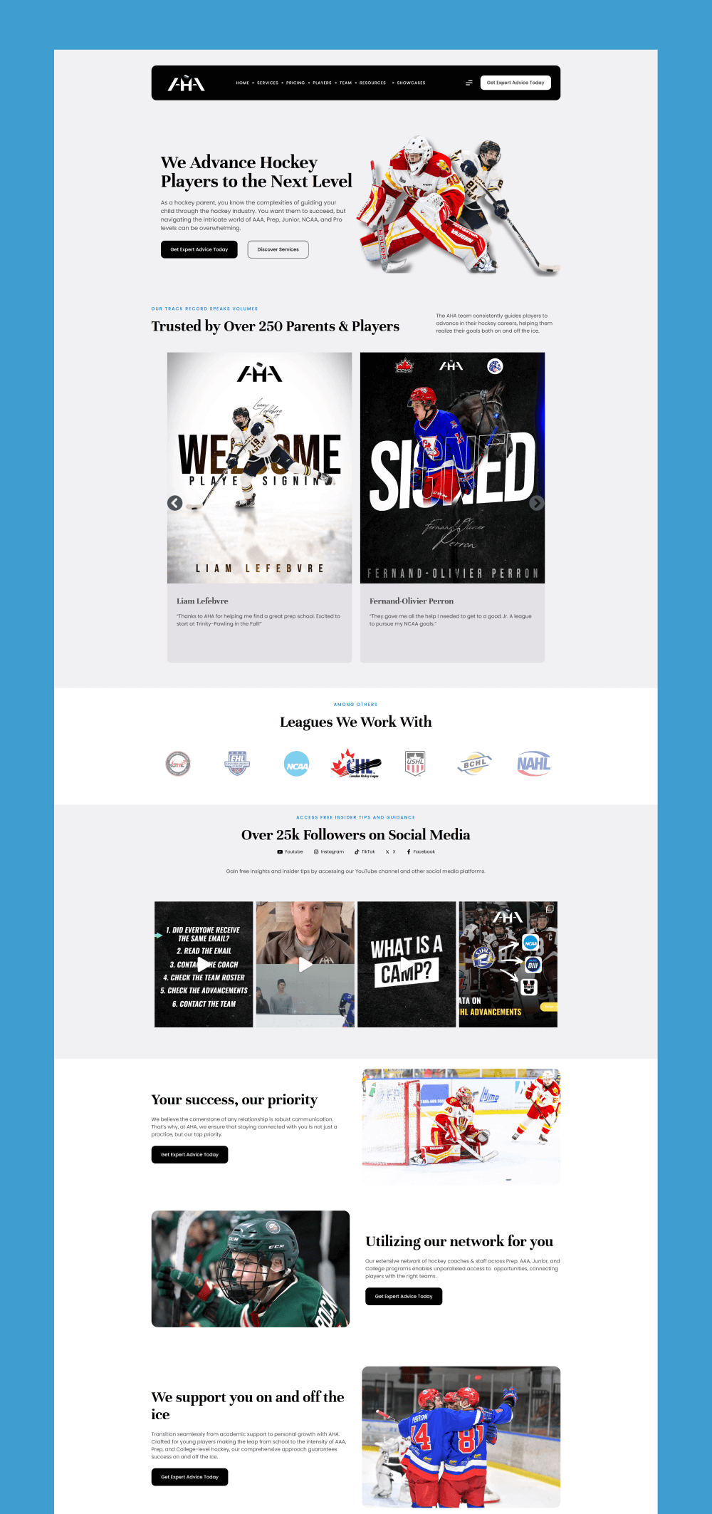
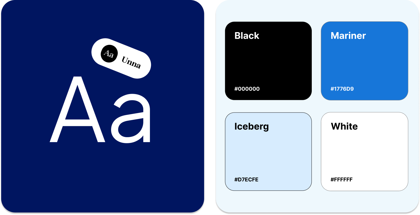
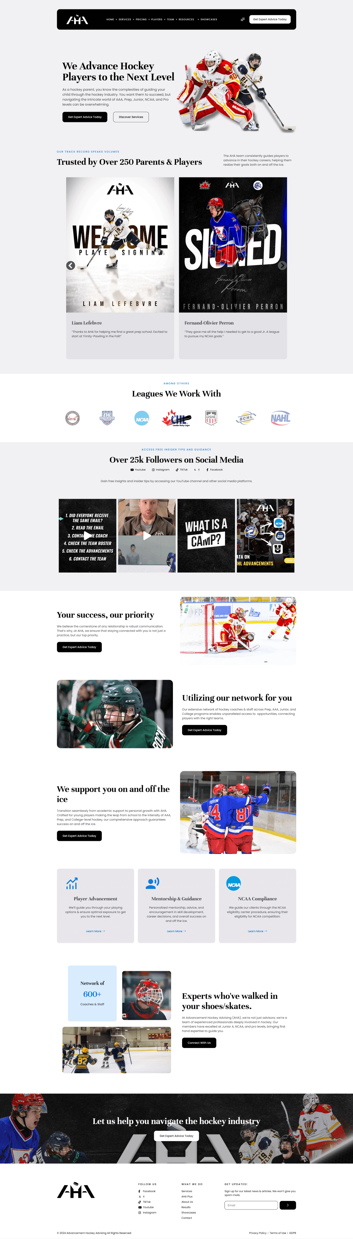
The new brand identity for AHA featured cool tones for a professional look and feel. We combined a beautiful black and blue combination mixed with sheets of ice and white to add that extra pop.
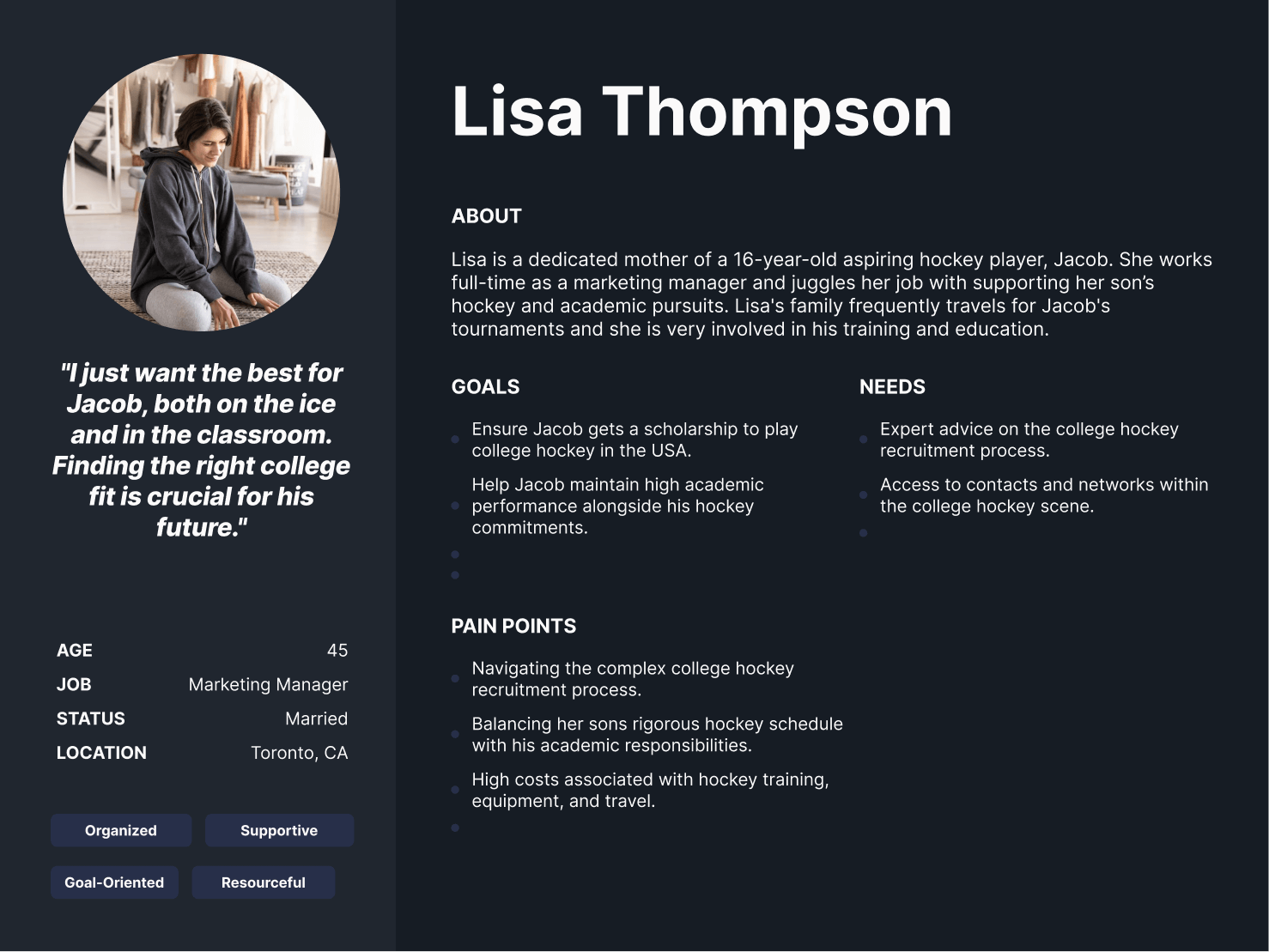
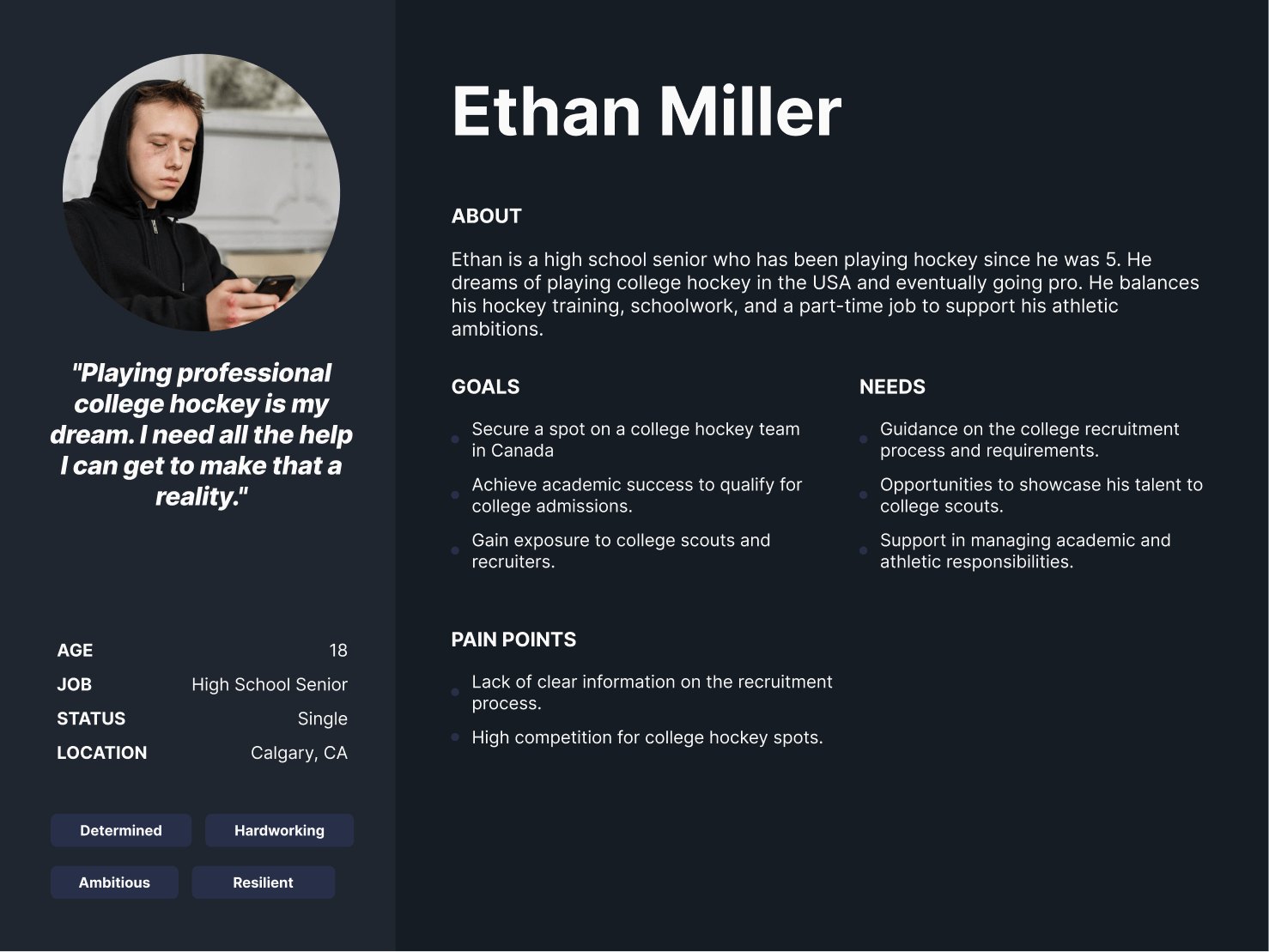
AHA had a unique audience demographic in that about 70%–80% of users were parents searching for hockey advising agencies for their children, while 30% of users were the children themselves reaching out for help. What made this nuanced was the fact that children were often the first point of contact who would eventually tell their parents about AHA and urge them to visit the website. Parents would then be the ones to take action on the site and fill out the form. In other words, it was crucial for the site to effectively speak to both audiences. Through multiple stakeholder interviews and discovery sessions, we discovered the underlying pain points that parents faced in that they didn’t know how to help their child succeed and navigate the hockey journey. We infused these deep-desire pain points back into the messaging of the site to elicit an emotional response.
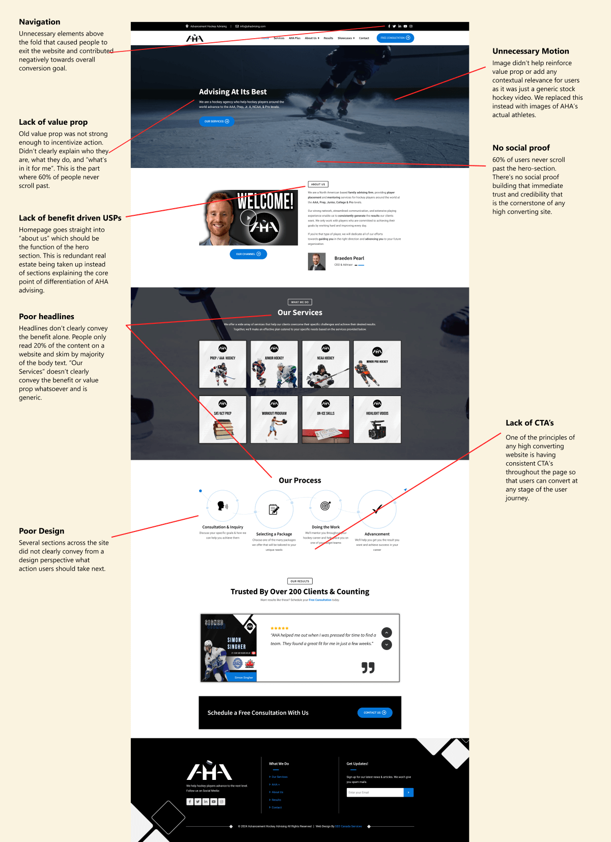
We discovered through heatmaps that there was very little interaction with the CTA buttons throughout the site, especially in the top hero section. Likewise, there was a massive 30–40% drop-off immediately past the top hero section due to a lack of a crystal clear value prop and social proof to build trust. These data-driven insights heavily shaped our final design decisions.
Our team analyzed hundreds of user recordings on the old website to identify usability issues as well as areas of opportunity. Some of the patterns observed included people barely engaging with the content on the site, navigating multiple pages, implying a more intricate user journey to take into account, and a lack of any sort of motivation to take action and reach out despite multiple CTA’s prompting users to do so.
As part of our rigorous onboarding process, we dove deep into the current state of AHA’s audience and learned the ins and outs of industry terminology. This helped us craft tailored user journeys and personas that allowed us to achieve the success in conversion increase that we achieved as a result of the redesign.
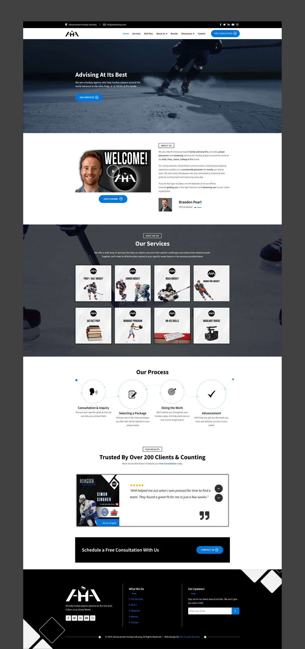
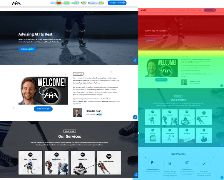
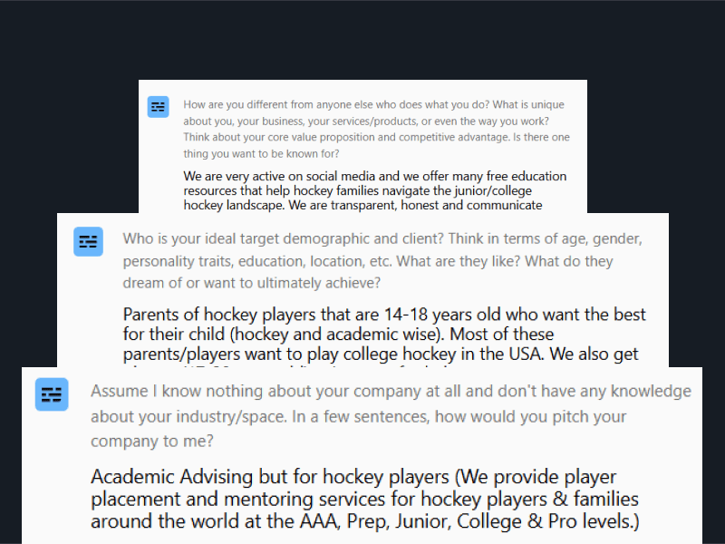
Looking at the original website and without any data analysis, we were able to identify multiple UX/UI design and conversion issues right off the bat. Most notably, there were major areas of opportunity from a messaging, design, and navigation perspective. Below is a mini-snapshot of a more detailed audit we conducted.
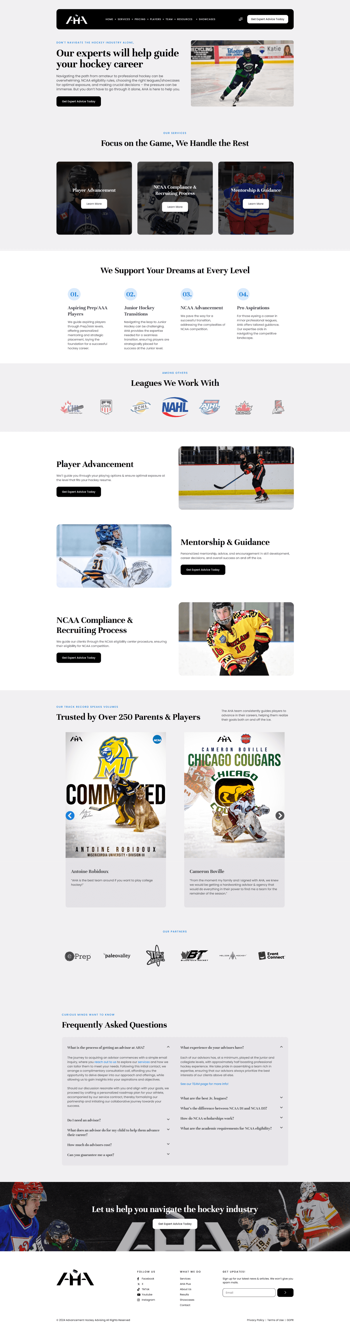
The Services page positions AHA as a leader in the space and as an as an authority that can help guide its prospects to success. From the messaging to the design, every aspect of the page speaks to the credibility that AHA possesses.
Just as important of a KPI as the quantity of leads is also the quality of leads coming through the site. We created a separate pricing page on the website that did not exist before on the old site to help pre-quality prospects and ensure that the right people were submitting forms. This page also featured FAQs to educate prospects prior to jumping on a sales call.
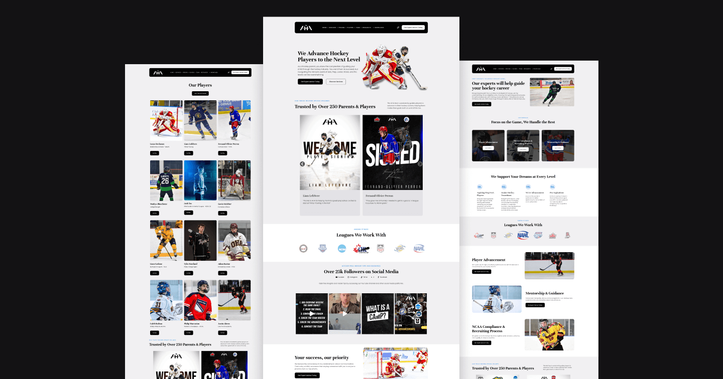
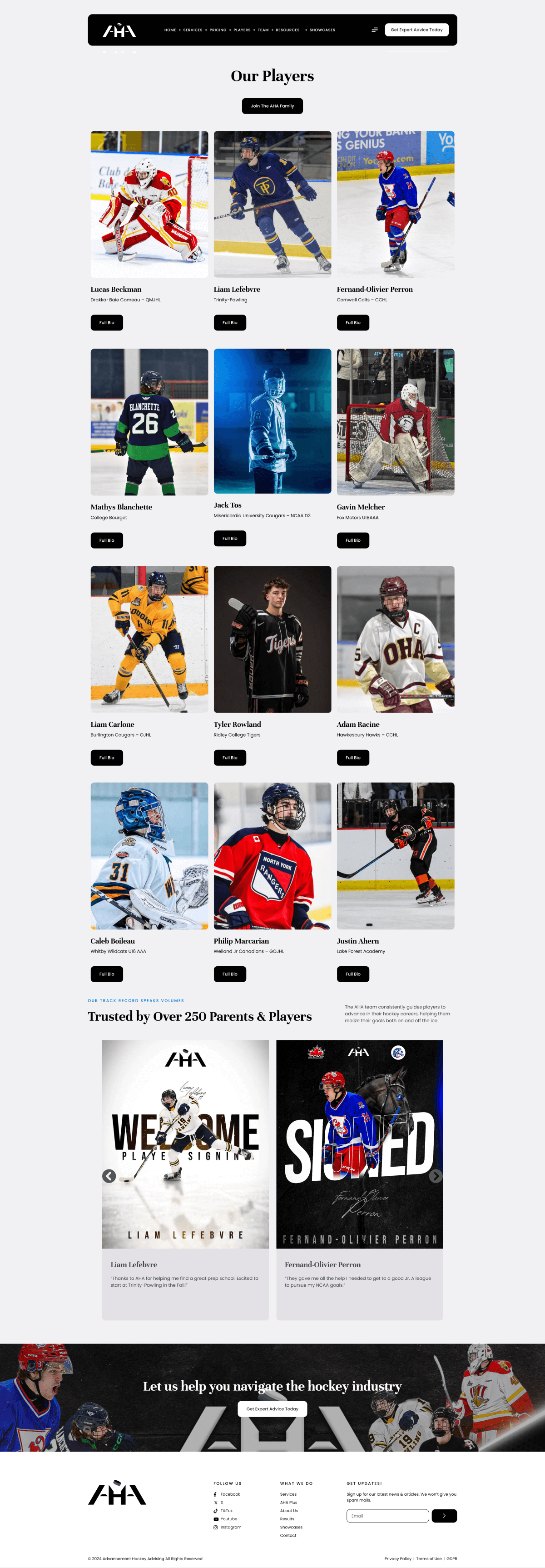
The old AHA website had no central repository to host all of its athletes and the amazing achievements they have accomplished as a result of their partnership with AHA. We created a scalable and sleek athlete page featuring all of their players, the position, and the league that they play in. We noticed a lot of traffic go straight to this page as prospects naturally want to see success stories and track records of other players AHA has already worked with.
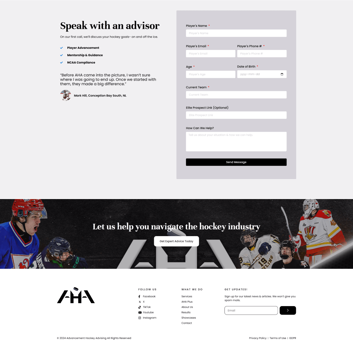
The contact page on a B2B website is often the most overlooked section. This is, in fact, one of the most critical areas and the lowest-hanging fruit for conversions. You spend all of the effort getting people here, only to have a handful leave the page. We mitigated this through conversion fundamentals like highlighting a testimonial to push people over the edge, a benefit-driven headline (“Speak with an advisor”), 2-3 benefits of what people can expect if they fill out the form, etc. This helped increase the number of conversions substantially on this page.
The new AHA website has allowed the organization to rapidly scale its digital marketing efforts and explore new opportunities for growth. AHA is well known on social media and in the online space. Now they had a high-converting website that helped them strategically scale the organization as they also simulatenously scaled their online following, creating a snowball effect of growth. Outside of generating new leads, the website also served as an amazing tool to educate prospects before they jumped on a sales call and were already “pre-selling” them.