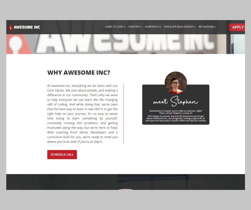
Awesome Inc. is a university bootcamp that helped its students break into the field within a matter of months. However, they were struggling with low conversions. We identified multiple usability issues on their site by performing a detailed 60+ page audit and making design recommendations.
“What I found most impressive was their ability to execute and explain why they made the decisions they did. They were clearly experts in the areas we needed help.”
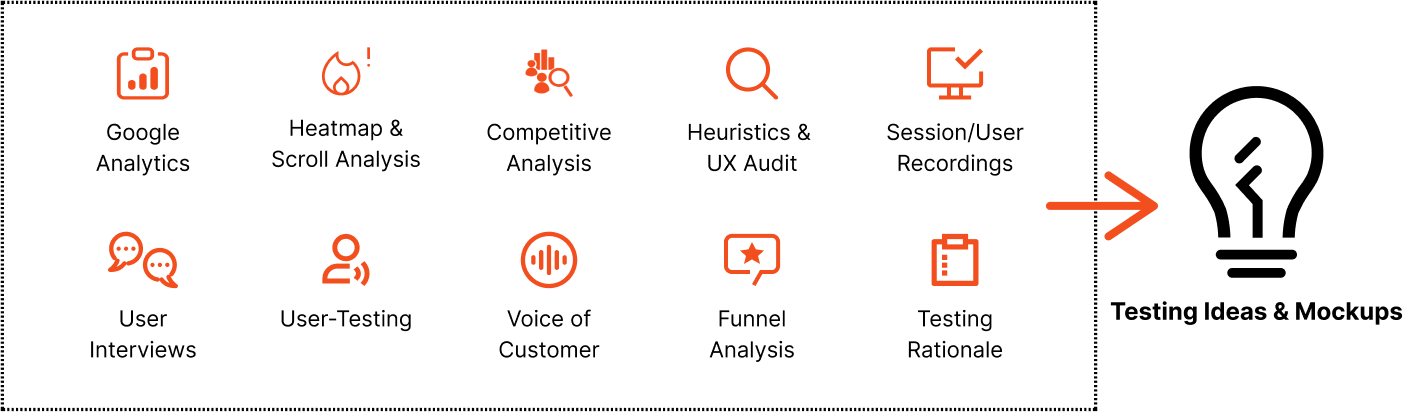
In order to get a holistic overview of the website and customers, our deep-dive audit always involves several steps across the user journey to
objectively analyze areas of opportunity from a data-based lens. This includes conducting several qualitative and quantitative research methods
to create data-backed hypotheses and an experimentation program.
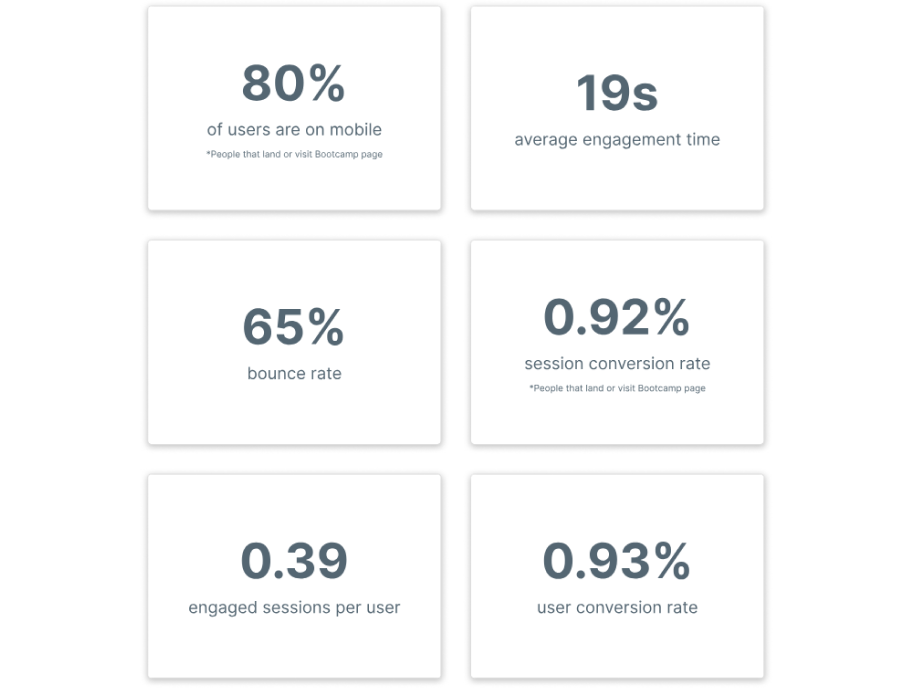
In order to better understand how users interact with the website, we compiled an overview of the main KPIs that helped drive all of our decisions for the redesign. Some high-level insights included the fact that the majority of traffic was from mobile, representing 80% of users. The average engagement time on the website was less than half the industry average of 52 seconds. There was a huge opportunity to keep people on the page longer and convert.
As part of our unique process, we actually interviewed Awesome Inc.’s exact target demographic to collect direct customer feedback. We asked multiple questions, ranging from their first impressions of the site to actually getting them to complete a series of tasks such as finding specific sections and/or information. We identified a whopping 30-35 usability issues PER VIDEO that substantially informed our final design decisions. Some of these included overwhelming design, poor usability with hard-to-read sections, etc.
Our team analyzed hundreds of user recordings on the old website to identify usability issues as well as areas of opportunity. Some of the patterns observed included people struggling to find clear information about the bootcamp pricing, poor engagement around the program information section that explained how everything worked, and multiple recordings showing users repeatedly resizing sections on their mobile devices (suggesting that content was difficult to read without zooming in).
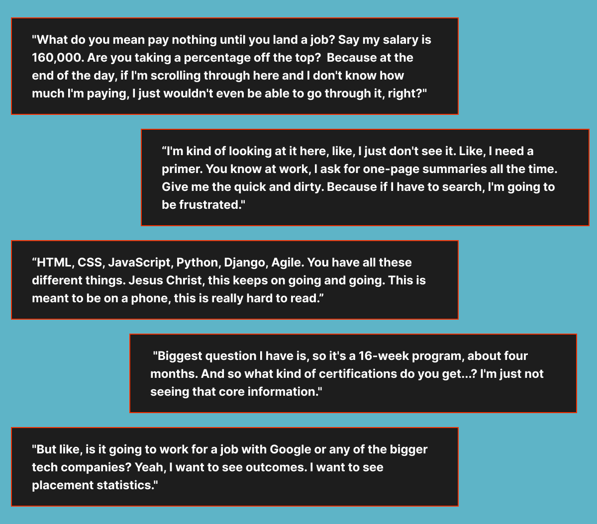
After conducting several user tests with Awesome Inc.’s exact target demographic, we were able to extract super valuable quotes directly from the voice of the customer. This helped the external leadership team truly understand the gravity of the situation with respect to the current site experience and where it falls short at a glance.
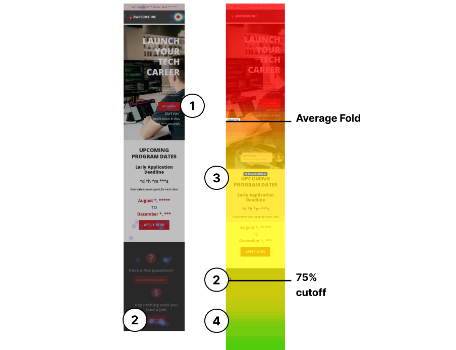
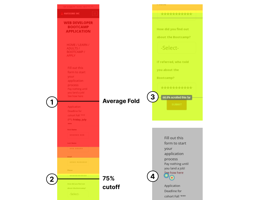
The first several weeks of our engagement were purely dedicated to a deep-dive data audit. We set up a series of heatmaps, scrollmaps, and clickmaps on high-traffic pages to determine areas of opportunity to increase conversions.
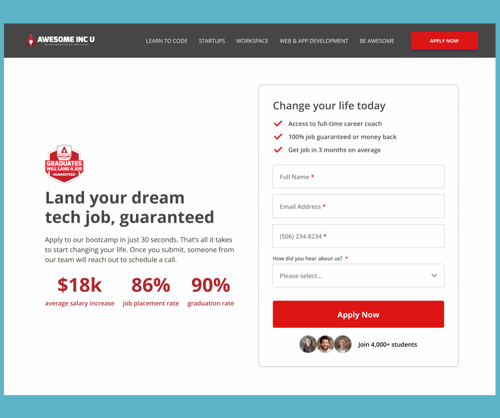
1) The main “Get Started” CTA was only getting 1.46% of clicks, which was poor relative to the rest of the elements on the page and the benchmark average of 4.23%. While microcopy highlighting the length of time it takes to complete the form was effective, the money-back guarantee, which was expressed in user interviews as a compelling USP, was subtle and lacked visual prominence. A clearer visual hierarchy was needed to incentivize higher CTA clickthroughs.
3) 15% of users never reached the Upcoming Program Dates section and immediately dropped off. The
hero-section took up unnecessary real estate and pushed down information substantially on
mobile. This presented an issue as the upcoming program dates provided important contextual
relevance to users on whether to apply or not.
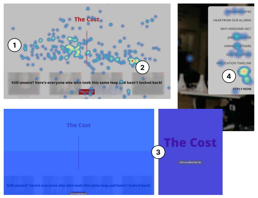
1) There were lots of clicks and movements registered around the cost section as users were actively seeking more information or details about how everything worked. However, there were no CTA buttons present in this area to capitalize on the high intent of these users.
2) 95% of users clicked underneath the “Up-front Payment”
option with no CTAs for detailed bootcamp fee information. Several
people during user-interviews expressed that the cost of the program was something they wanted to know upfront and higher up in the funnel.
3) On desktop, only 32% of users reached this section, and 24% of users reached it on mobile. From a messaging standpoint, highlighting the cost as an investment rather than a cost can help reduce friction. For example, highlighting the statistics or job guarantee in close proximity to the investment can give people the confidence they need to take the next step.
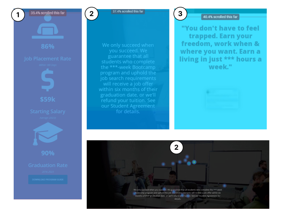
1) Addressing FUDs (fear, uncertainty, and doubts) early can significantly improve user engagement. On the old website, this information was located much lower on the page, where only 35% of people reached it, potentially leading to missed opportunities to convert visitors who might have concerns.
2) Only 37% of users reached the job guarantee section. This presented a large conversion blocker, as multiple people mentioned in the user interviews that this was a section that would have motivated them to apply.
3) On mobile, only 40% of users reached the testimonials section, whereas this social proof would be much more strategically placed higher up in the funnel.
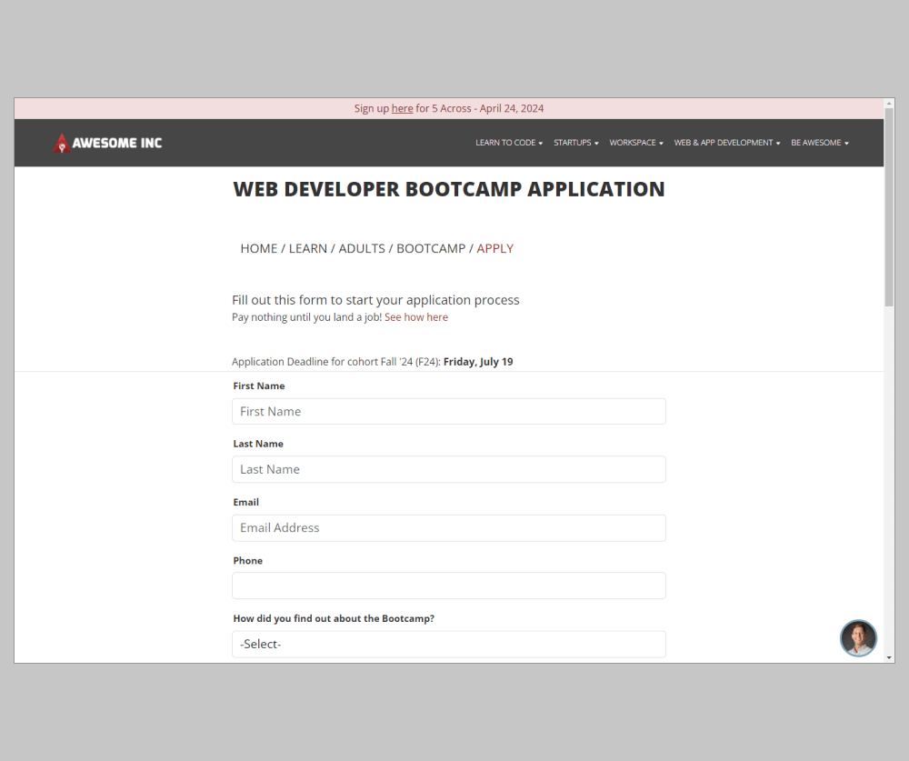
1) The average fold and entire form application page were heavily underoptimized. The visual design of the page and large amounts of empty white space between sections and form fields resulted in a huge dropoff each step further down in the journey. Left and right padding on paragraphs was causing the form to get pushed down substantially.
2) A whopping 25% of people dropped off after the phone number section. Phone numbers are statistically proven to decrease conversions.
3) 30% of users never reached the submit button of the form due to
unnecessary real estate being taken up higher on the page, a lack of
social proof to get people over the edge, and a reduction in FUDs.
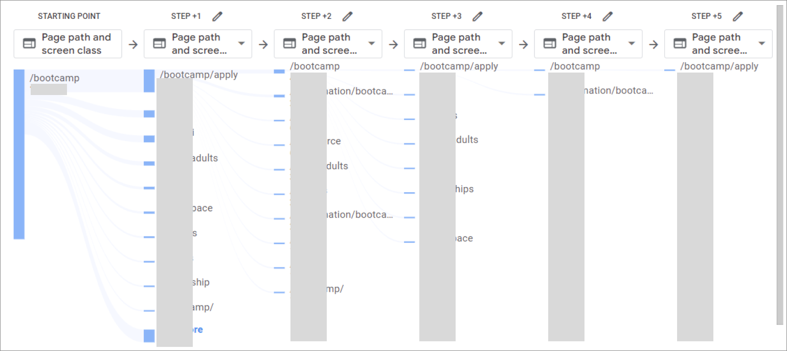
Understanding the entire application funnel and how people are navigating the website was crucial to optimizing the user journey. We noticed that from the bootcamp page, only 13.45% of people visit the application page. Out of the people who visit the application page, only 11.47% actually convert and fill out the form. Thus, users did not have enough information upon visiting the application page to be ready yet to convert, or they were experiencing friction or a lack of motivation that compels them to collect more details. There was a huge underlying missed opportunity, as there was no easy form capture immediately upon landing on the website. A separate form page experience resulted in no easy way for users to switch back and forth, collect the information they need in one spot, and feel confident in moving on to the next step.
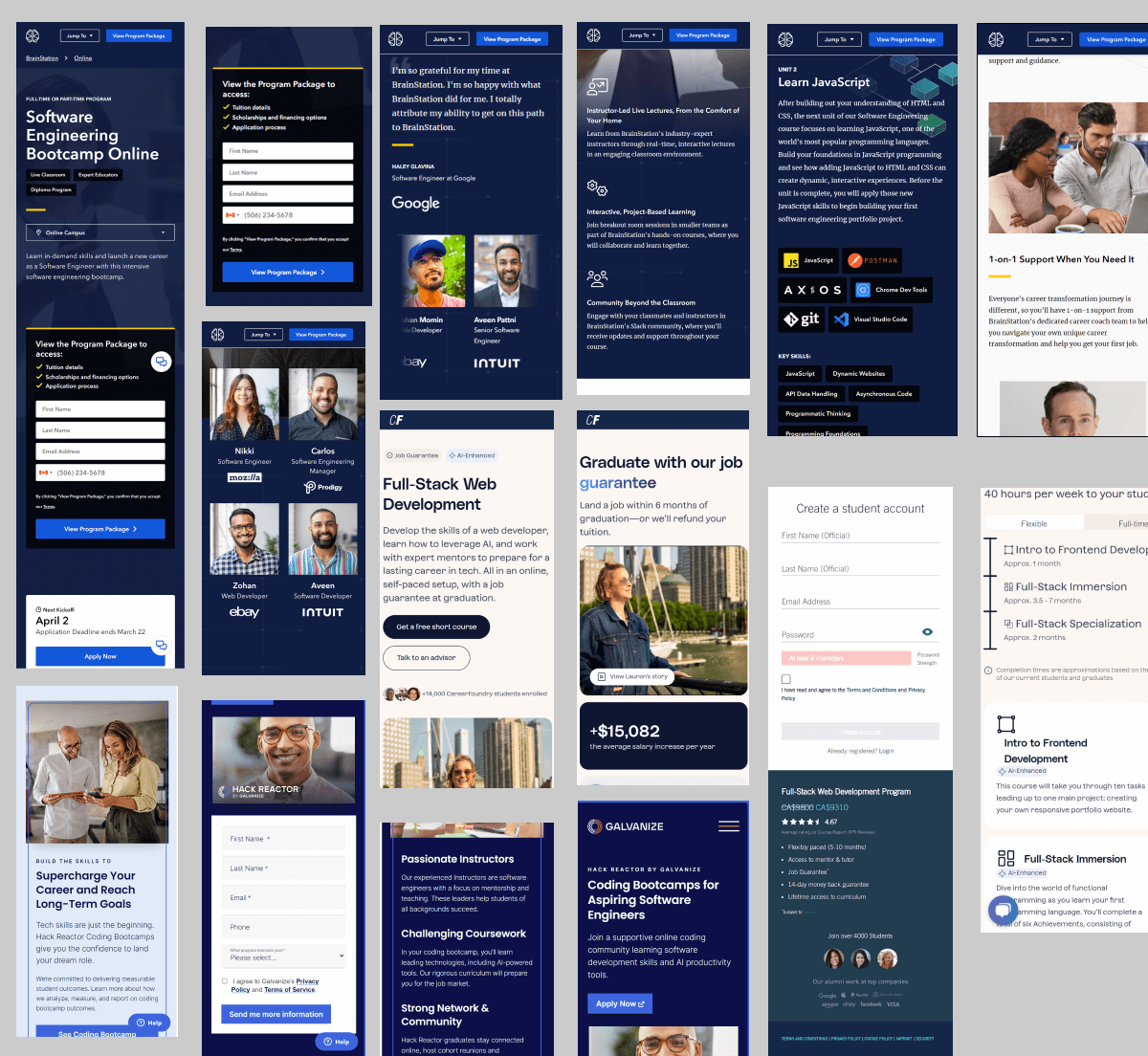
Now that we had a detailed overview of the problems on the site, we conducted a thorough competitor analysis to understand what others were doing in the space from a user experience perspective. We analyzed giants like BrainStation to other industry-leading bootcamps and pulled a massive amount of insights that helped shape the final design.
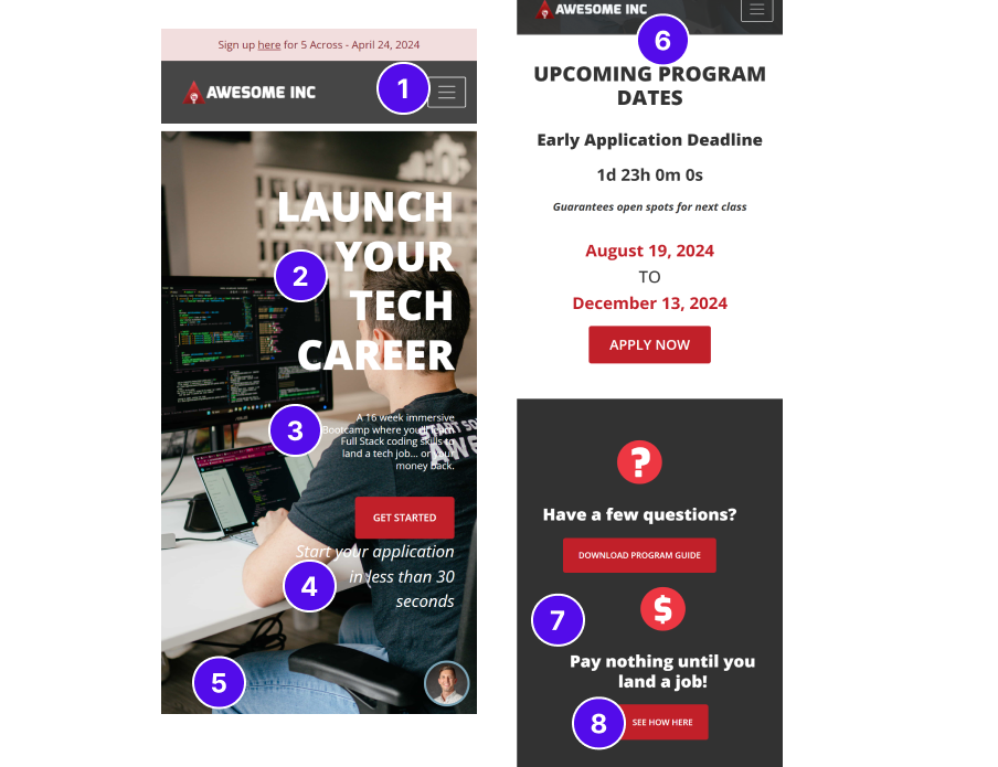
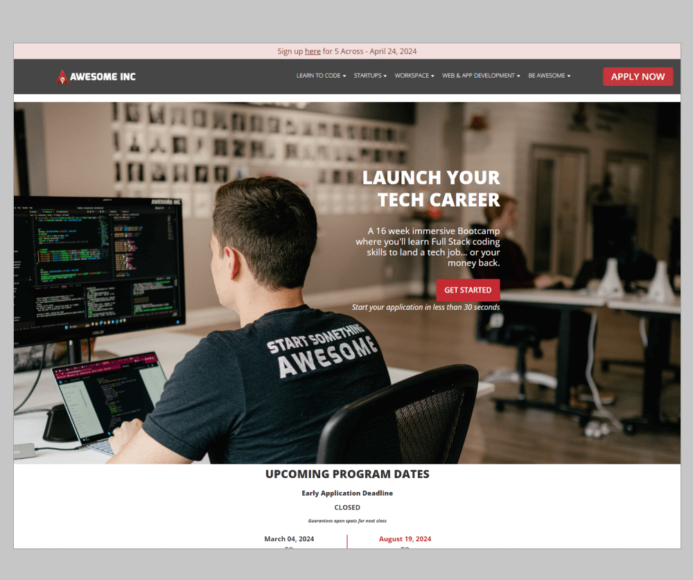
We analyzed over 200 different usability issues. For the sake of brevity, the top 3 are highlighted below as per the screenshot on the left:
1) The Hamburger menu was on the right-hand side, which is an unconventional design
pattern. Most users scan websites in a “Z” pattern (top-left first). Straying away from
this increases the cognitive load for users and also leads to less trust. Navigation also
lacks quick CTAs like a sticky filter or “Apply Now” button, allowing users to convert
anywhere.
2) The headline lacked the deeper “why” and “what’s in it for me.” What is the by-product of being able to “launch your tech career”? Is it the ability to leave a job one hates and pursue a career one is more passionate about? Or the ability to earn more income and live a dream life with increased freedom? The core value prop is missing.
6) The entire upcoming program dates section from top to bottom lacks a clear visual hierarchy. 7 text rows overwhelm users. Vertical stacking wastes space. Headlines need to be more clear through font weight and styling, while dates need to have a different visual treatment.
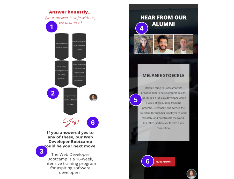
We analyzed over 200 different usability issues. For the sake of brevity, the top 3 are highlighted below as per the screenshot on the left:
2) The text inside these shaped boxes appeared irregular and was barely readable
on smaller devices like mobile, causing most users in the session recordings to
completely skip by this area.
3) “If you answered…” and “The Web Developer…” are the same font size, implying that they both hold equal importance. There is no sense of visual hierarchy distinguishing headers from body text and guiding the user from top to bottom on where their eyes should go, increasing friction and giving users the information they need.
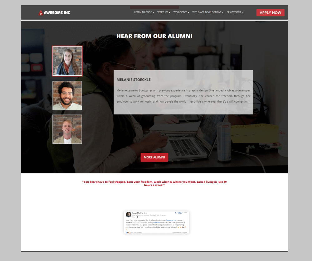
4) Despite images being clickable, on first-load interaction, the active state (red border) is
not prominent or apparent, presenting a major usability problem. Introducing arrows or
pagination can help guide the user and generate more interaction with the testimonials,
which are statistically proven to increase motivation.
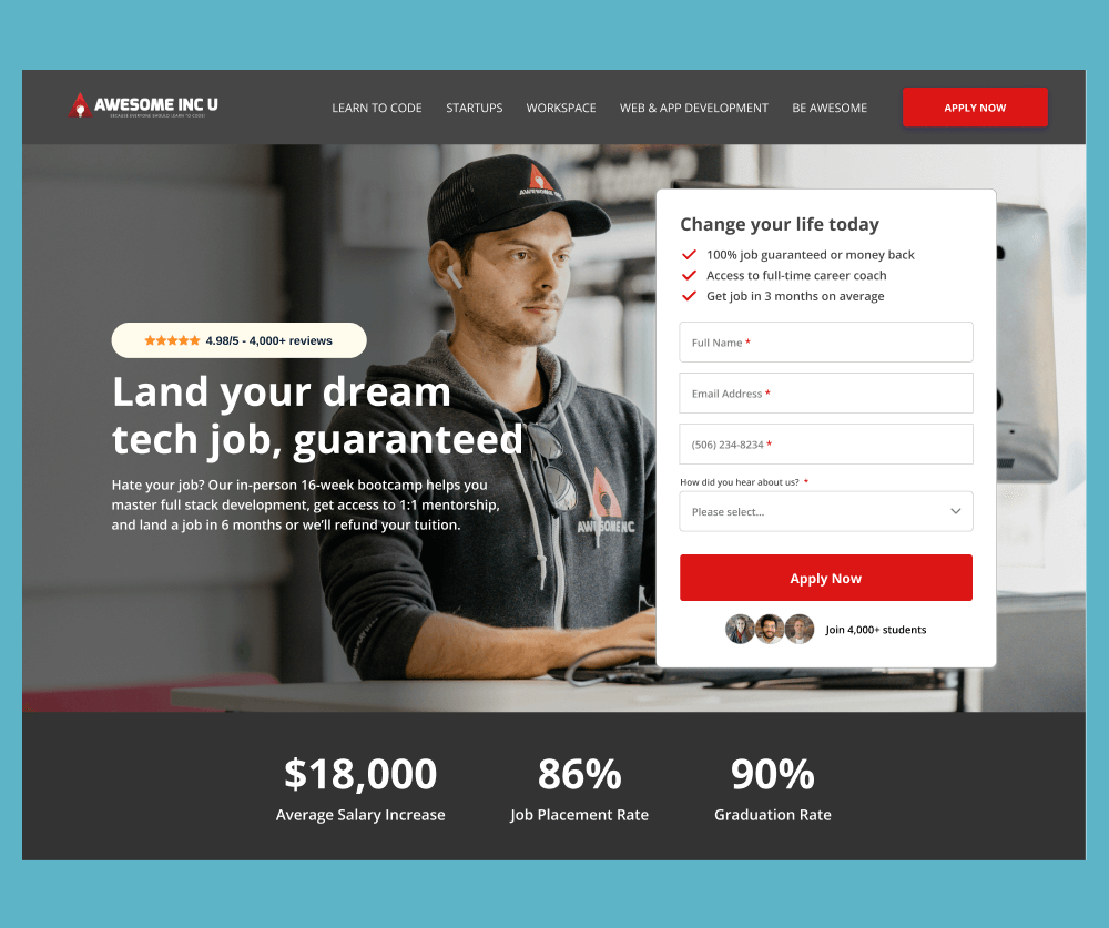
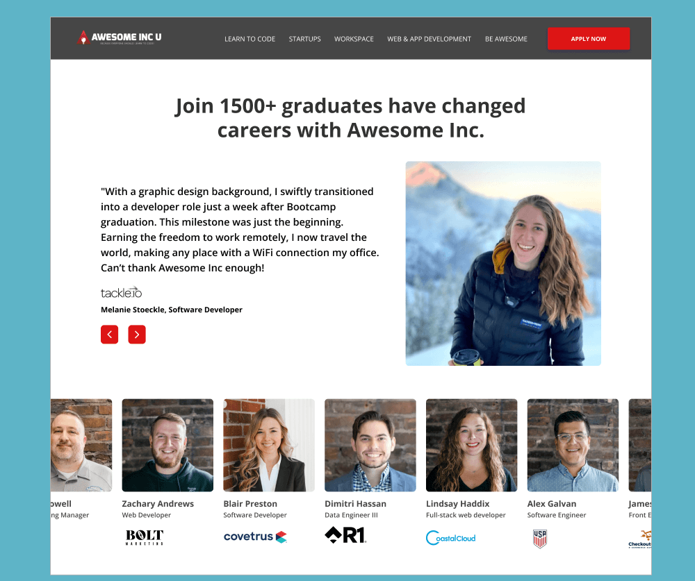
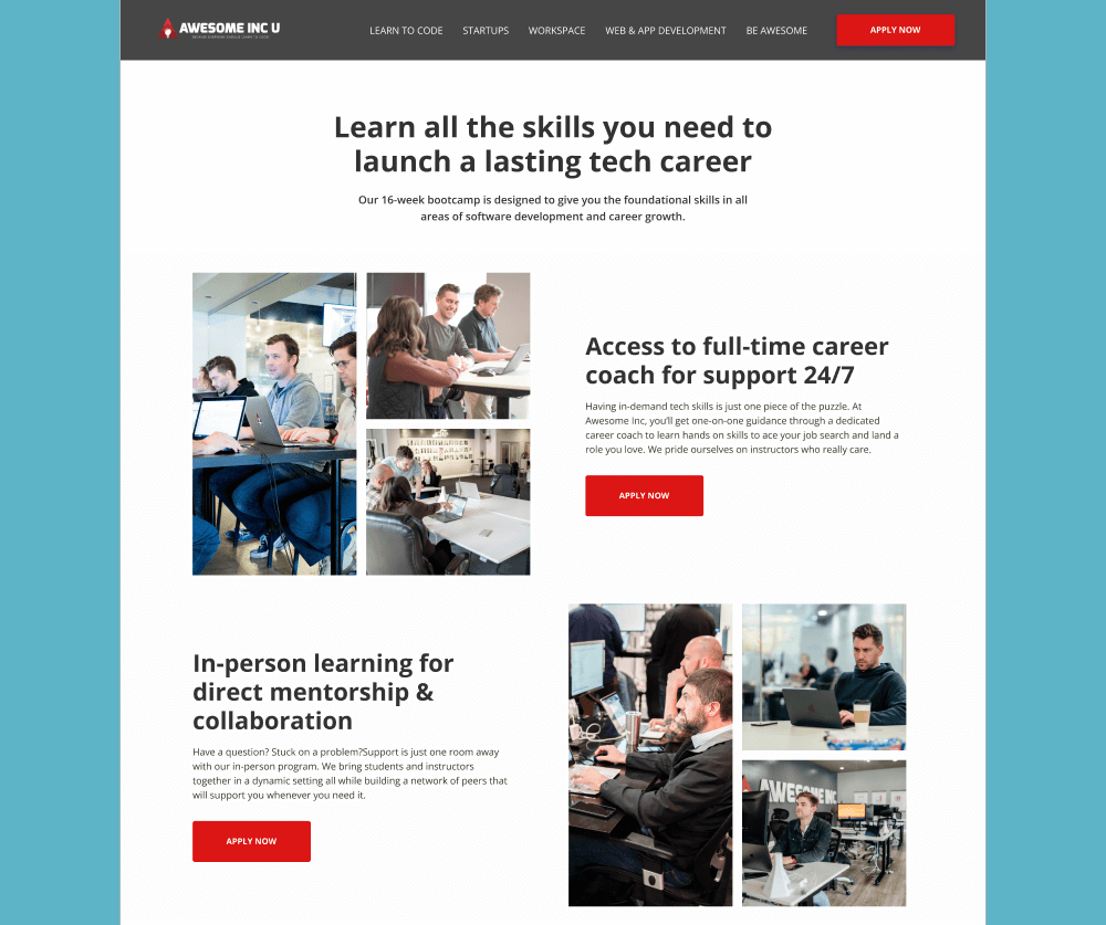
Through multiple additional UX/UI design recommendations and audit findings, Awesome Inc was finally able to solve the conversion bottleneck they were facing and confidently scale digital marketing again to the bootcamp page without stress.