Carolindica prides itself on crafting and testing every product they own to give its customers the most premium experience. However, the old website needed an upgrade from a usability, design, and user experience perspective. We worked closely with the team to revamp the site from top to bottom.
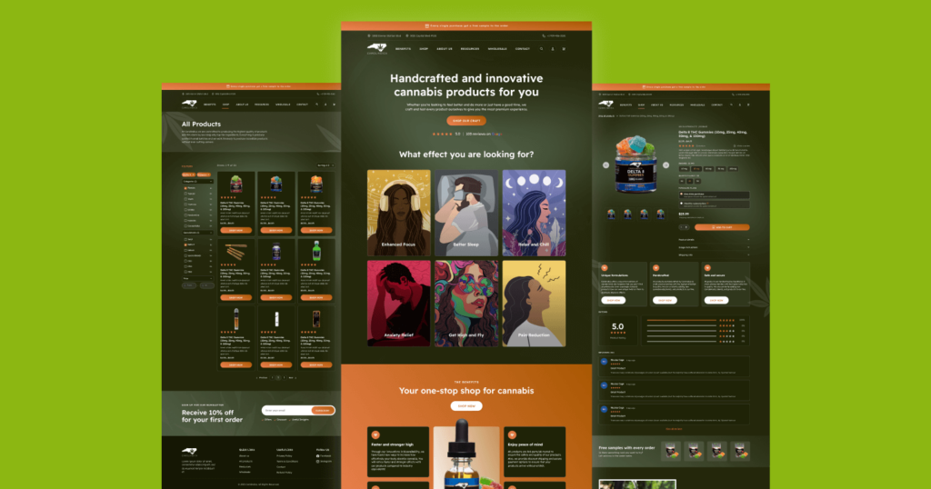
Our website underwent a high level redesign, adding new assets, features, and functionality. The overall purpose of this process was to improve conversions, but also to improve our internet footprint of the company. There were quite a few changes made, but the entire aesthetic, funtionality, and feel of the website is now significantly improved.
Increase in conversions (store orders)
Increase in Average order Value (AOV)
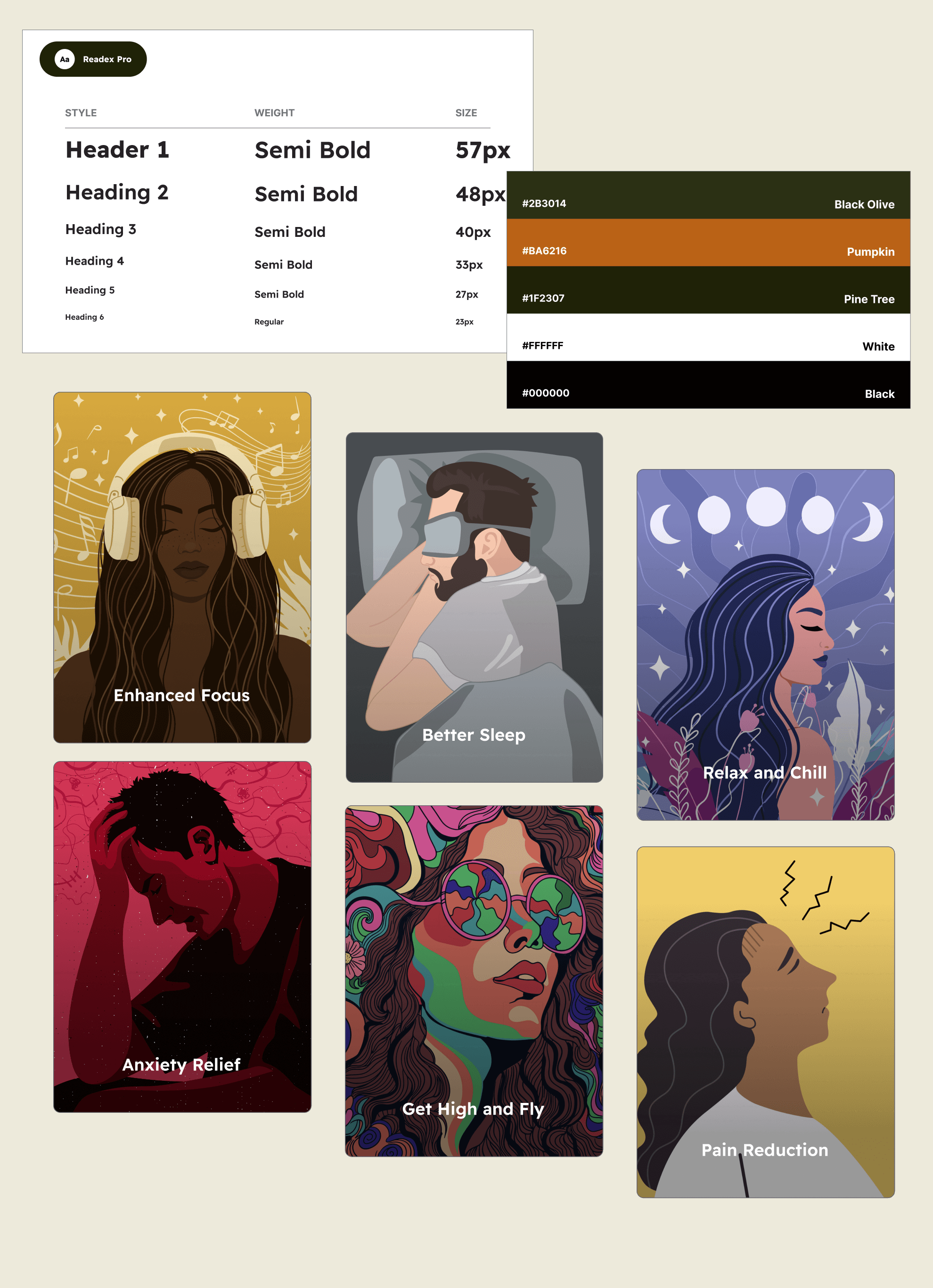
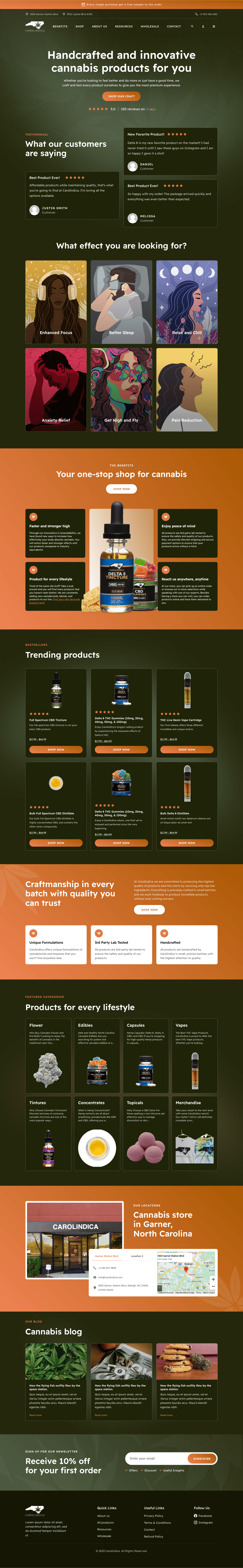
Carolindica is known for providing premium-quality products at affordable prices. The core value that they wanted communicated through their branding was that they were an innovative and unique company that was thinking outside the box in the ever-growing cannabis industry. We created a beautiful and clean brand identity that featured darkish tones for that “cool” or “wow” factor, balanced with pops of orange to elevate the look and feel. We also hand-crafted beautiful custom illustrations in alignment with Carolindica’s mission of “handcrafted” products.
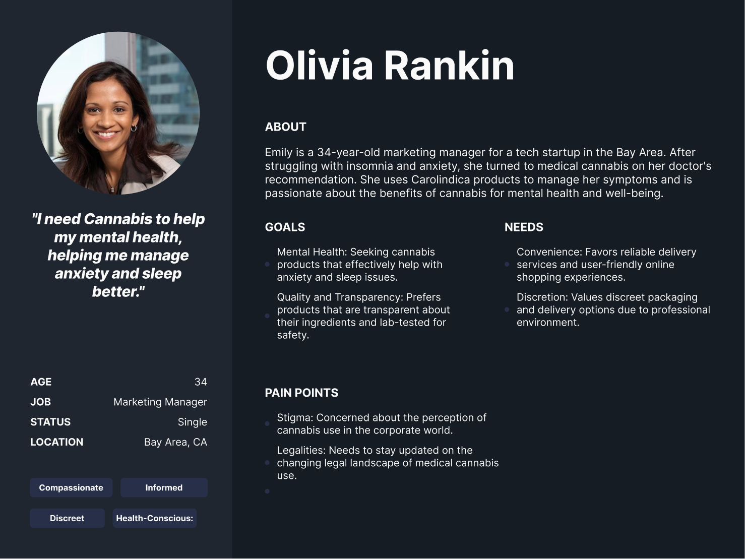
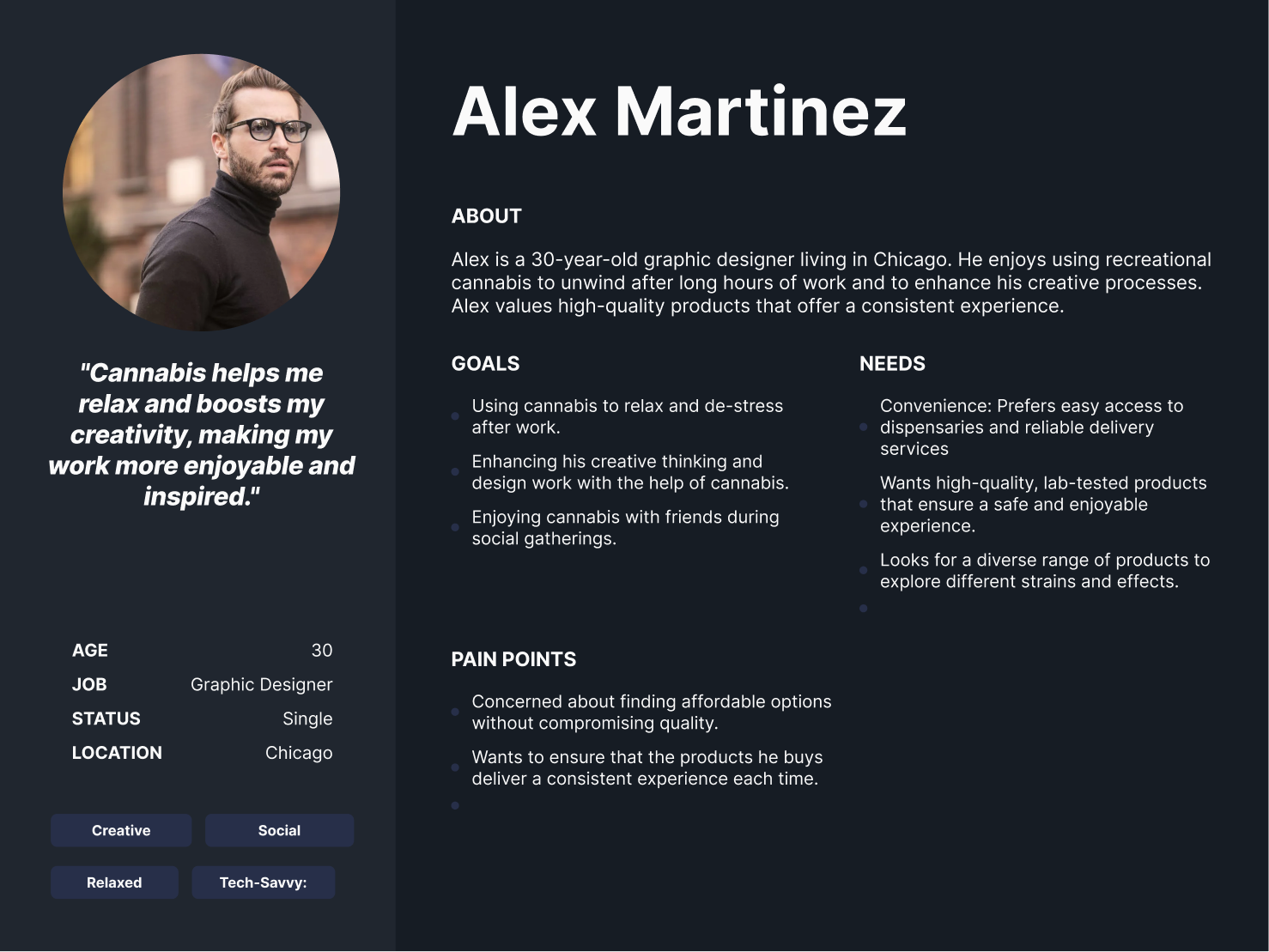
Carolindica had two distinct user segments, which consisted of those who wanted recreational cannabis for a good time with friends or family. On the other hand, they had several customers who were older and needed cannabis for pain management with issues they were dealing with. The revamped website had to uniquely combine and cater to both of these audiences while still effectively communicating the core value proposition of Carolindica.
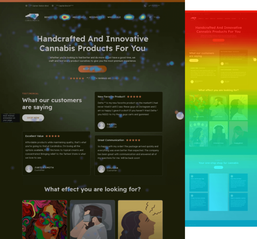
Before even touching a single pixel of code or design, our team dove deep into the current analytics of Carolindica. We discovered that the majority of users were on mobile and that they had a decent bounce rate and session duration. The main area of opportunity was sending people further down the funnel from the hompeage to the PDP’s. After we launched the revamped site, we also analyzed the improved heatmap data to see the impact of our changes.
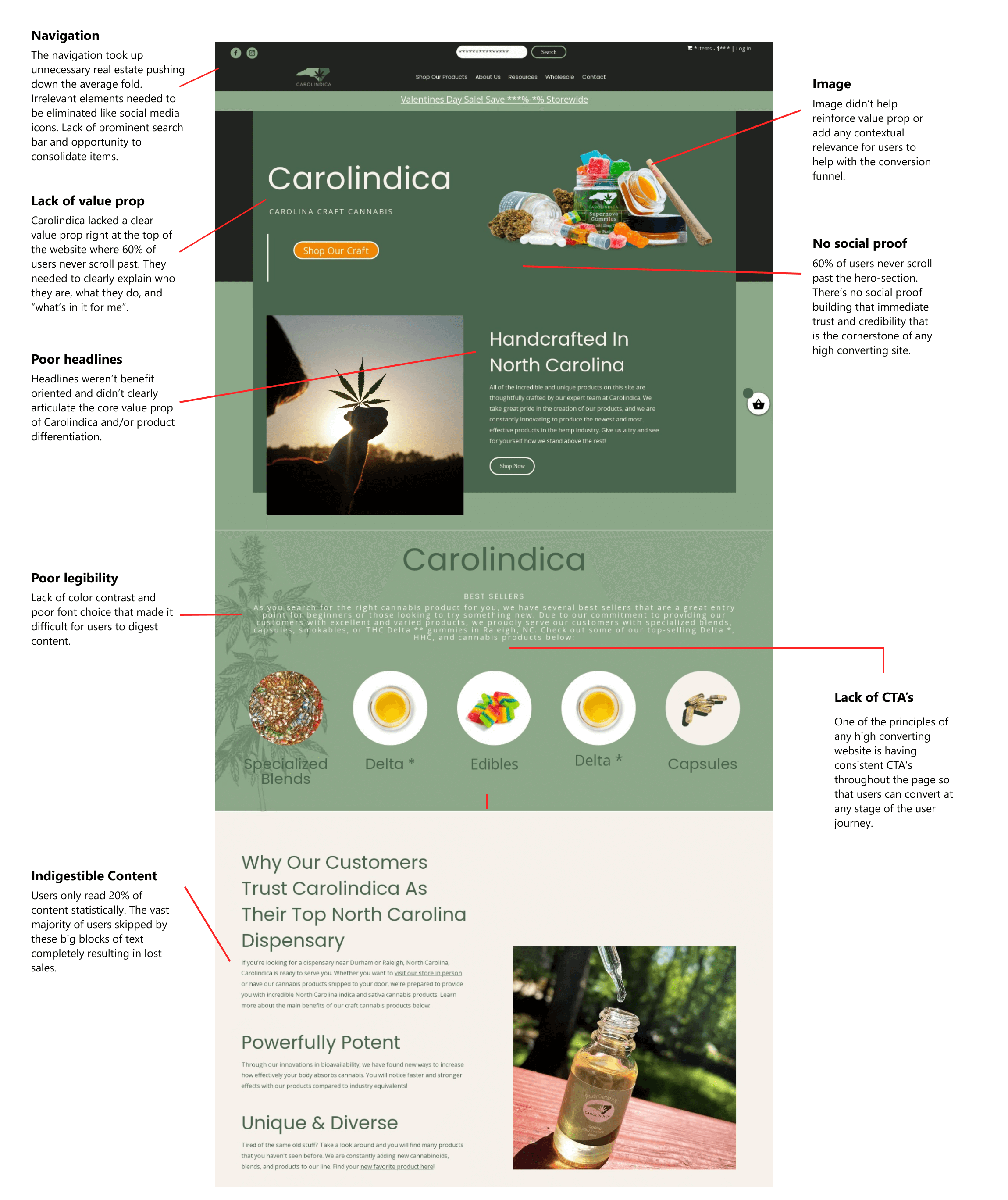
Our team analyzed hundreds of user recordings on the old website to identify usability issues as well as areas of opportunity. Some of the patterns observed included people navigating multiple pages, implying a more intricate user journey to take into account, users skipping through extremely large blocks of content (although valuable), and a lack of motivation to take action to purchase a product at various stages of the journey.
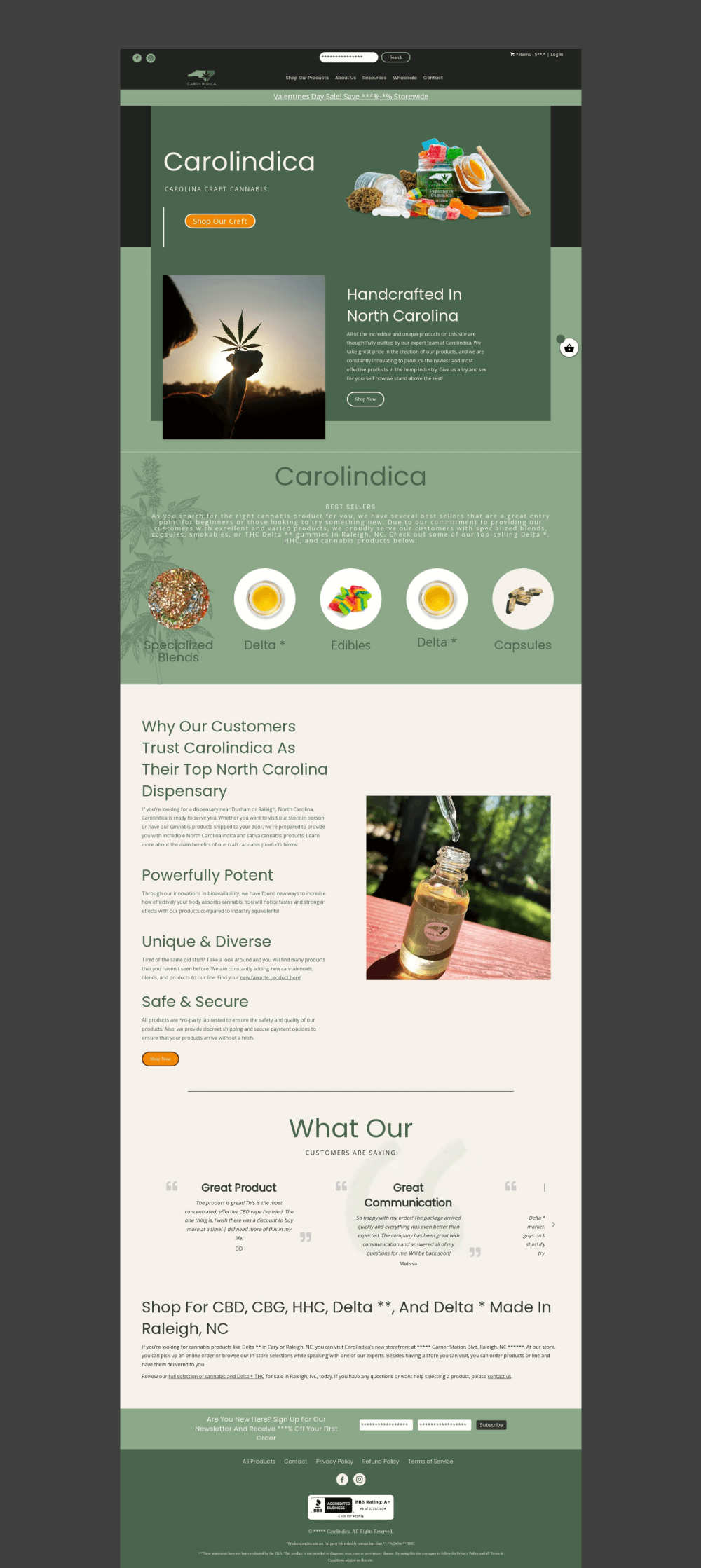
Looking at the original website and without any data analysis, we were able to identify multiple UX/UI design and conversion issues right off the bat. Most notably, there were major areas of opportunity from a messaging, design, and navigation perspective. Below is a mini-snapshot of a more detailed audit we conducted.
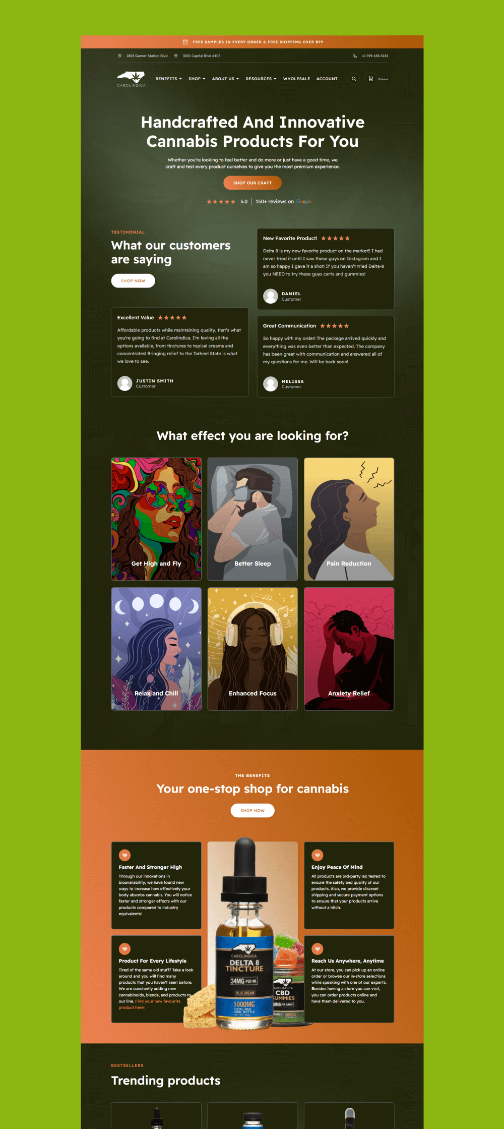
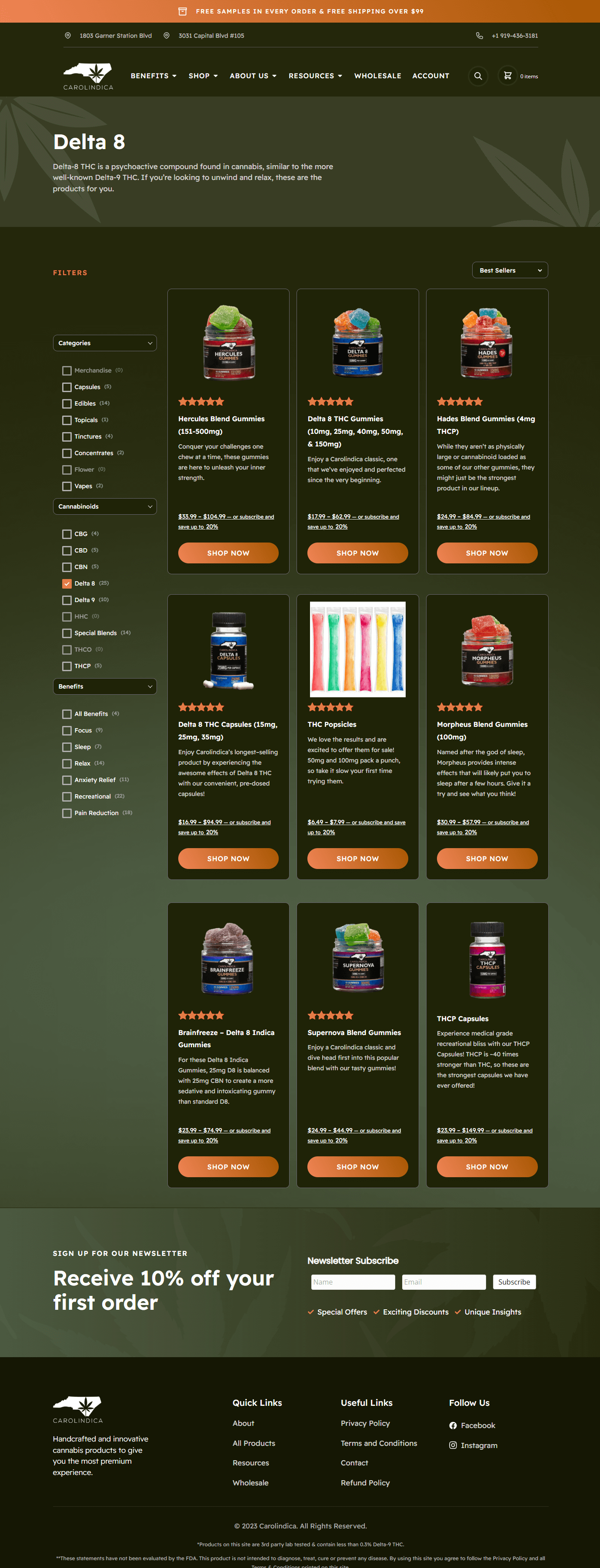
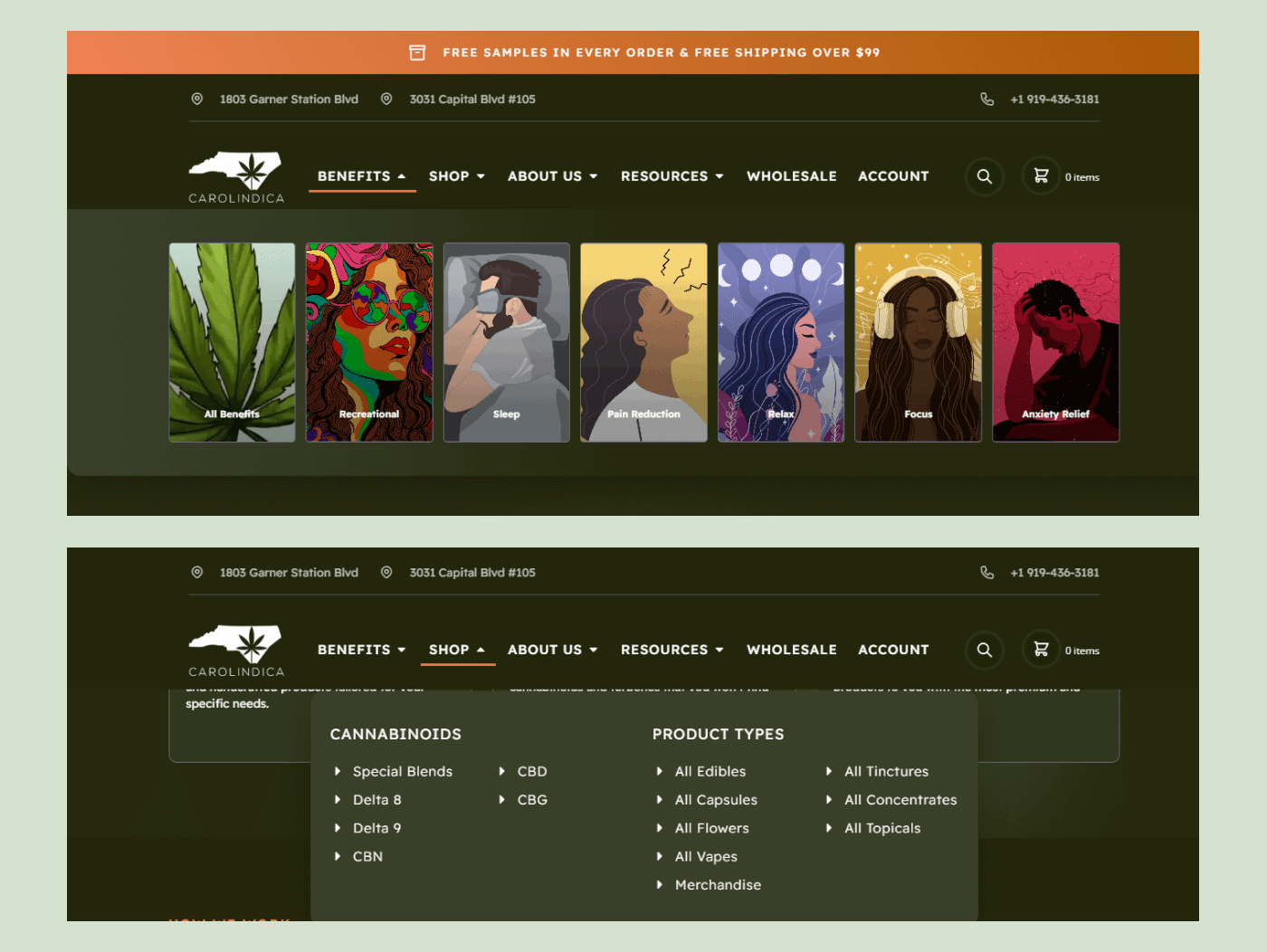
With Carolindica constantly launching new products and categories, they needed an overall shop page that was scalable, which allowed for additional items while still prioritizing the user experience. We focused on ensuring that the navigation of the shop page had a great user experience and that users could easily filter by benefits, cannabinoids, and category.
Navigation has never been more intuitive than on the new Carolindica website. We added a whole new benefits category to the top navigation so that users could efficiently find the products they were looking for based on the desired effect. This allowed both the recreational and medicinal customer bases easy access to the products they wanted. The Cannabinoids and Product Types categories were also filtered down to avoid an extra click.
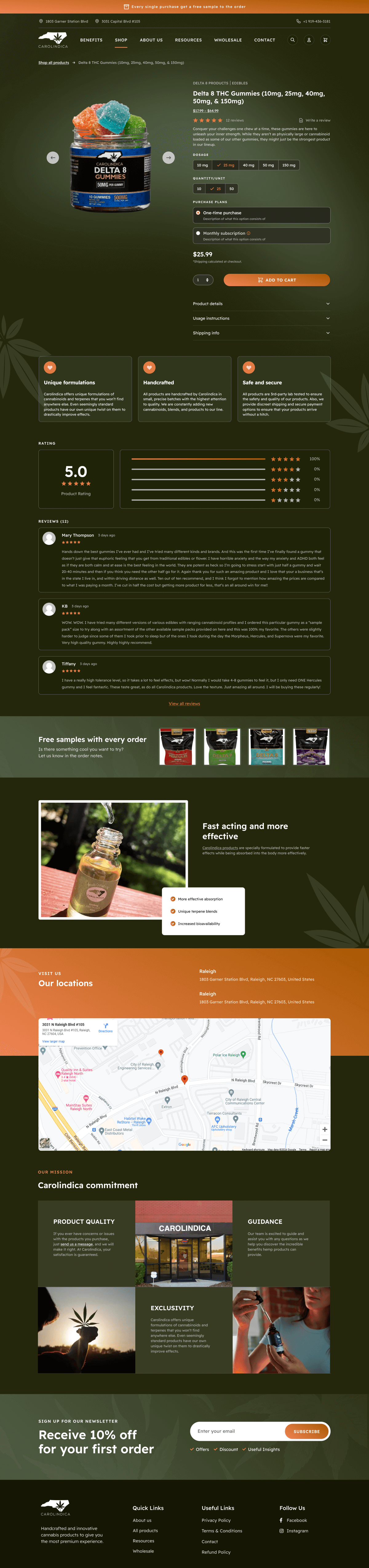
Carolindica’s old product page was bare bones and lacked many conversion-focused elements to motivate users to buy. We designed a hyper-optimized PDP, including a reduction of FUDs (fear, uncertainty, doubts) under the add-to-cart button, highlighting several core value props scattered throughout the page to emphasize the main product differentiation, and integrating reviews as well as subscriptions for an enhanced shopping experience.
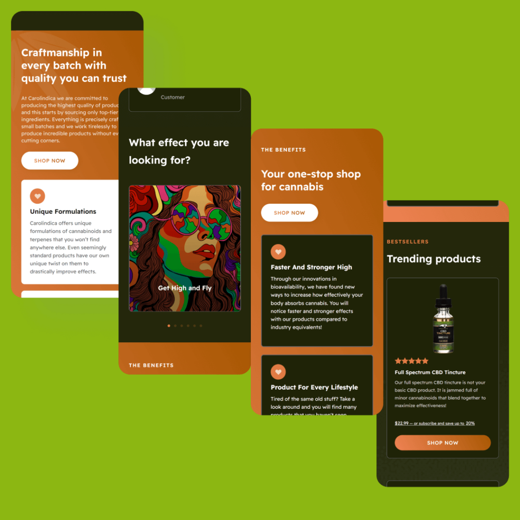
Ensuring the mobile experience was as good as the desktop for the Carolindica website was essential. As an e-commerce brand, the expectation is high when it comes to the user experience on any device. With an abundance of graphic elements, we had to make certain everything aligned properly and the flow was uninterrupted on screens of all sizes.
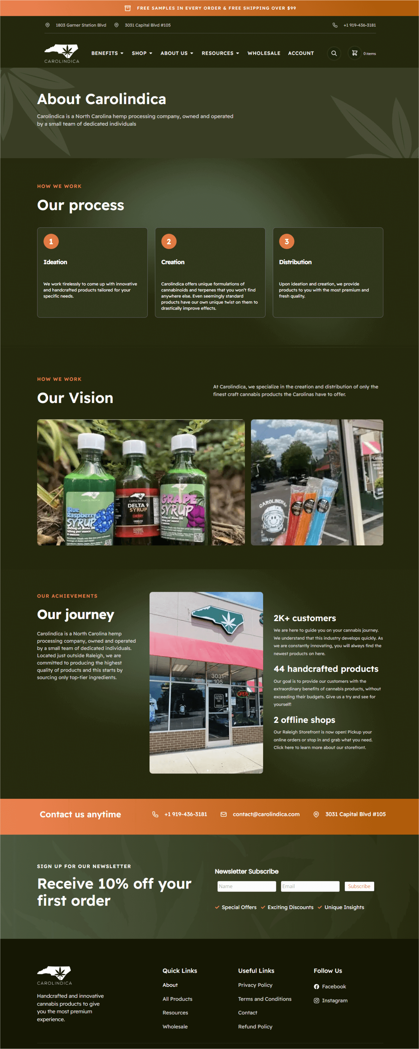
Carolindica’s brand values of innovation and handcrafted products needed to be reflected on the About page. Especially for B2B customers who specifically look for this information when searching for a company to purchase from.
Since the redesign, Carolindica has seen its sales increase and broke a record for its biggest month ever. They are now more confident in scaling their digital marketing efforts thanks to a conversion-focused website.