Fiddler’s Green is a veteran-owned farming venture in Illinois that provides pure and premium CBD products for reduced pain, better sleep, and less stress and anxiety.
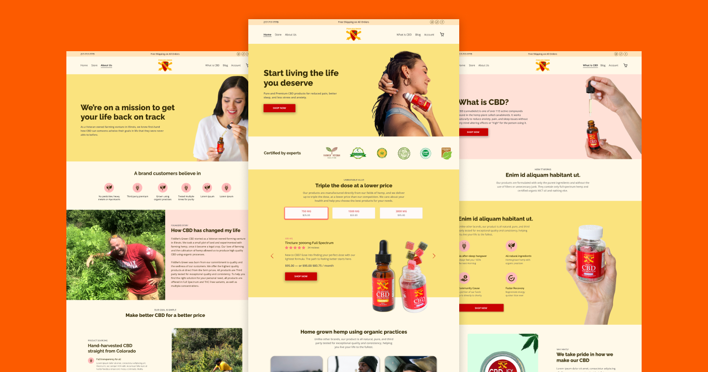
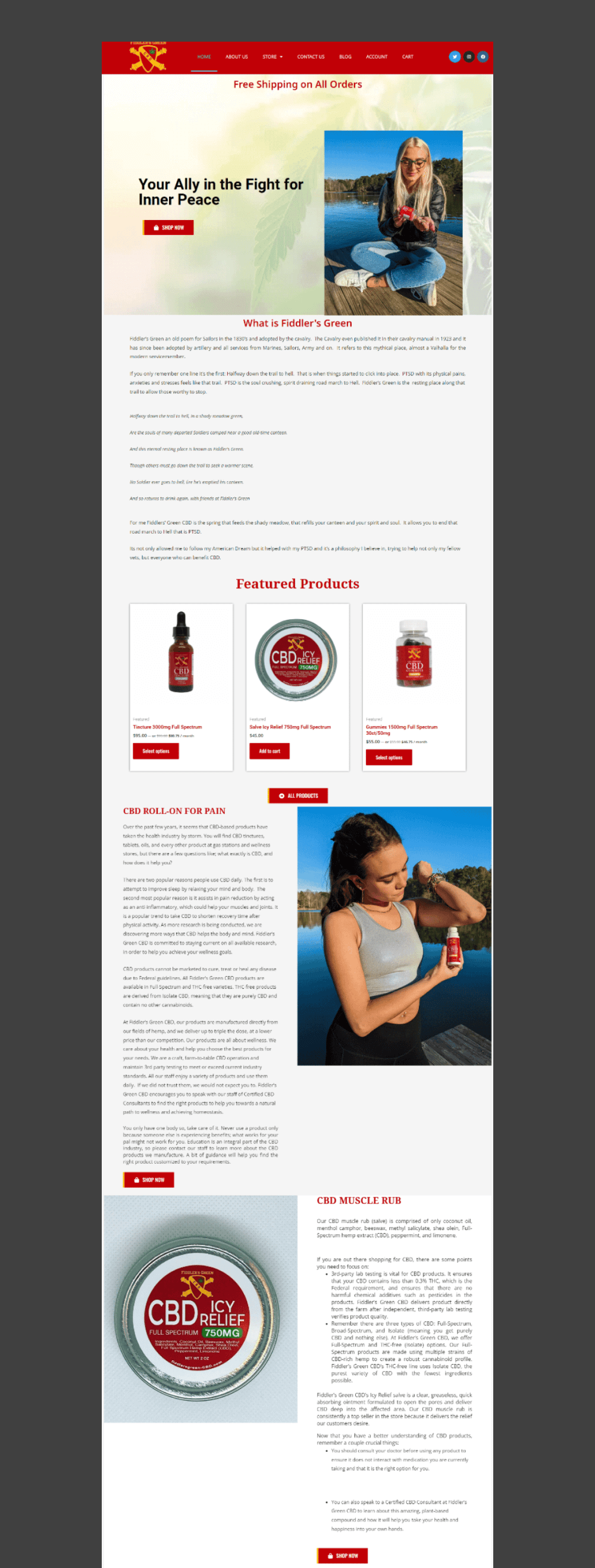
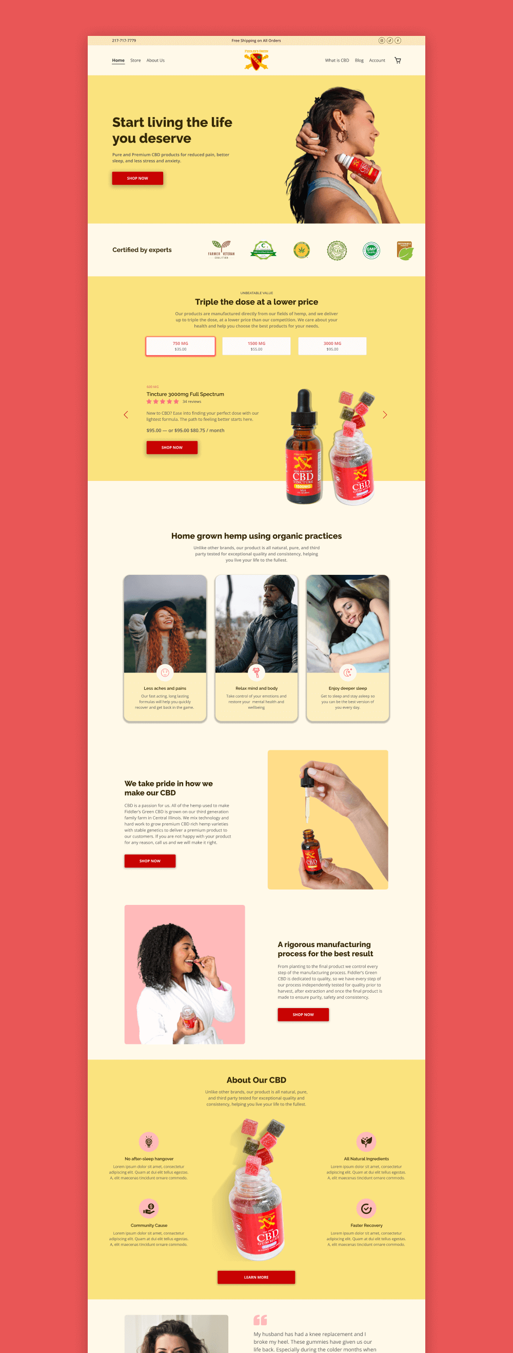
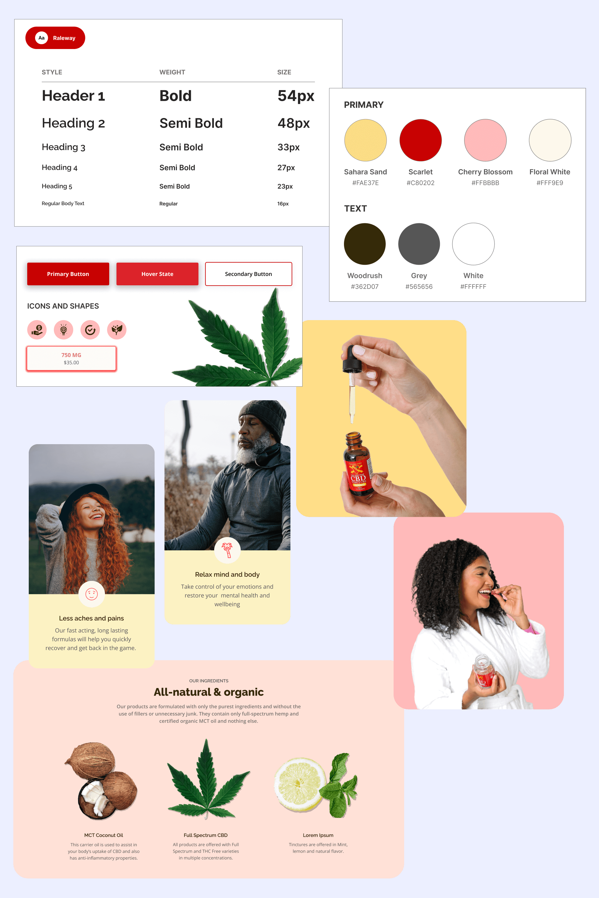
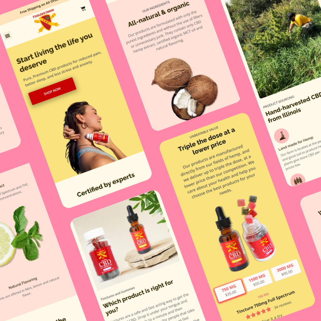
Fiddler’s Green CBD sells premium products, and they needed a premium website to match. To do this, we redesigned the website, utilizing a beautiful marigold yellow to elicit emotions of joy, happiness, and premium products. We complemented this with the brand color scarlet red for the call-to-action buttons to encourage users to take prompt action, helping conversions. The branding and colors work seamlessly with the website copy and imagery.
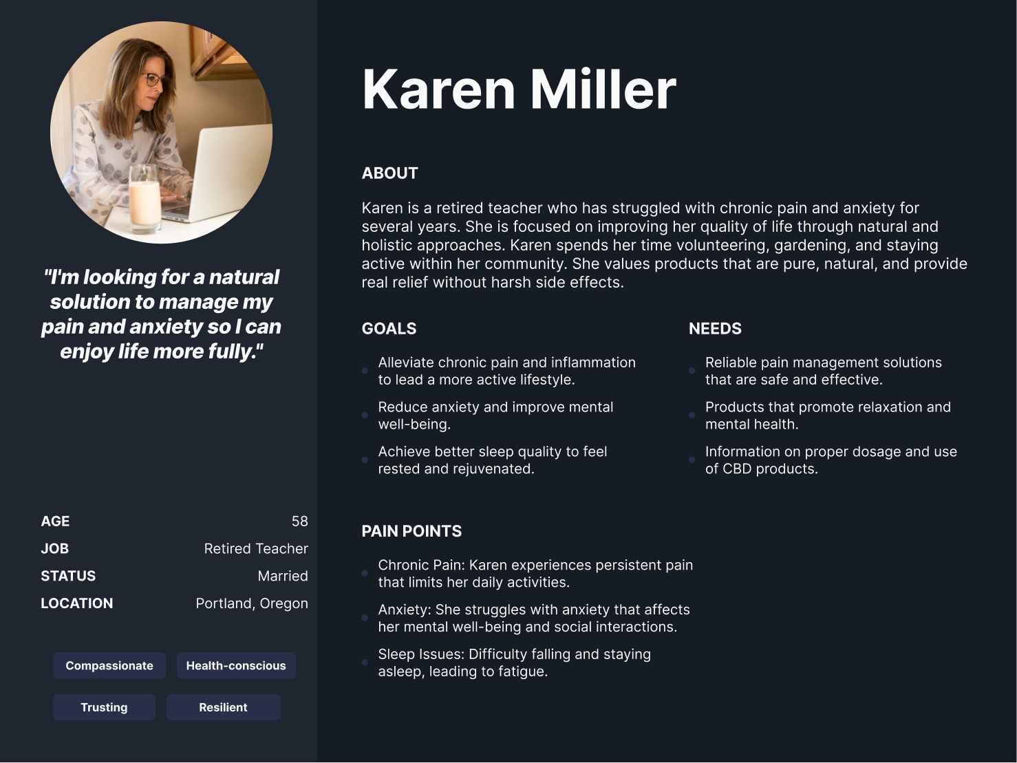
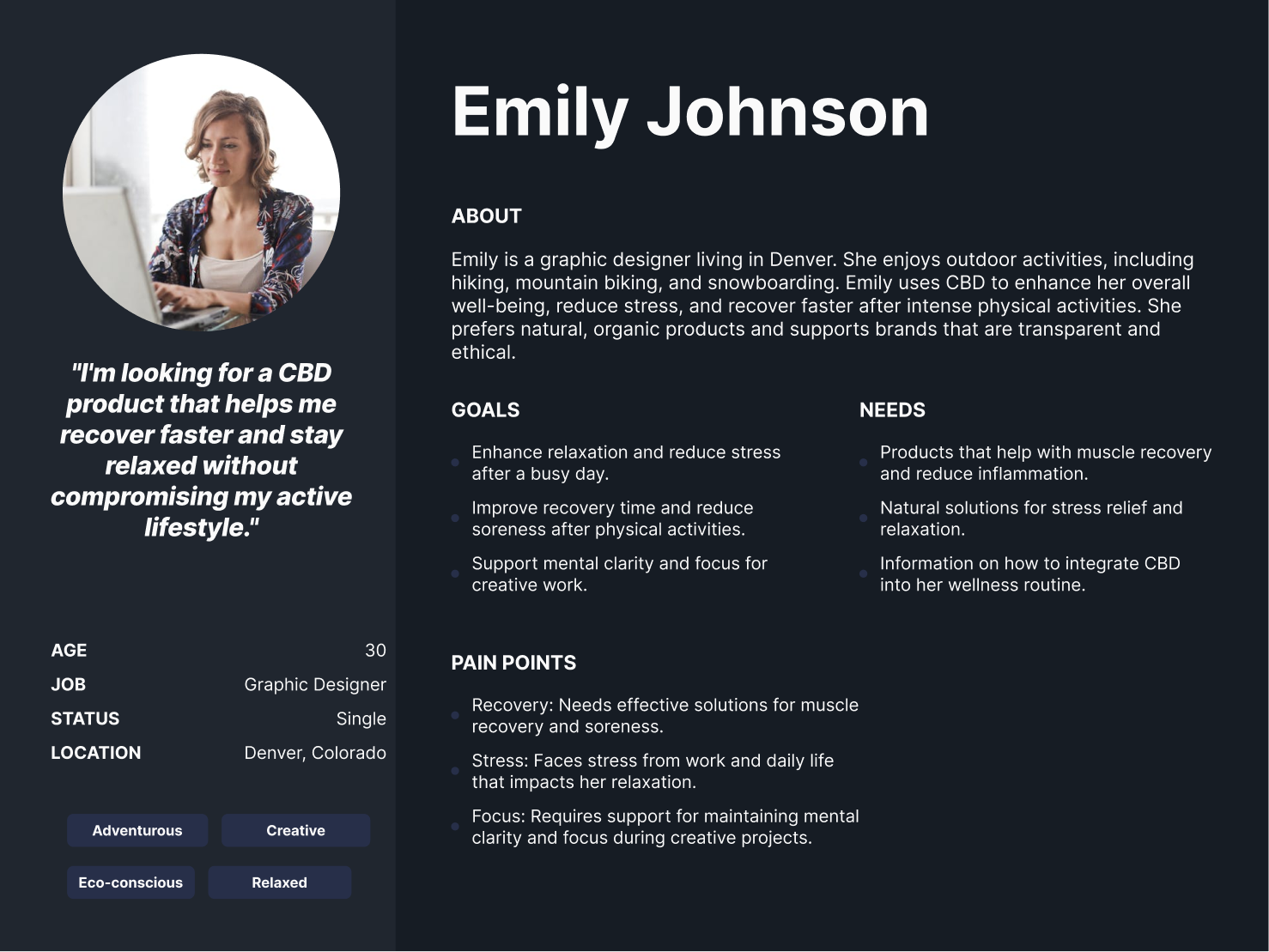
Fiddler’s Green had two distinct user segments, which consisted of those who wanted recreational cannabis for a good time with friends/family. On the other hand, the majority of its customers were older and needed cannabis for pain management with issues they were dealing with. The revamped website had to uniquely combine and cater to both of these audiences while still effectively communicating the core value proposition of Fiddler’s Green CBD. We discovered through multiple discovery sessions that Fiddler’s Green wanted to help people live the life they deserve, so we made that our motto throughout the site.
Prior to the redesign, Fiddler’s Green had a separate product for each strength variation of their CBD tinctures. For example, they had three separate products for tinctures, which included 750 mg, 1500 mg, and 3000 mg. We discovered that users found this frustrating and not intuitive. We combined any products with different strength amounts into one single product, which is shown on the left. Users can then select their desired strength and flavor through the radio buttons, which is much more intuitive.
During our strategy consultation with Fiddler’s Green, we discovered that their best selling product was their Tinctures which came in 3 different strengths. Similarly, we determined that one of Fiddler’s main value propositions is that they are able to offer triple the dose than competitors at a much lower price. We decided to combine these two aspects perfectly into a product slider on the homepage. The title reads “Triple the dose at a lower price” while users can physically switch through the various strengths and see the respective value prices in action.
Statistics and research show that animation and motion, when done correctly, can help significantly increase user engagement, comprehension, and ultimately lead to conversions. For these card designs on the left, we added animated icons to complement the copy which focused on benefits that users can receive such as better sleep, less aches and pains, etc. We noticed an increase in the scroll rate (how far people scroll down a page) and a decrease in the bounce rate from small changes like these.
One of the most notable changes we made to the store page was adding product variants. Prior to the redesign, Fiddler’s Green had a separate product for each strength variation of their CBD tinctures. For example, they had three separate products for tinctures, which included 750 mg, 1500 mg, and 3000 mg. Our research and competitive analysis showed that users found this frustrating and not intuitive. We combined any products with different strength amounts into one single product. Users can then select their desired strength and flavor through the radio buttons, which is much more intuitive. We revamped this page by adding several sections highlighting the benefits of Fiddler’s CBD products, as well as social proof through testimonials to encourage users to trust the brand and ultimately make a purchase.
The about page provides more information about Fiddler’s story and its mission to craft premium, high-quality CBD products. We featured several sections talking about their entire process, going from hand-harvesting CBD straight from Illinois, managing the entire process from start to finish, and then conducting product tests for the utmost quality. We also showcased their premium ingredients through beautiful photography and some initiatives they are taking to give back to the veteran community.
Ensuring the mobile experience was as good as the desktop for the Fiddler’s Green website was essential. As an ecommerce DTC brand, platform, the expectation is high when it comes to user experience on any device. With an abundance of graphic elements, we had to make certain everything aligned properly and the flow was uninterrupted on screens of all sizes.