Golden Leads combines a simple UI with the latest in AI and real-time data to get you up-to-date prospecting information for outbound sales. We evaluated the site from top to bottom by performing heatmap analysis, heuristic audits, and data-driven web design to substantially increase lead volume.
Golden Leads had managed to scale their company primarily through cold outreach. However, they were struggling when it came to generating more sign-ups through the website, despite getting a decent amount of traffic. We sat down with the leadership team to understand the various audience segments, the current state of the site, and where we could best optimize things for conversions.
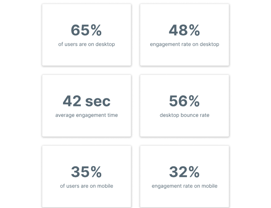
In order to better understand how users interact with the website, we compiled an overview of the main KPIs that helped drive all of our decisions for the redesign. Some high-level insights included the fact that the majority of traffic was from desktop, representing 65% of users. The average engagement time on the website was satisfactory and slightly below the industry benchmark of 52 seconds. The bounce rate was pretty high at 56%, and they had a low engagement rate.
Our team analyzed hundreds of user recordings on the old website to identify usability issues as well as areas of opportunity. Some of the patterns observed included multiple dead clicks on elements that appeared clickable but were in fact not, having to constantly scroll up to access the navigation menu even though it was a 1-page site (each menu item scrolled you down), large blocks of content that users completely skimmed by, etc.
As with all websites we do, the first several weeks of our engagement were purely dedicated to a deep dive data audit. We set up a series of heatmaps, scrollmaps, and clickmaps on high-traffic pages to determine areas of opportunity to increase conversions.
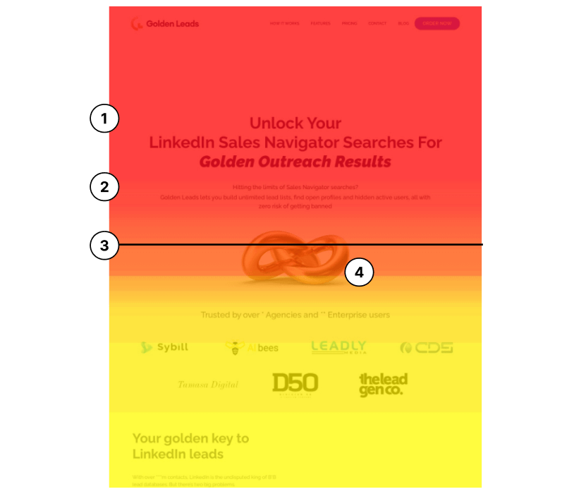
1) The headline was unclear as to who Golden Leads is, what they do, and what’s in it for me. The headline used jargon related to the brand, such as “Golden outreach results,” which was vague. Always aim for clarity.
2) The original subheader explained the core value proposition of Golden Leads and the pain points their ICP faces. However, there was no CTA button immediately present within the main hero section to capitalize on users interested in learning more and wanting to take action. Despite the CTA being on the top-right, the average attention span of users is extremely low. You need multiple CTAs to incentivize users to take action.
3) There is no way of immediately reducing FUDs (fear, uncertainty, doubts) or social proof to build instant trust to motivate users to further engage with the website.
4) Illustrations were great for branding elements but added no value to complement the core value prop.
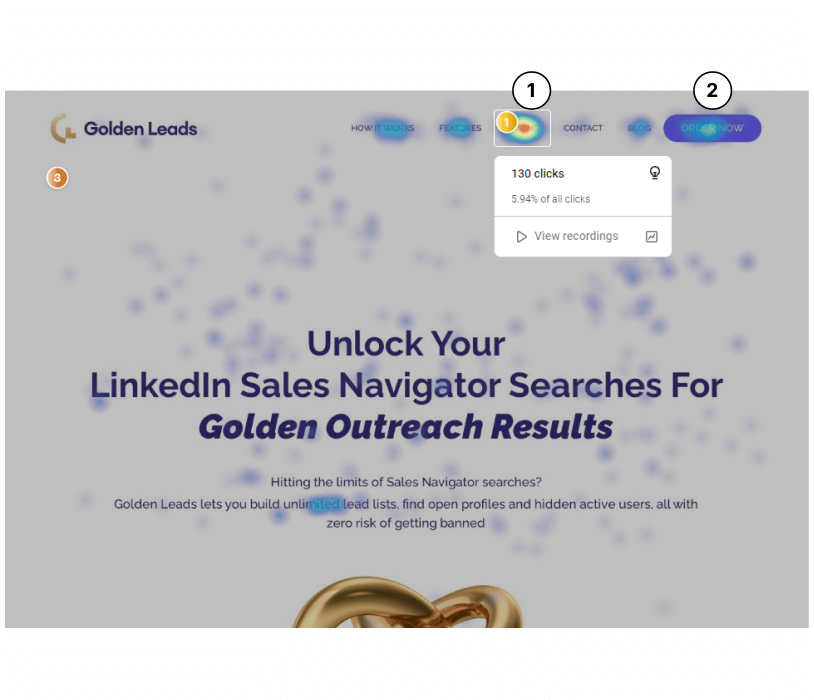
1) 5.94% of users clicked straight onto pricing from the top upon
landing on the website without having any other context of the
value proposition outside of the header. A potential issue and
conversion blocker was that upon users clicking on one of the items
and getting taken down to a section of the page, they had to
scroll all the way back up just to get to another section. This was
demonstrated in several user recordings.
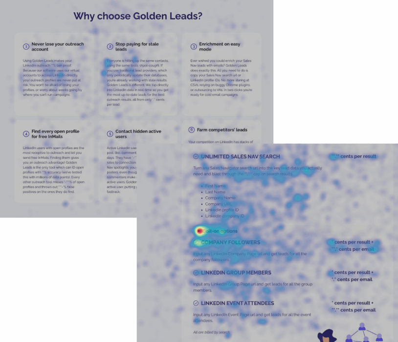
1) In the screenshots, these are click maps that represent areas where users clicked on the website. There was a substantial amount of movement and clicks on several key sections of the website. Specifically, the “Why choose golden leads” section and the “pricing” section. However, there were no CTA buttons to capture this intent or help the user convert during the journey. Users had to scroll all the way back up to the top just to convert, which was not an intuitive experience.
1) Multiple recordings of users clicking on pricing tiers several times to no avail. There was no way for them to select a specific plan or payment type until they actually got to the onboarding and order forms.
2) Heatmaps indicated a lot of clicks and movement around the pricing area. The assumption was that people were trying to purchase specific plans or tiers, but they were not able to do so without scrolling all the way back up to the very top with the only single “order now” button. The majority of people were bouncing due to low attention spans, as demonstrated in the recordings of users exiting the site shortly after not being able to click on any of the pricing tiers.
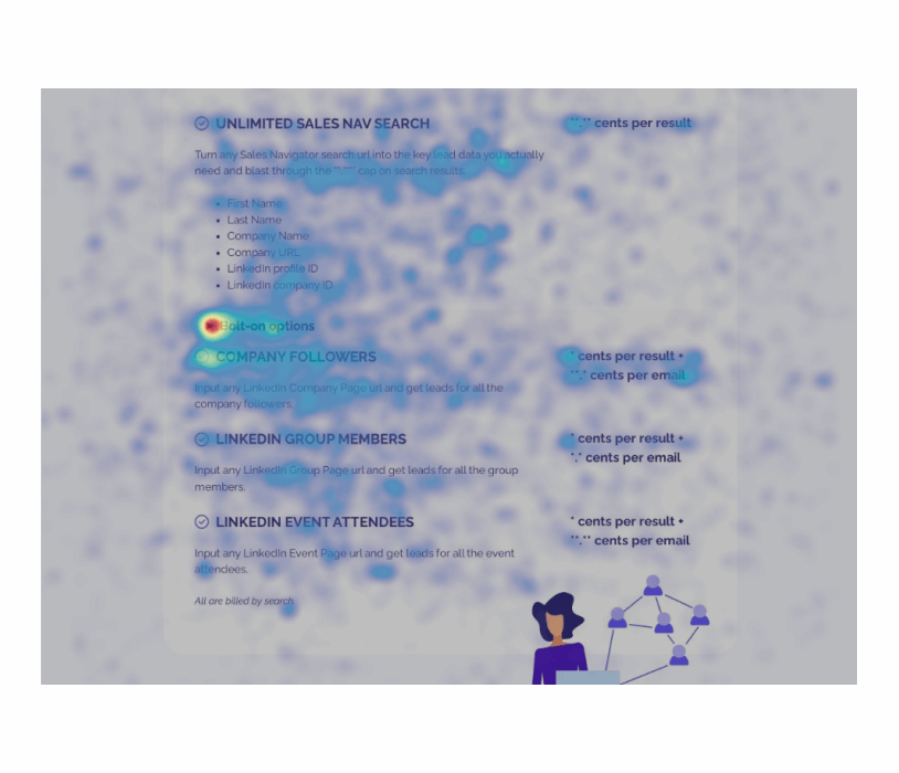
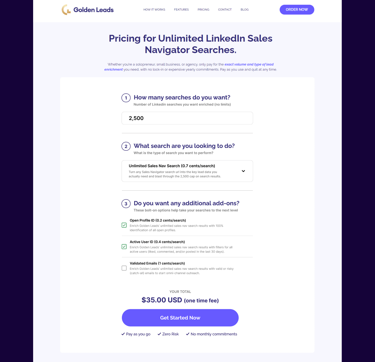
3) Bolt-on options get a large percentage of clicks. The pricing area is quite busy and crowded; there is an opportunity to simplify the experience.
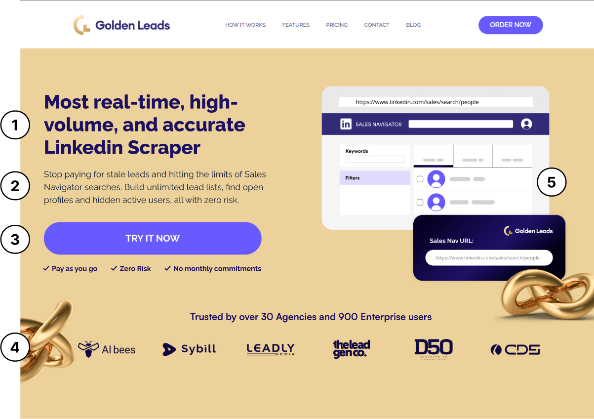
1) Headline avoids using industry jargon and instead opts for clarity with the most compelling USPs of Golden Leads being real-time and accurate data combined with high-volume. Headline now
clearly explaine “who you are” and the core value prop.
2) Sub header builds upon existing copy by adding further emotional pain (stop paying for stale leads) followed by the solution and offer
3) CTA encourages action by using the word “Try” which is less intimidating for users. This is especially important given the context of how long the order process is. This CTA also helps to reduce the number of drop-offs. Microcopy is utilized effectively to reduce any fear or uncertainty users may have.
4) Social proof of logos added within the visible fold of the website to build immediate trust with users upon landing. Photo of golden leads knot used strategically to point towards the CTA -> used as a visual cueing technique to direct a user’s attention to a desired action.
5) A picture is worth a thousand words. Similar to competitor websites, introducing a relevant picture of the software can help users visualize what they are signing up for and can expect.
Instead of the busy and crowded pricing section that Golden Leads had previously on the old site, we created a super optimized flow that allowed users to follow a step by step process. This was proven through data to be more efficient and simpler.
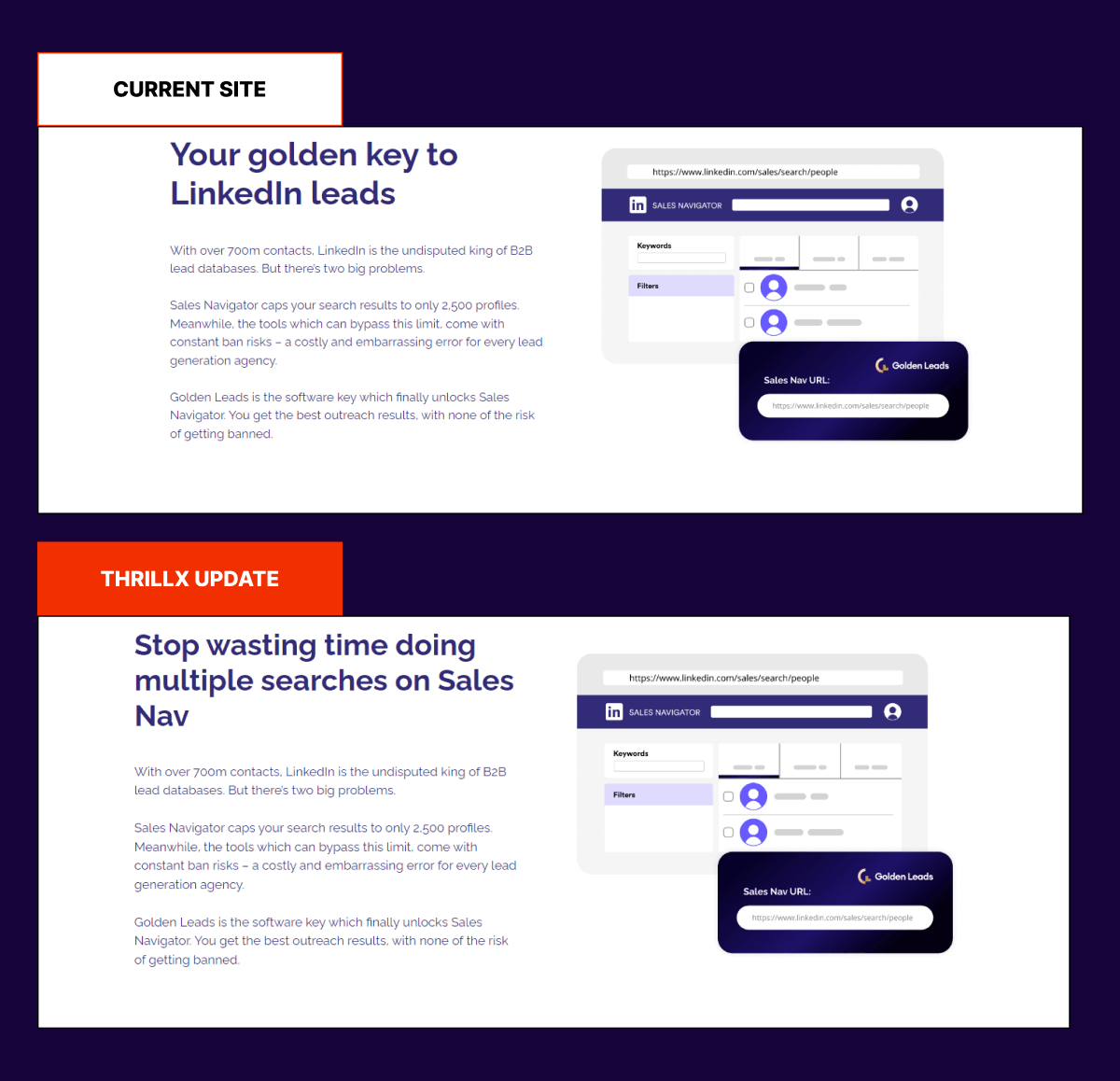
“Your Golden Key” falls into the trap of using jargon that is confusing and vague. To err on the side of clarity, we implemented a pain point and solution-oriented headline. The pain point is the amount of time that is wasted doing multiple searches on Sales Navigation just to get a lead list where time to market and speed are of the essence. Several other messaging enhancements were done throughout the website in conjunction with this one.
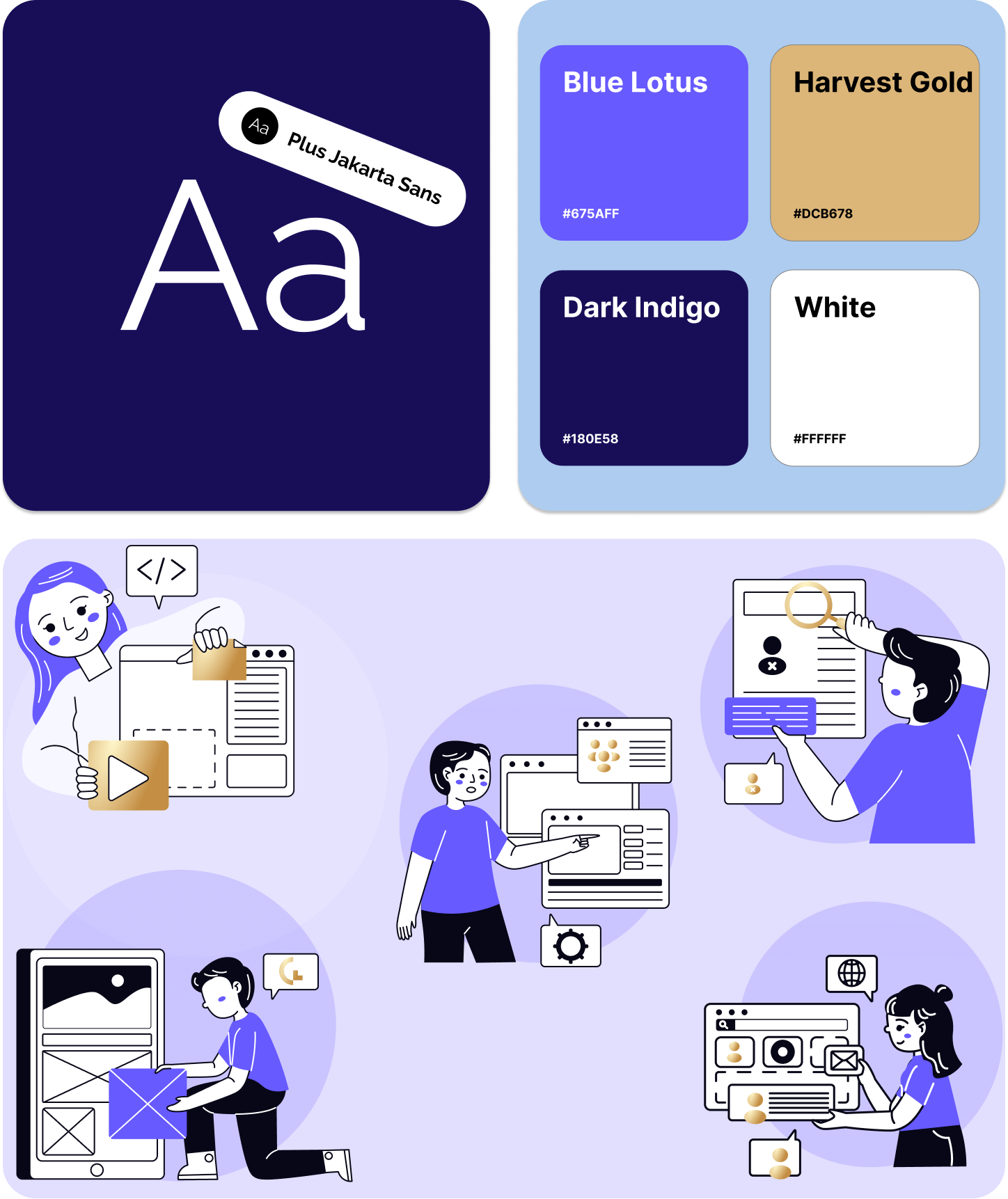
Golden Leads wanted to convey a feeling of safety and trust throughout their website. They also wanted to balance this with a hint of creativity and uniqueness to stand out in a crowded market of “boring” players. We opted for a light purple design combined with darker tones for that professional look and feel. We also featured custom graphics and illustrations to add an extra level of personality.
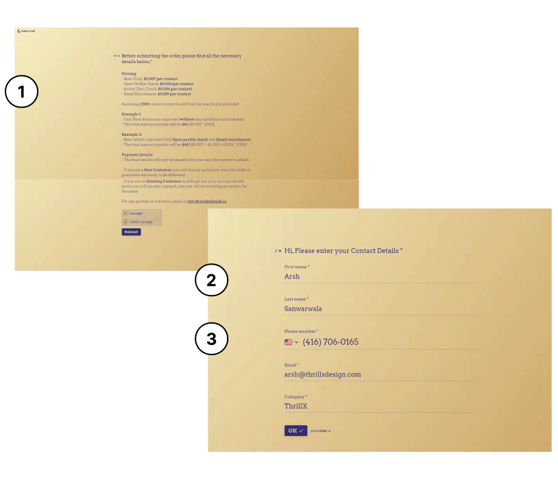
1) The payment details experience was very overwhelming and
confusing at first glance. We looked at ways to simplify the
buying experience for prospects through designated onboarding
forms based on the specific tiers they chose.
2) The fewer form fields you have, the better. HubSpot found by conducting a study that conversion rates increased by almost 50% when reducing the # of form fields from 4 to 3. A lowhanging fruit to simplify the sign-up experience and reduce the # of form fields was combining first name and last name into one form field that reads ‘Full Name’.
3) After consulting with the Golden Leads leadership team, we discovered that the phone number wasn’t absolutely necessary to collect in the sign-up procedure and could be removed. This was hurting conversions substantially before and is statistically proven to do so.
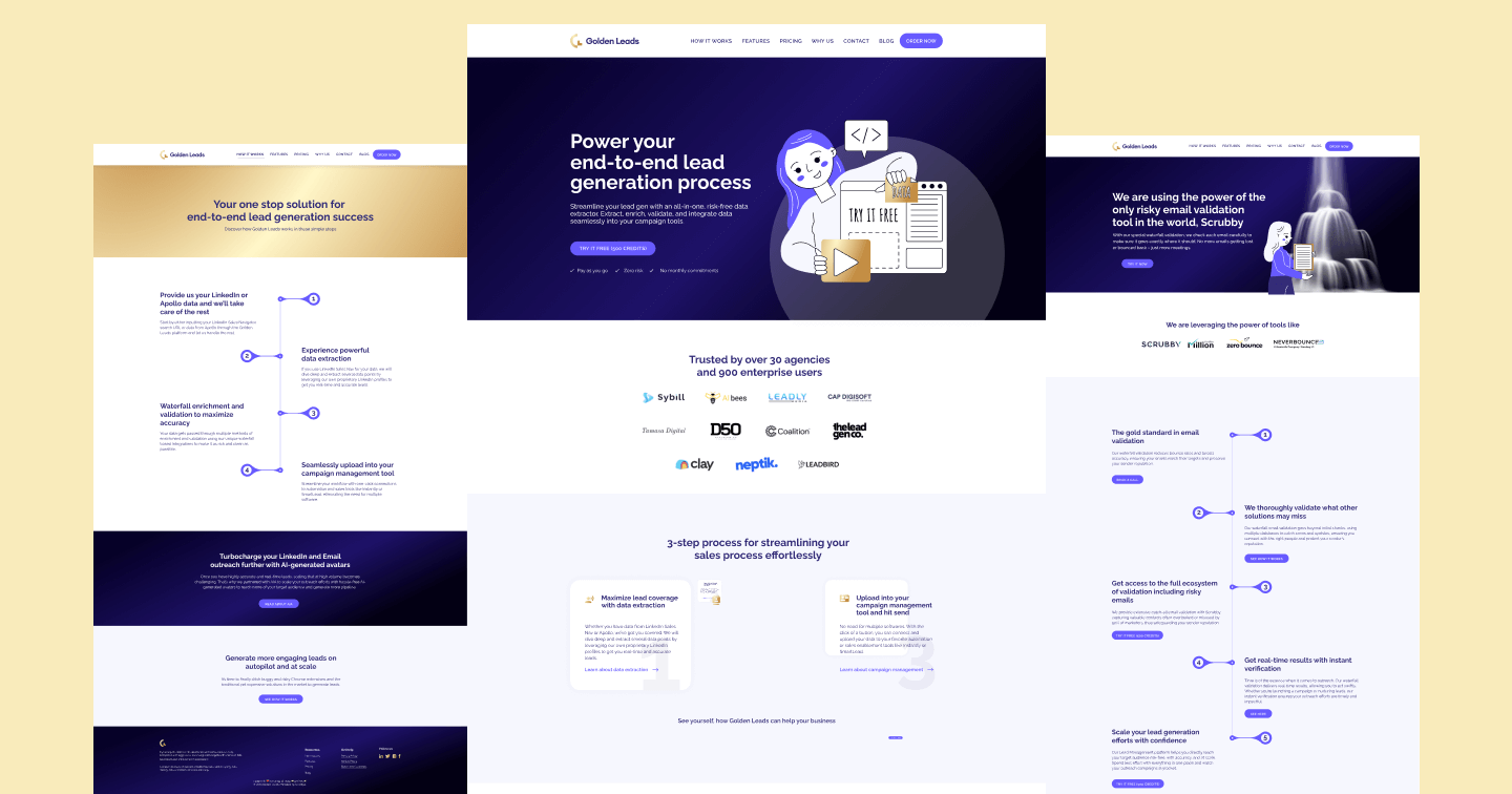
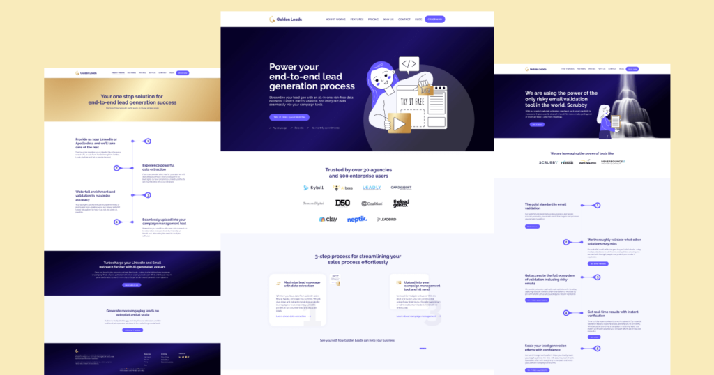
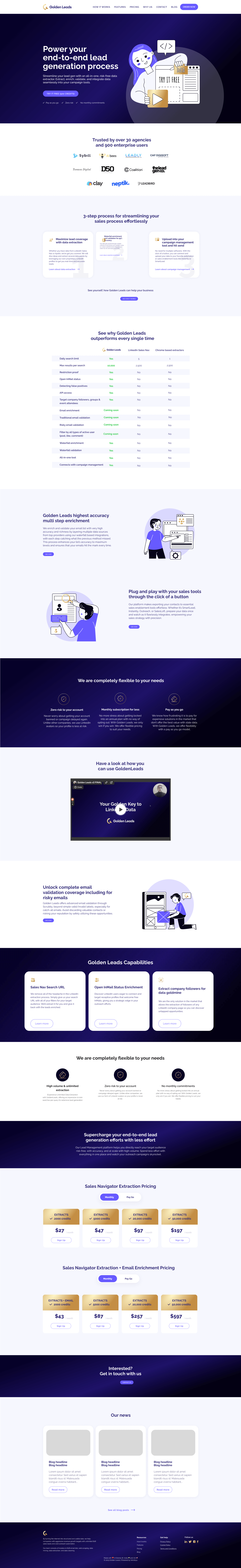
The revamped homepage featured interactive and stunning graphics, followed by extremely benefit-driven value-proposal sections to motivate people to sign up. From top to bottom, everything was strategically organized and thought out in alignment with the core user journey.
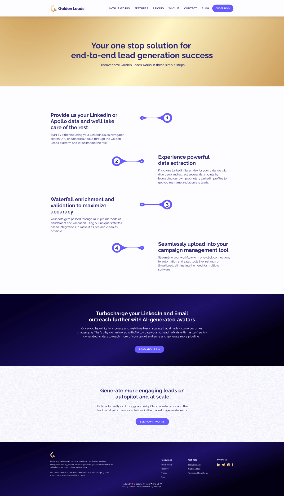
The how it works page focused on telling users a story of how they can get from point A to point B.
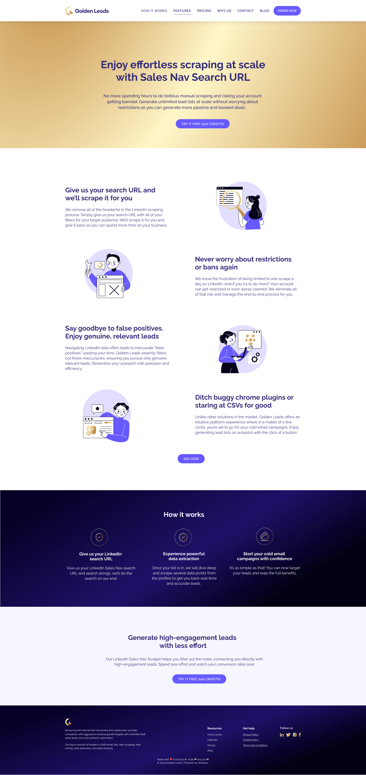
We created hyper-CRO and SEO-optimized landing pages for each of Golden Lead’s core features. Each page featured benefit- and pain-point-driven copywriting, stunning graphics and illustrations to amplify conversions, and a strategically thought-out design.
Golden Leads slowly went from purely relying on cold outbound to gradually building a thought leadership hub in-house on their website and SEO-optimized pages that brought them substantial traffic, leads, and revenue.