Inboxy approached us in need of a UX/UI design and Conversion Rate Optimization audit. Using HotJar and Google Analytics, we were able to identify key areas of improvement and conversion blockers by analyzing heatmaps, and session recordings, and gathering qualitative feedback from users. Through SEO and CRO, we increased sign-ups by 89% and traffic by 258%
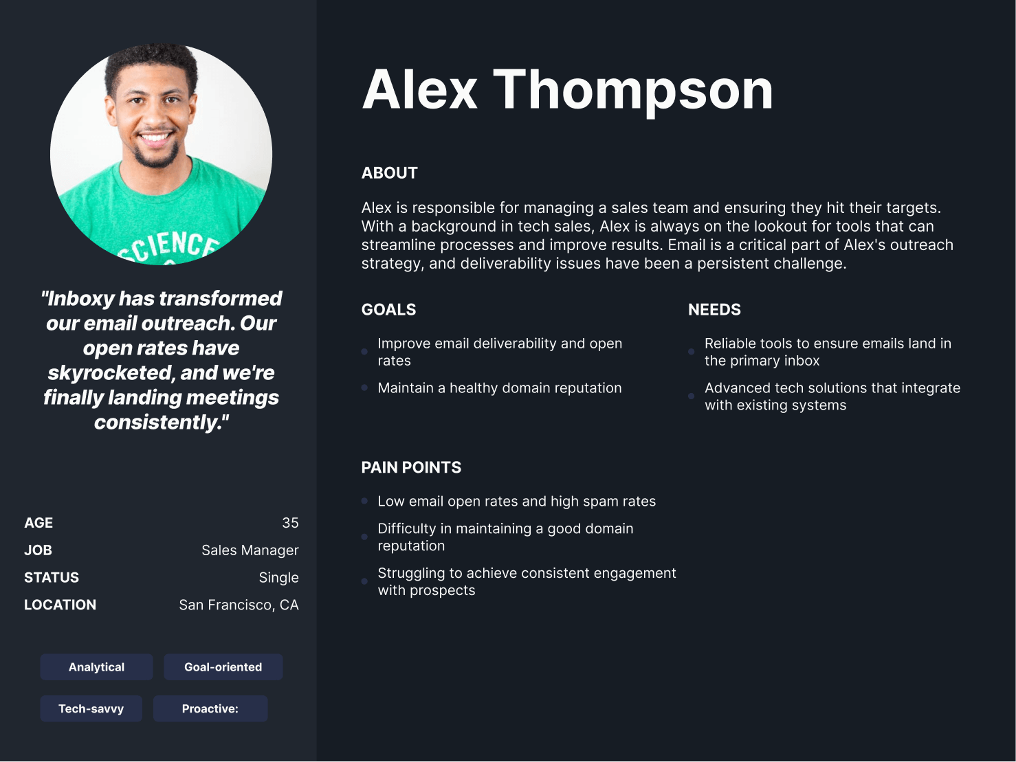
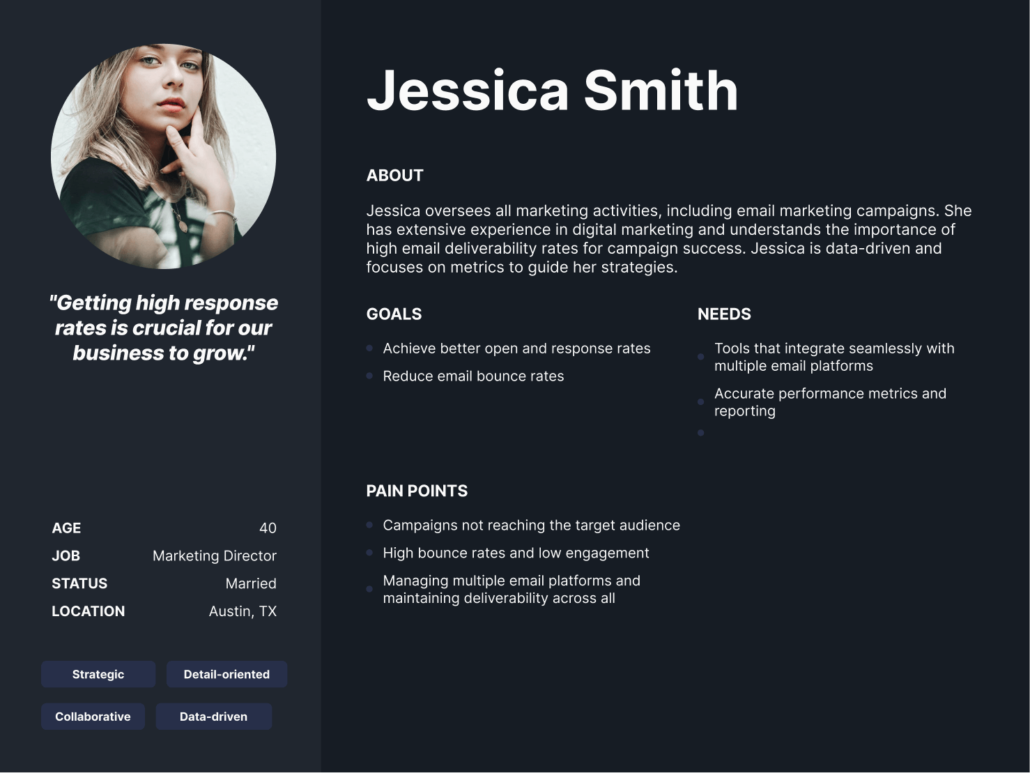
Inboxy serves multiple complex demographics and customer segments ranging from small businesses, large enterprises, and lead gen agencies looking for solutions for their clients. Each of these audiences had their own unique dynamics in terms of goals, motivations, and pain points. We conducted multiple stakeholder interviews and discovery sessions to understand these customer segments inside and out and to ultimately ensure the final site reflected these perspectives.
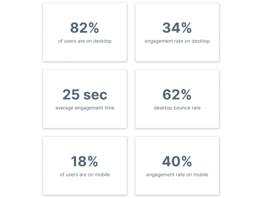
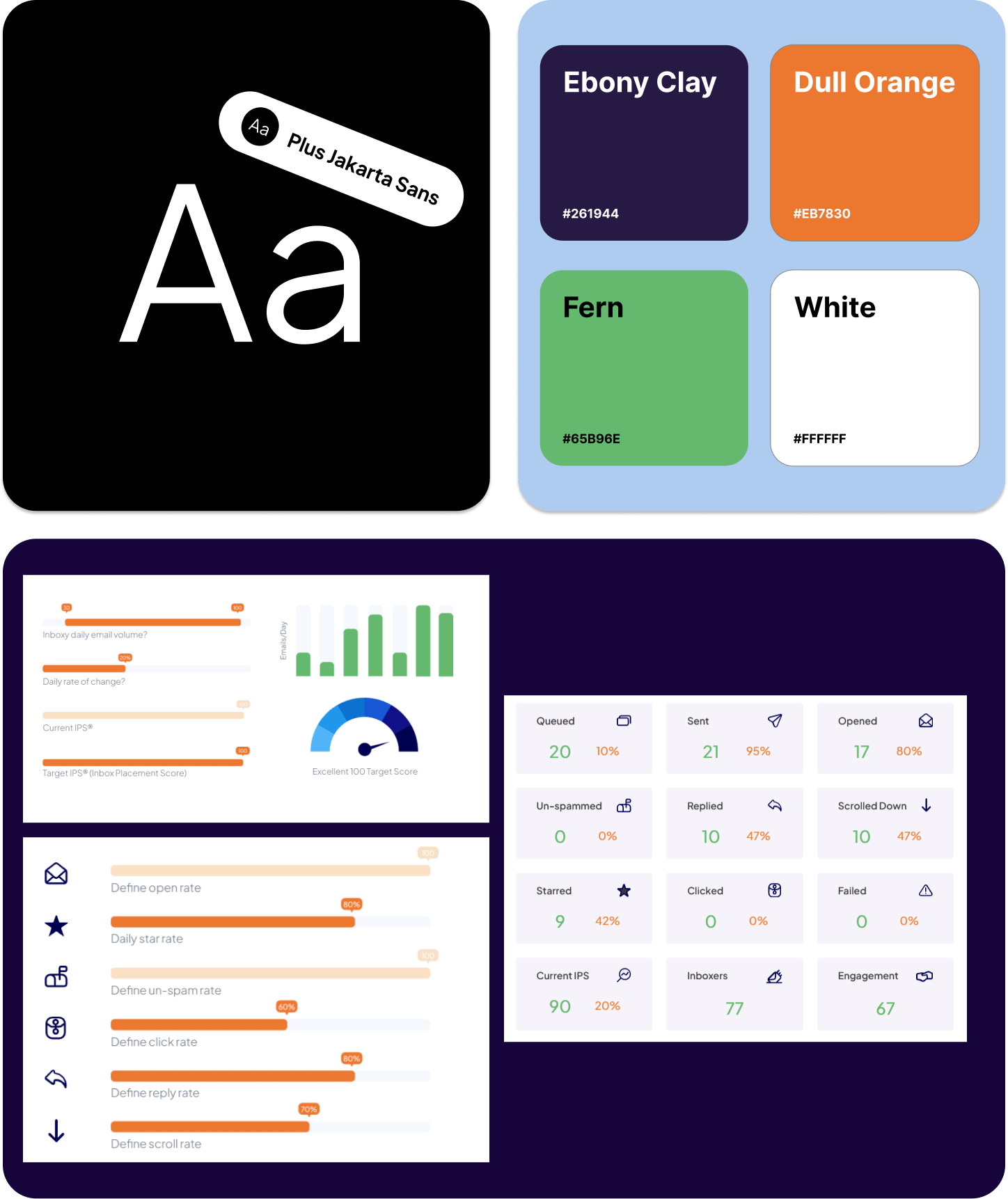
In order to better understand how users interact with the website, we compiled an overview of the main KPIs that helped drive all of our decisions for the redesign. Some high-level insights included the fact that the majority of traffic was from desktop representing 82% of users. The average engagement time on the website was less than half the industry average of 52 seconds. There was a huge opportunity to keep people on the page longer and convert.
Our team analyzed hundreds of user recordings on the old website to identify usability issues as well as areas of opportunity. Some of the patterns observed included people having to constantly scroll up to access the navigation menu even though it was a 1-page site (each menu item scrolled you down), large blocks of content that users completely skimmed by, etc.
The first several weeks of our engagement were purely dedicated to a deep-dive data audit. We set up a series of heatmaps, scrollmaps, and clickmaps on high-traffic pages to determine areas of opportunity to increase conversions.
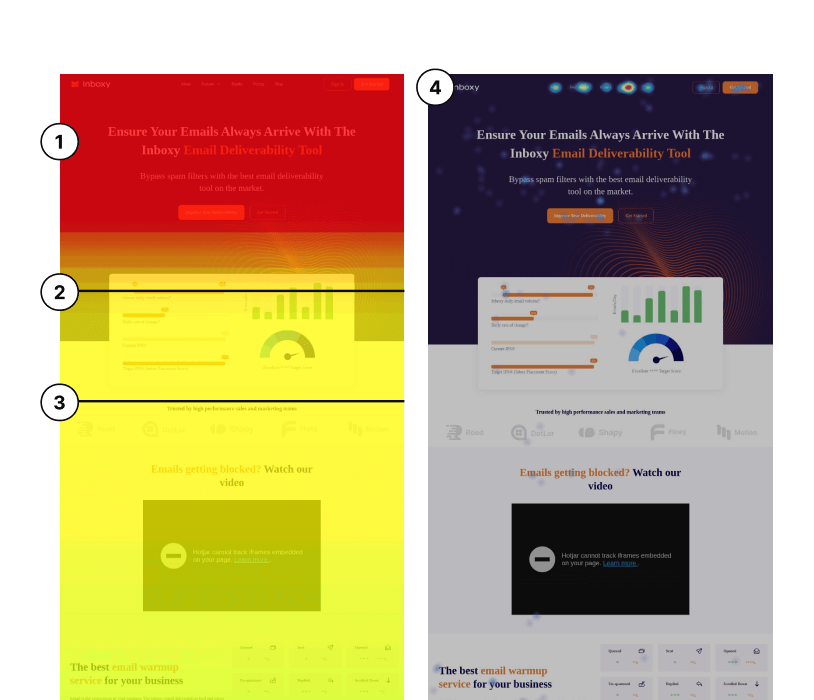
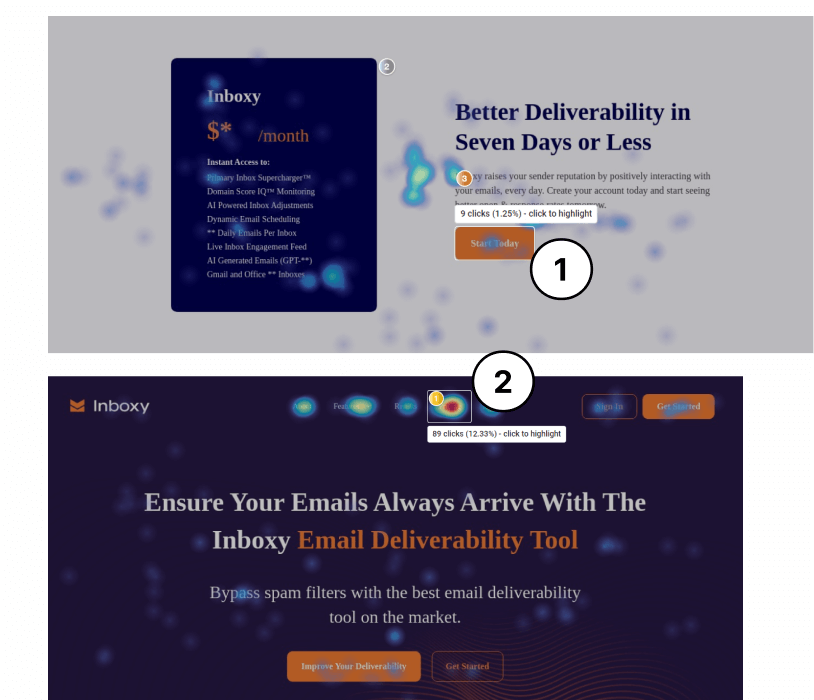
1) The original headline explained who Inboxy was and what they do. explains who you are and what you do. The part that was missing was ‘what’s in it for me’ and what the core value proposition and competitive advantage of Inboxy.io were. Users needed to know what made Inboxy the “best email deliverability tool on the market” and how it allows users to ensure “their emails always arrive.”.
2) Only 85% of people scrolled this far on the page. There was a lot of empty real estate on the page that was not being used between the title and photo. There was a huge opportunity to tighten up spacing, introduce social proof, and reduce fear, uncertainty, and doubt.
3) Only 75% of people scrolled this far on the page (25% drop-off). The key question was: how do we motivate people to further scroll down the page and hold their attention a little bit longer?
4) The “Pricing” tab had a 12.33% clickthrough rate compared to other key CTAs, which hovered between 1-3%. The key question was: how do we encourage more clickthroughs on the primary CTA buttons?
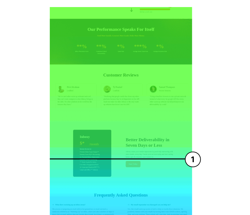
1) Only 50% of people were reaching the pricing section on the website (50% of users dropped off). However, pricing was the most clicked element on the top navigation, leading to a disconnect in which the conclusion was that the content above the pricing was not valuable enough to incentivize scrolling through.
1) The ‘Get Started’ button near the pricing section only had a 1.25% click rate, which had massive room for improvement. The pricing purple box on the left in comparison was grabbing more attention, as indicated through heatmaps (combined click rate of roughly 5%) and user recordings.
2) The “Pricing” tab had a 12.33% clickthrough rate compared to other key CTAs, which hovered between 1-3%. We knew people wanted to get straight to the pricing page. The question was: how do we incentivize more people to take action once they visit it with a comprehensive experience?
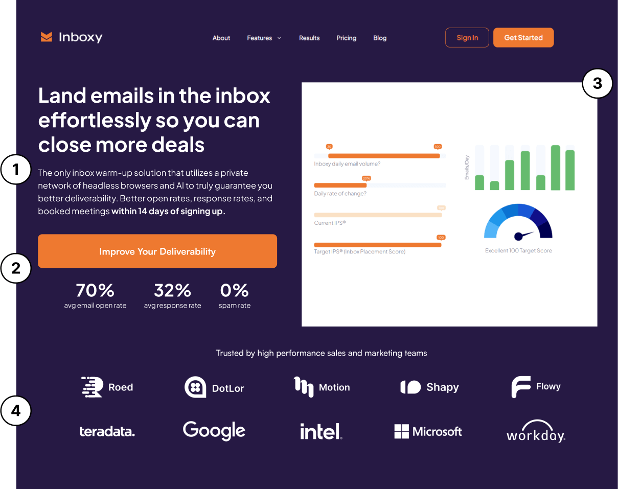
1) Headline now conveys the key benefit that users gain which is that they can focus on closing more deals as a result of landing more emails in the inbox. Subheading focuses on core value proposition of Inboxy.io while also having an extremely compelling offer.
2) CTA is now focused on one clear action which is to sign up for an account. Highlight stats above the fold near the critical action points such as 0% spam rate to drive action to increase clickthroughs.
3) Eliminated empty space before and move image right next to core messaging to further reinforce value proposition. This trend is common with competitors such as MailReach and Folderly.
4) Social proof of logos is within visible view upon first landing on the website, building immediate trust with users and motivating them to further engage and interact with your website.
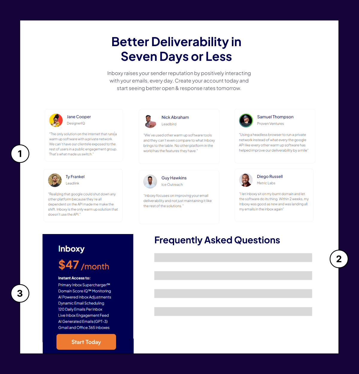
1) Since we know that a large chunk of users skip straight through to pricing, we want to give them some contextual value that they can digest before presenting them with the final number. Inboxy doesn’t compete on price, and that is the biggest objection. Therefore, by introducing customer reviews earlier in the journey, it sets up users to have a healthier interaction with the price and is more likely to convert.
2) A key component of increasing conversions is to reduce FUDs (fear, uncertainty, and doubts). By moving the FAQ questions right next to the critical point of action (the pricing section), we can help reduce these FUDs at the point where users are most likely to experience them.
3) We made the pricing box clickable and introduced a CTA within the box experience itself to incentivize higher clickthroughs.
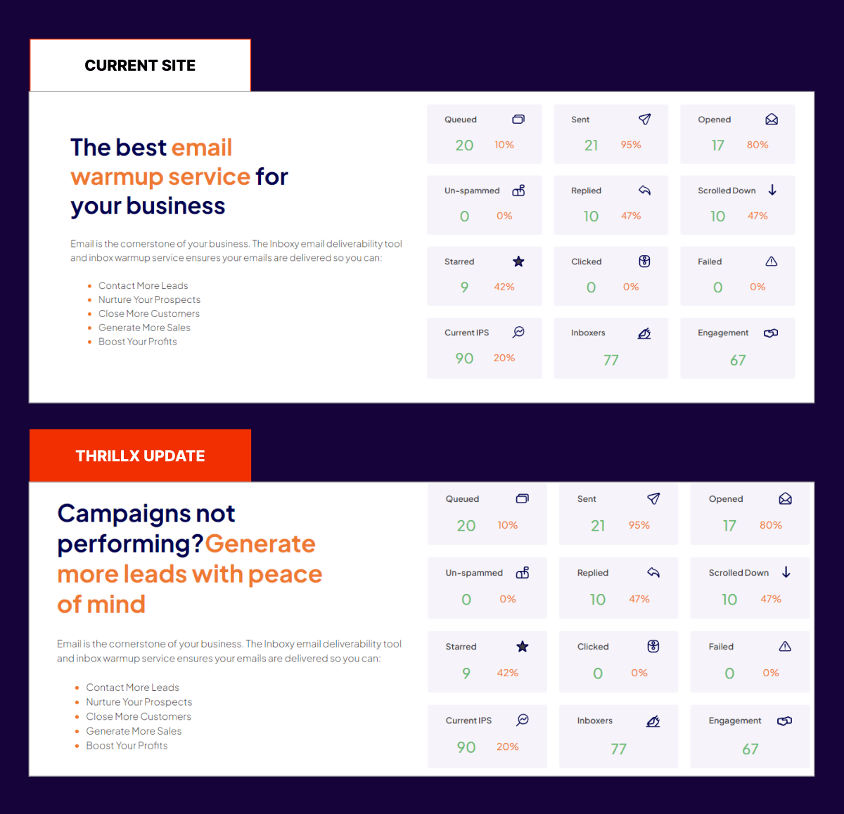
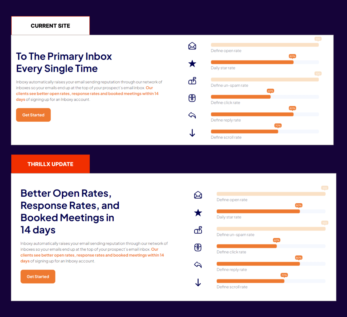
In the original version, ‘The best email warmup service for your business’ didn’t tell users what problem Inboxy solved for them or hit on their emotional side. Every other company also thinks that they are the best email warm-up service. Instead, we leveraged the contrast principle in the improved version and focused on highlighting the pain prospects commonly experience (poor campaign performance) and the solution Inboxy provided (generating more leads without the stress).
‘To the primary inbox every single time’ is a feature of Inboxy. What is the tangible benefit that users actually gain as a result of getting to the primary inbox every single time? That needed to be conveyed and highlighted in the main header, which is exactly what we did in the improved version below.
Inboxy was known to provide premium software services to its clients at affordable prices. They wanted the core brand value of innovation and creativity to be expressed throughout their site. We leveraged playful tones of orange and purple to help convey those emotions. We also hand-crafted custom illustrations and graphics on the website to add to this level of personality.
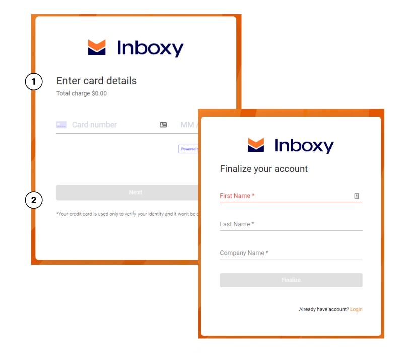
1) The old website asked people for credit card information as the first step before other personal information. This gives people the impression that the primary intention of signing up is to collect payment rather than provide a valuable service. Users are significantly less likely to give away credit card information as one of the first steps in creating an account. They are much more likely to give away less valuable information, such as their name, company name, etc. We quickly switched the two steps around.
2) Is credit card information absolutely required to be collected upfront prior to signing up? Upon users signing up, they were required to sign up for a subscription, despite the total charge showing as $0.00 during the sign-up flow. There was a disconnect that appeared confusing to users and caused them to lose trust in the company. We instead worked with Inboxy to change their offer and provide a free trial, making that more clear throughout the site.
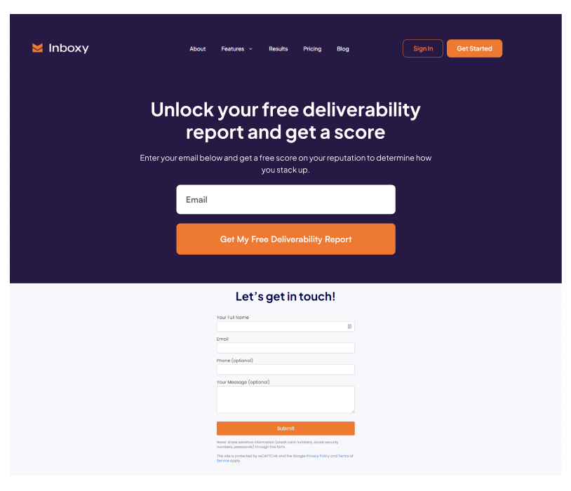
Not everyone is ready to sign up for a pricing plan, and that’s okay, as long as we capitalize on those users. We strategized with Inboxy to introduce one last opportunity to convert people by asking for their email and sending them a free deliverability report right above the contact form.
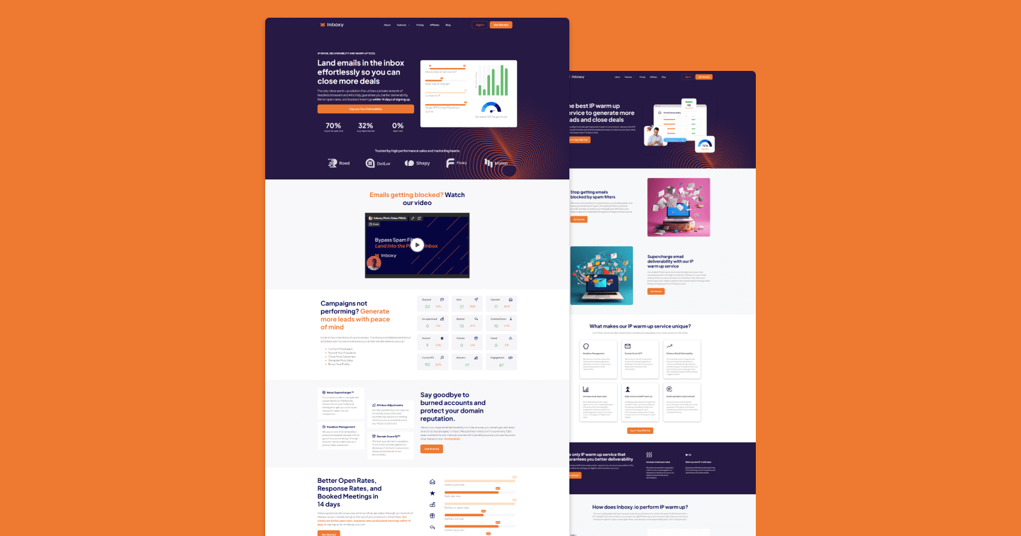
The revamped homepage started off with a bang with a super-optimized hero section. The value proposition of helping users “close more deals” resonated and drove substantial CTA clickthroughs. This was quickly followed by “stacking” of social proof at the top of the site through stats of performance and also logos of brands worked with to build instant credibility. Lastly, the image illustration helped visually convey what Inboxy does and reinforced the core value proposition of improving inbox scores.
As part of our redesign efforts, we also worked with Inboxy on crafting a tailored SEO strategy. As part of these efforts, we created multiple service-based SEO landing pages targeting keywords like “IP Warm Up Service” and “Email Warm Up Service,” which were direct words people searched on Google. We crafted an intuitive narrative on the page aligned with the core customer journey of helping people land their emails in the inbox and not land in the spam folder. We ranked this page on the 2nd page of Google in 2 weeks.
Inboxy slowly went from purely relying on cold outbound to gradually building a thought leadership hub in-house on their website and SEO optimized pages that brought them substantial traffic, leads, and revenue.