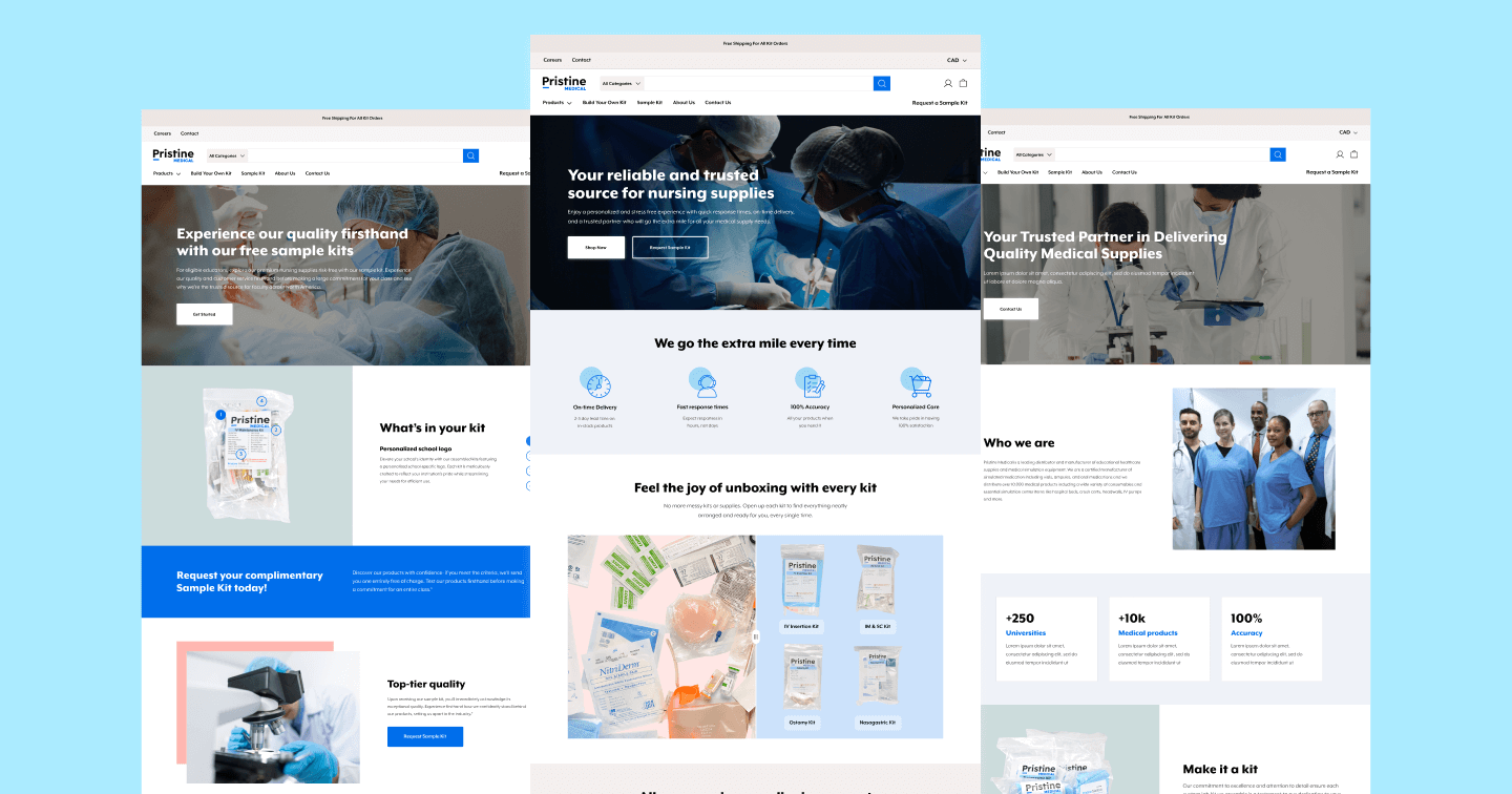
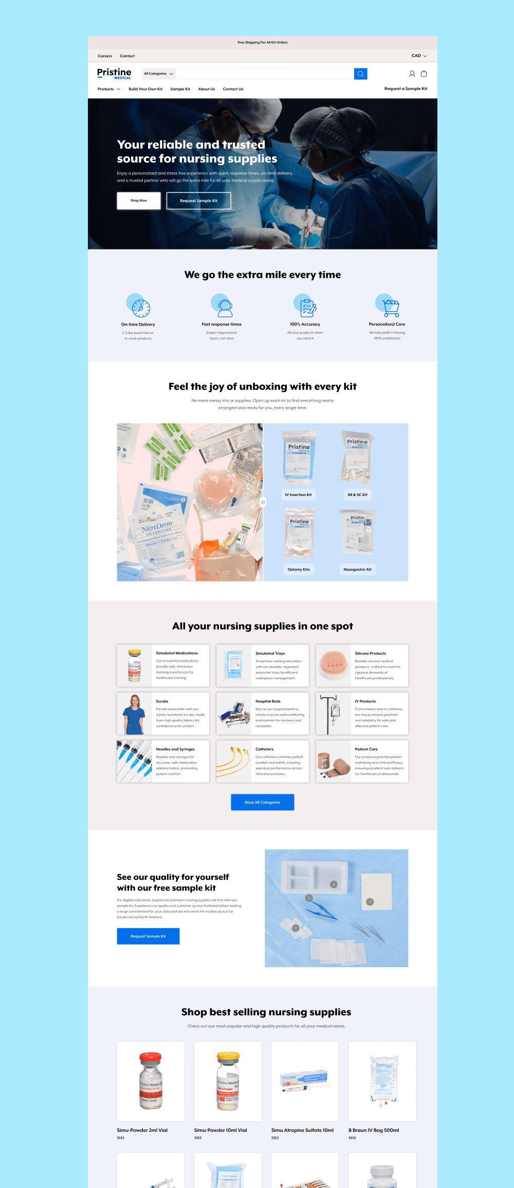
Pristine, offering over 3,000 medical products, sought a user-friendly website that could drive revenue independently from sales reps —a tough ask in their field. We did a full website revamp and helped them create a 24/7 salesperson that generated an immediate ROI.
Increase in organic traffic (ongoing)
Boost in Average Order Value
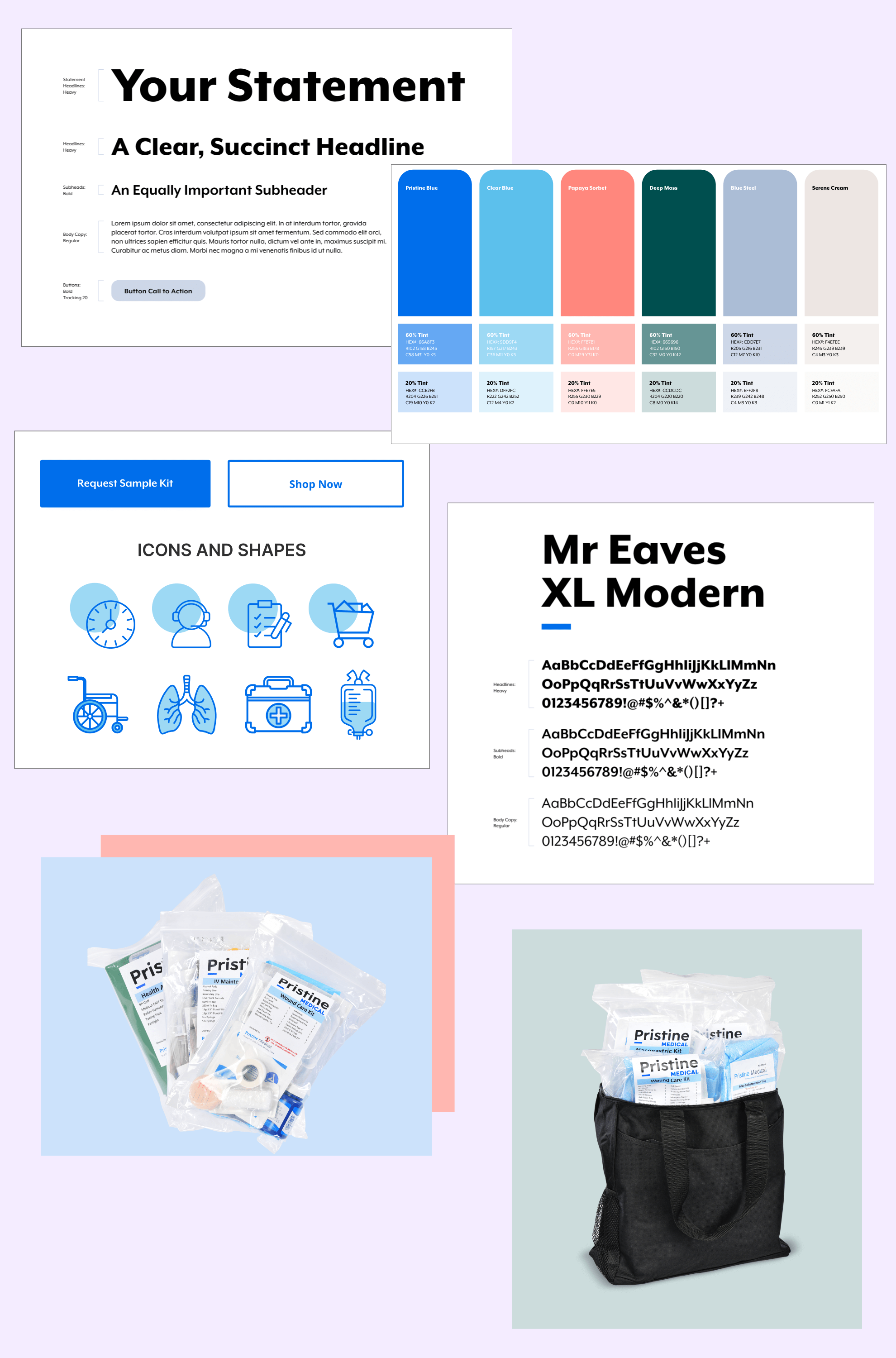
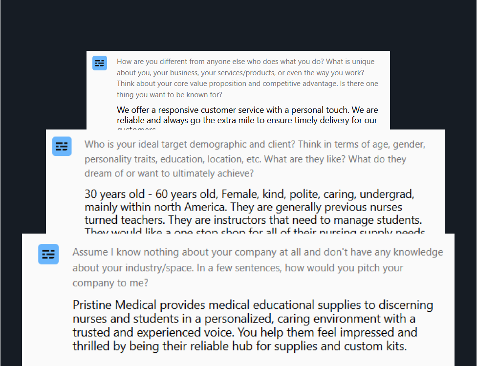
Pristine Medical provided us with a brand kit, which we then leveraged and experimented with to create the final brand identity for the website. This included custom icons, graphics, and illustrations throughout the website. The branding was aligned with Pristine’s mission of helping customers feel impressed and thrilled by being the reliable hub for supplies and custom kits. The tone of voice needed to be trusted and experienced in a personalized and caring environment.
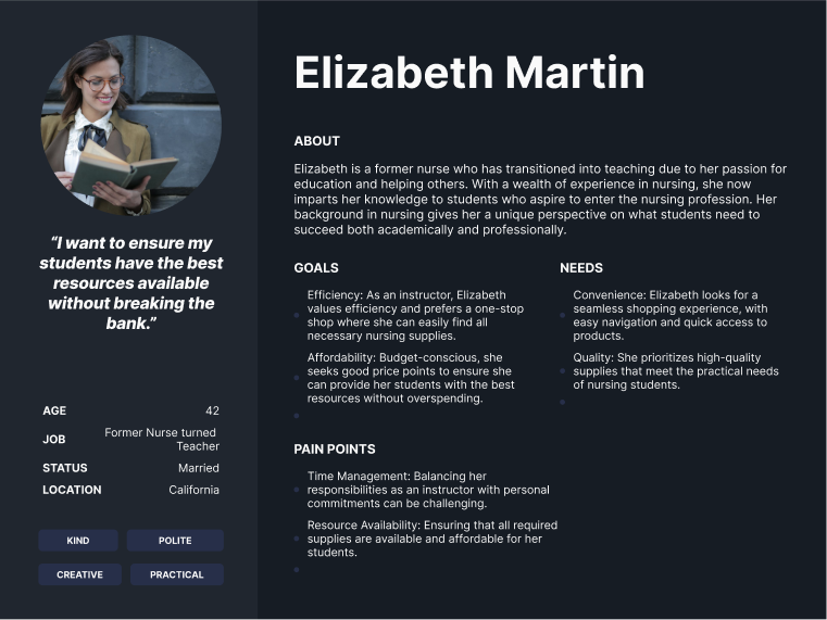
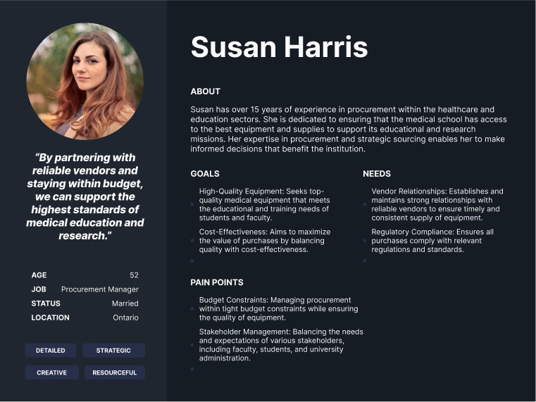
Pristine Medical primarily served a female dominant audience between the ages of 30 and 60 years old. These were generally previous nurses who turned into teachers who needed to manage their students. We worked on crafting and validating multiple user personas, user journeys, and empathy maps to ensure that the final design was truly user-centric.
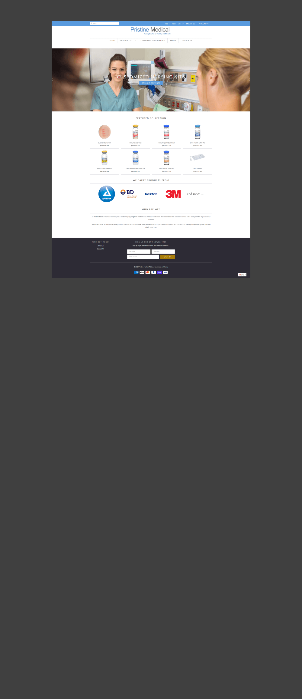
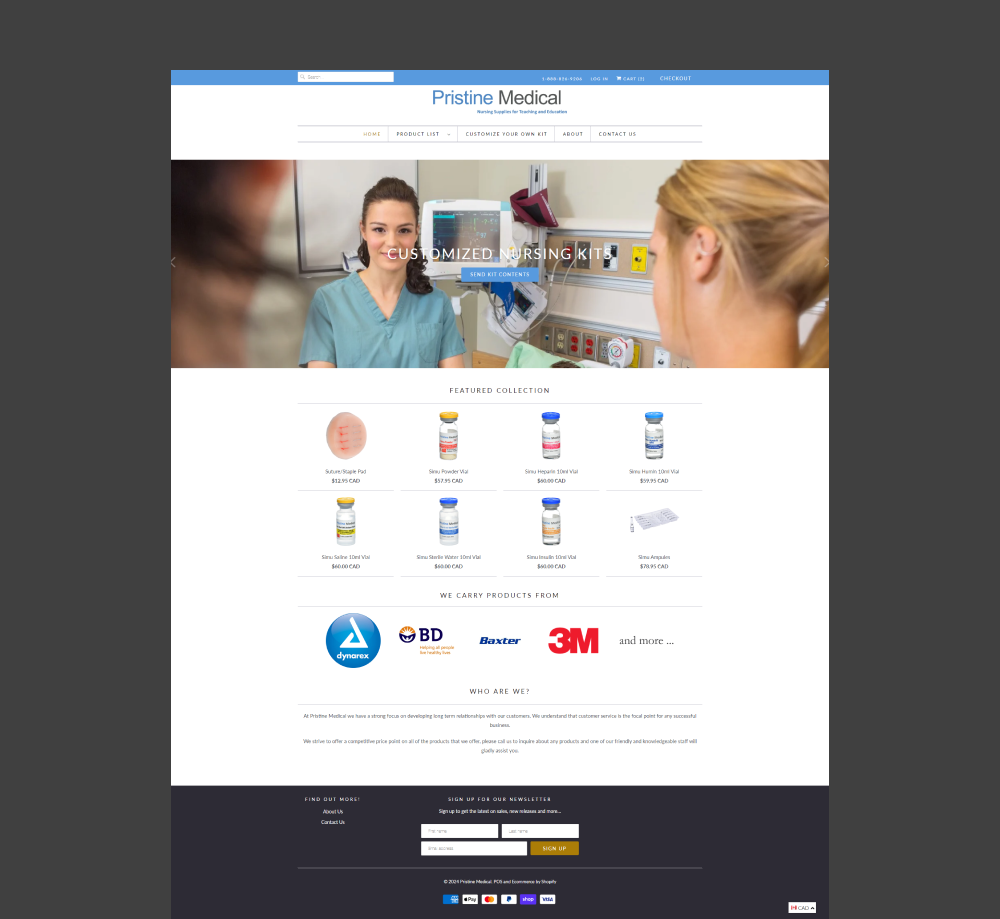
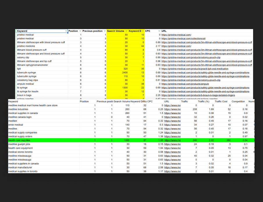
Pristine was sitting on a goldmine in terms of SEO opportunity with their current keyword rankings and search volume. However, the existing site was not SEO optimized with multiple H1 headers, a lack of meta titles and descriptions, etc. As part of every redesign we do, we make sure that the website is fully SEO-optimized and builds the foundation to ramp up traffic volume. We discovered several areas of opportunity from a ranking perspective and infused that into our design process.
As part of our unique process, we actually interviewed Pristine Medical’s exact target demographic to collect direct customer feedback. We asked multiple questions, ranging from their first impressions of the site to actually getting them to complete a series of tasks such as finding specific products and going from cart to checkout. We identified a whopping 30-35 usability issues PER VIDEO that substantially informed our final design decisions. Some of these included overwhelming design, a lack of streamlined messaging, etc.
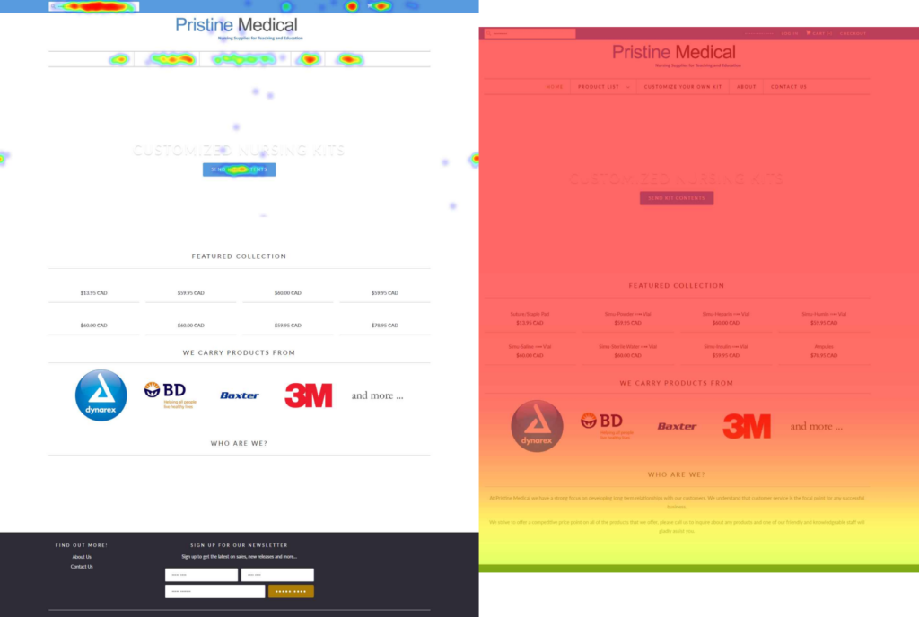
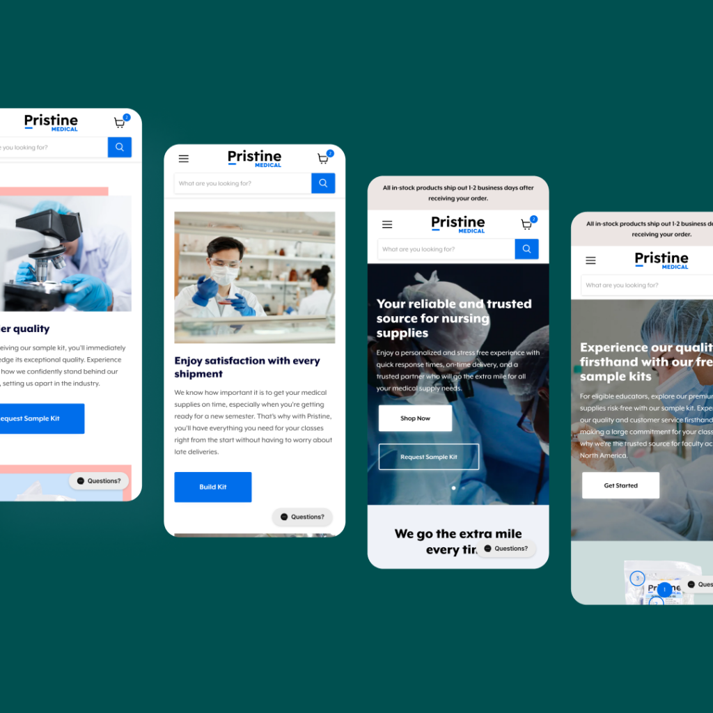
We discovered through heatmaps that the vast majority of users never even made it past the hero section due to a poor value proposition above the fold. The majority of the clicks were distributed across the main navigation, and substantial interaction was around the search bar. With the advent of 3,000 new products on the website, we used this insight to heavily shape our design decisions. For example, we made the search bar prominent on desktop and mobile instead of a hidden search icon.
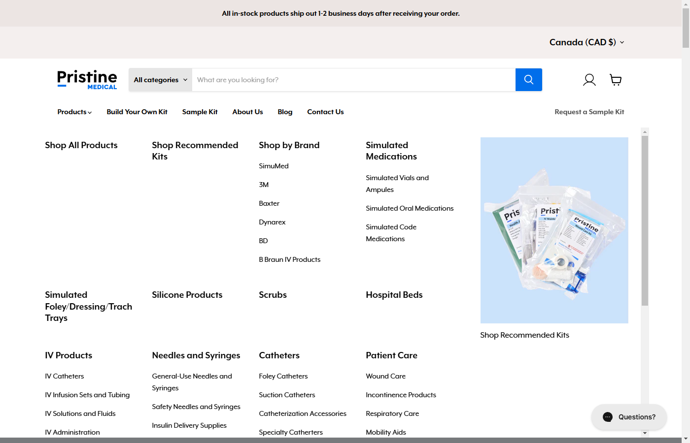
Arguably, one of the most critical areas of concern with the new website was making sure that the navigation was well thought out, considering there were going to be over 3,000 products. We designed and developed a mega menu to house all of the products and strategically organized it by category. This helped increase rankings from an SEO perspective but also allowed users to find the products they needed within seconds. The prominent search bar at the top also helped facilitate easier user navigation.
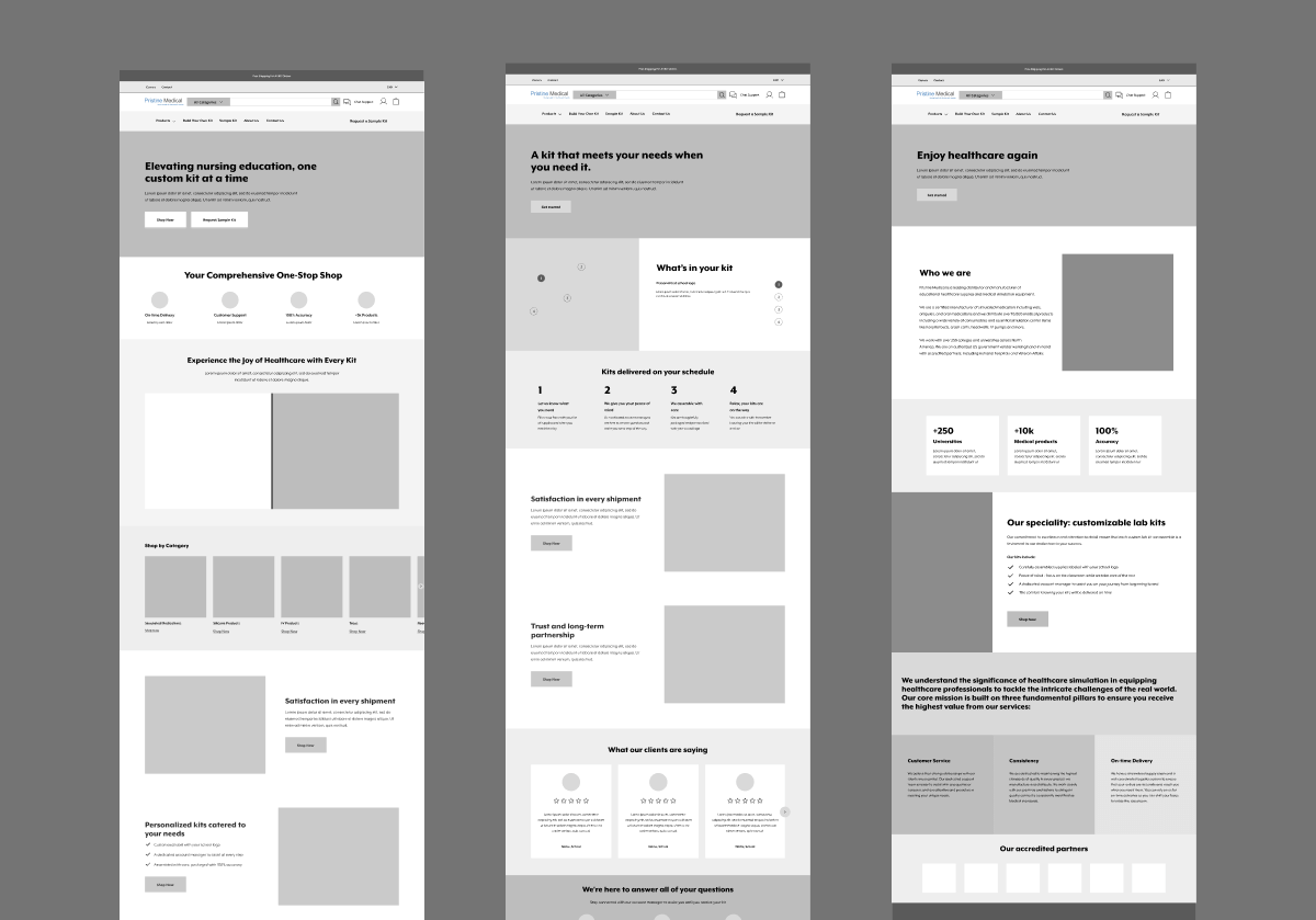
As we do for all custom design projects, our team created a rough mockup of the website in a prototyping tool first before it was developed. This helped the Pristine Medical team see the layout of the website at every stage and provide feedback iteratively. We also hosted weekly meetings with the team so they could see the mockups converted to full-fledged designs firsthand. Additionally, it enabled our internal design team to plan the information architecture, visual hierarchy, and overall design of the site quickly without getting too bogged down in the details, which are more relevant for the development phase.
Pristine’s old product page was extremely bare bones and had close to zero conversion-focused elements to motivate users to buy. We designed a hyper-optimized PDP, including a reduction of FUDs (fear, uncertainty, doubts) under the add-to-cart button, highlighting several core value props scattered throughout the page to emphasize the main product differentiation, etc.
About 40% of traffic to Pristine’s website was from a mobile device. We did extensive QA testing to ensure the site was responsive on all devices to create a smooth shopping experience for everyone.
Pristine offers customers the ability to build their own customized kits based on their unique needs, specifically for B2B customers. However, the old site had no centralized place to facilitate such transactions, leaving a ton of revenue on the table. We created a tailored page speaking directly to the B2B audience and also including a form for lead capture capabilities that the sales team can then follow up on. This was a game changer for Pristine Medical and once again helped achieve their vision of a 24/7 salesperson.
Similar to the Build Your Own Kit page, Pristine offers select customers who qualify free sample kits so they can try out the product firsthand. Previously, they were facilitating these transactions through outbound sales to try and get people onboard a trial. However, we created a separate tailored page on the site for this to create a funnel for self-fulfillment to reduce the amount of time required by the sales team.
People buy from people, especially in the medical industry. The about page needed to showcase the brand values of Pristine and the strong team members that stand behind it. We focused on telling a story throughout the entire product page that highlighted the various unique aspects of the brand.
Since the redesign, Pristine has seen its sales increase and broke records for its biggest months. They are now more confident in scaling their digital marketing efforts thanks to a conversion-focused website. We are still working with them today on ongoing monthly SEO work.
