“We are thrilled with what ThrillX delivered to us at RAIZE and got plenty of unprompted comments about our website looking great after we launched it. ThrillX genuinely cared about us as a client, and they made sure that all our concerns were addressed throughout the process with consistent communication. It’s clear that they put their full effort into their job and want a great end result for their clients. We will definitely be calling on ThrillX as website needs come up in the future.”
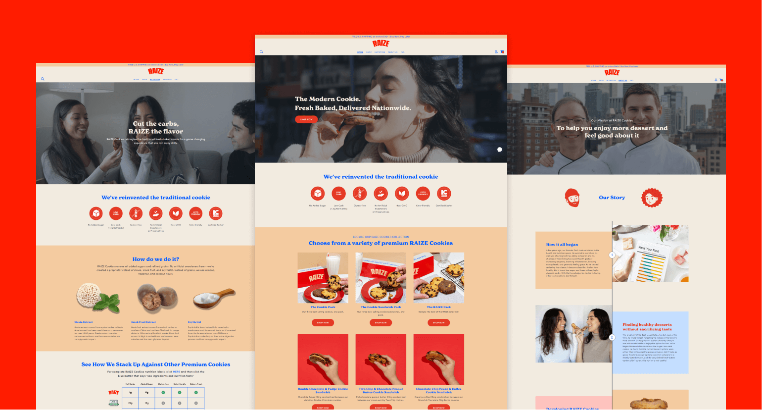
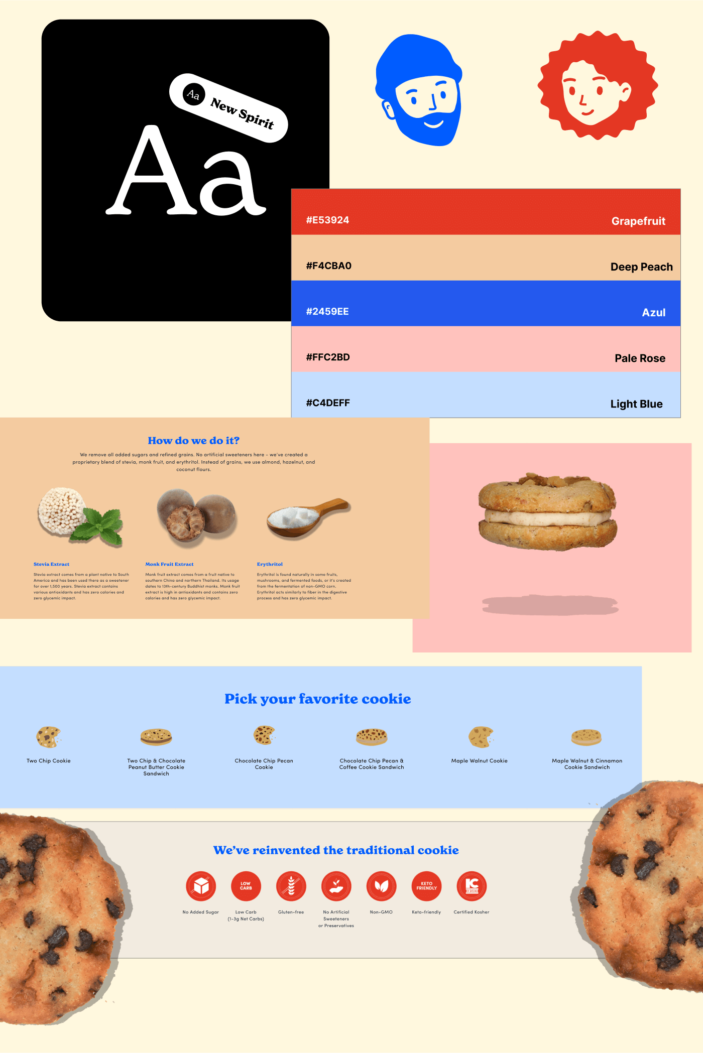
RAIZE provided us with a brand kit, which we then leveraged and experimented with to create the final brand identity for the website. This included custom icons, graphics, and illustrations throughout the website. We wanted RAIZE’s personality to be portrayed as trendy, premium, relatable, youthful, and bold through the branding identity. The colors marry the ideas of wholesomeness and boldness together, while we used the custom illustrations to add a sense of uniqueness to the site. Custom cookie illustrations were scattered throughout the page to increase user engagement.
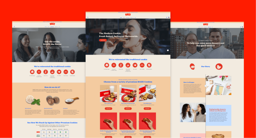
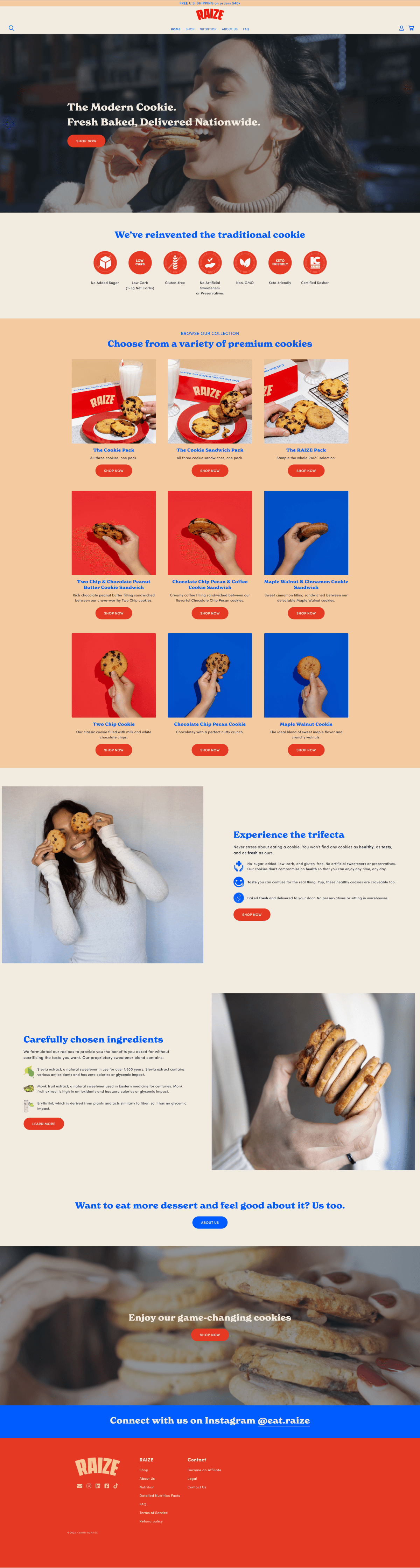
The RAIZE homepage prominently features bold and powerful colors to grab the users’ attention, along with a variety of high-quality lifestyle and product photos to build an emotional connection with customers looking to eat dessert guilt-free. Several customer reviews are featured to establish social proof and build trust with customers. The website copy focuses on the benefits that RAIZE cookies provide rather than the features, which is one of the fundamentals of a high-converting landing page.
The sliding cart menu allows users to continue to shop from any page of the website, increasing ‘stickiness’ and therefore conversions. It also provides a visual indicator to users that their ‘add to cart’ action was successful, allowing for a more enhanced shopping experience.
We added a product filter on the shop page since RAIZE has several categories of products such as cookies, cookie sandwiches, etc. As RAIZE plans to add additional categories in the future, this filter will continue to serve as an important feature to allow for seamless navigation of products.
In order to make the home page less flat, we added a hover feature to keep the user engaged at all times and effectively showcase all of the products in a unique way.
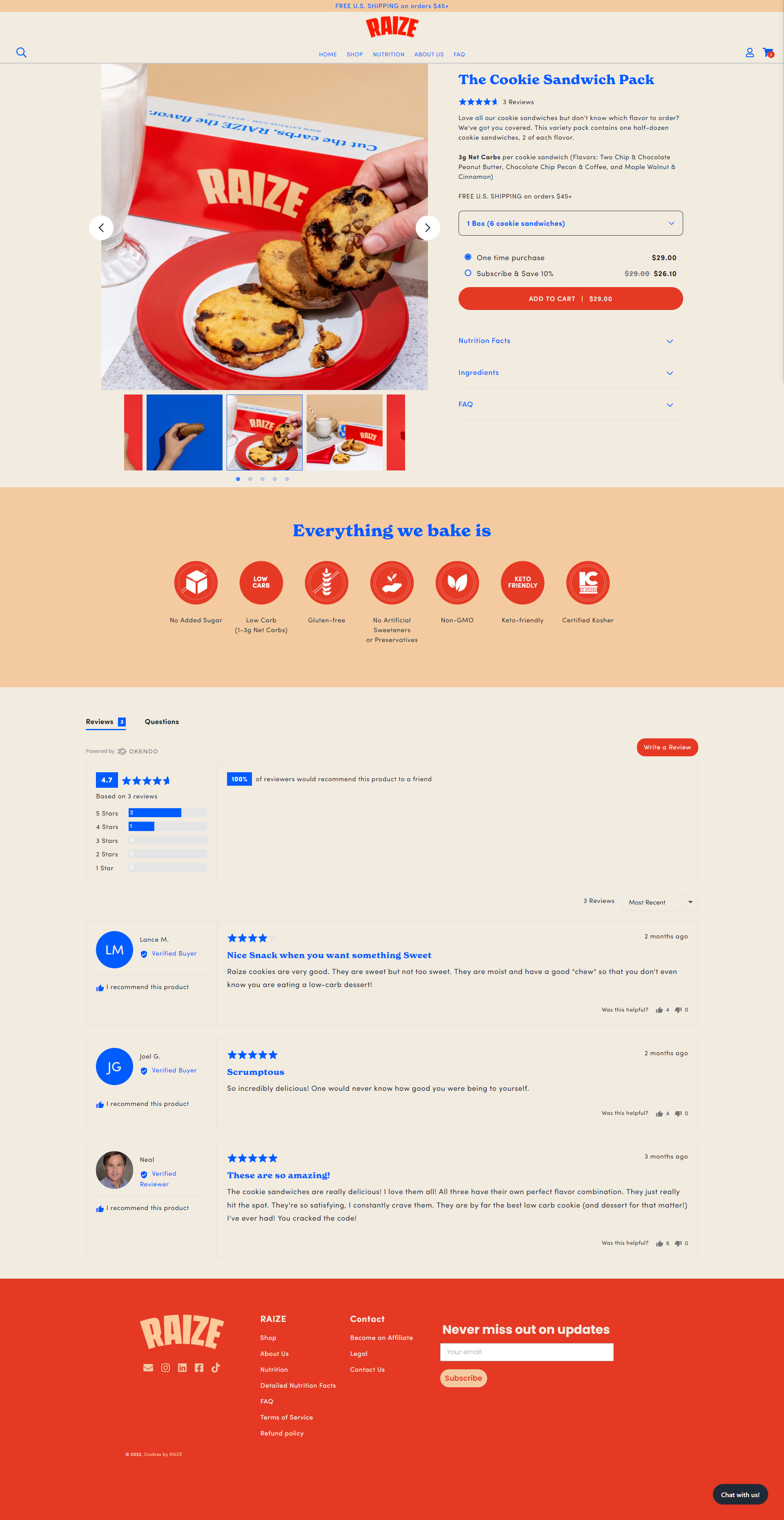
Each product page has a slider menu to showcase RAIZE cookies in a spectacular fashion. There is a dropdown menu to allow users to choose their desired quantity with ease, as well as some high level-nutritional benefits and reviews to further incentivize customers to purchase the product.
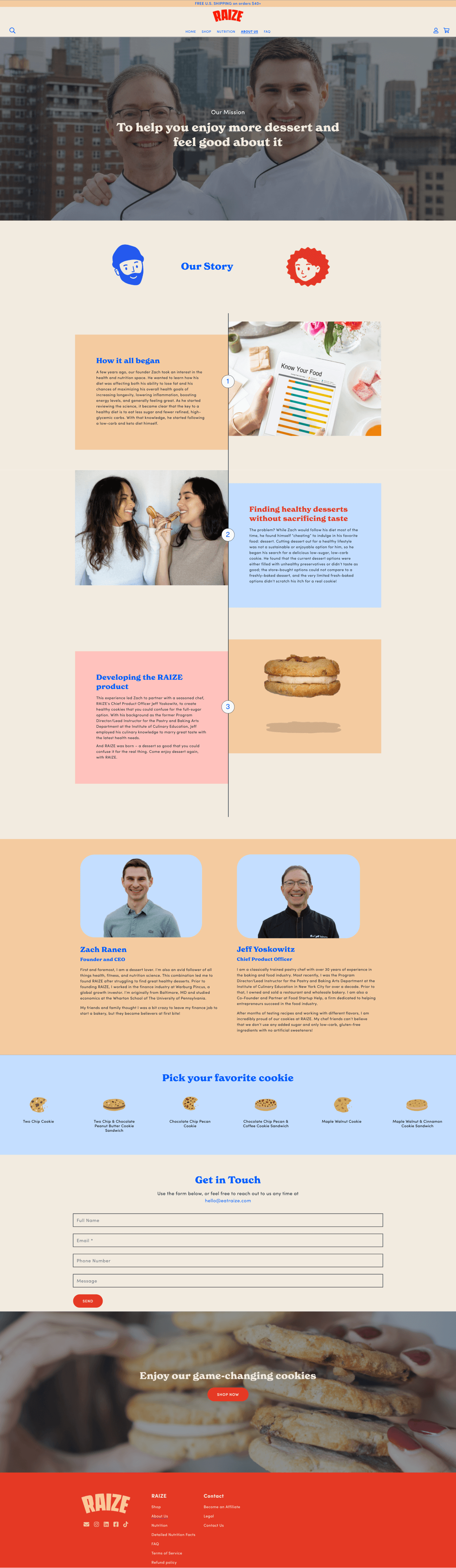
This was one of the most important pages for RAIZE. The about us page needed to have personality, a strong message, and truly communicate RAIZE’s story to build an emotional connection between its brand and customers. We decided to display the RAIZE story through a beautiful custom-coded timeline, which walks users through the journey of how Zach Ranen, Founder and CEO at RAIZE, started a bakery after leaving his comfortable finance job.
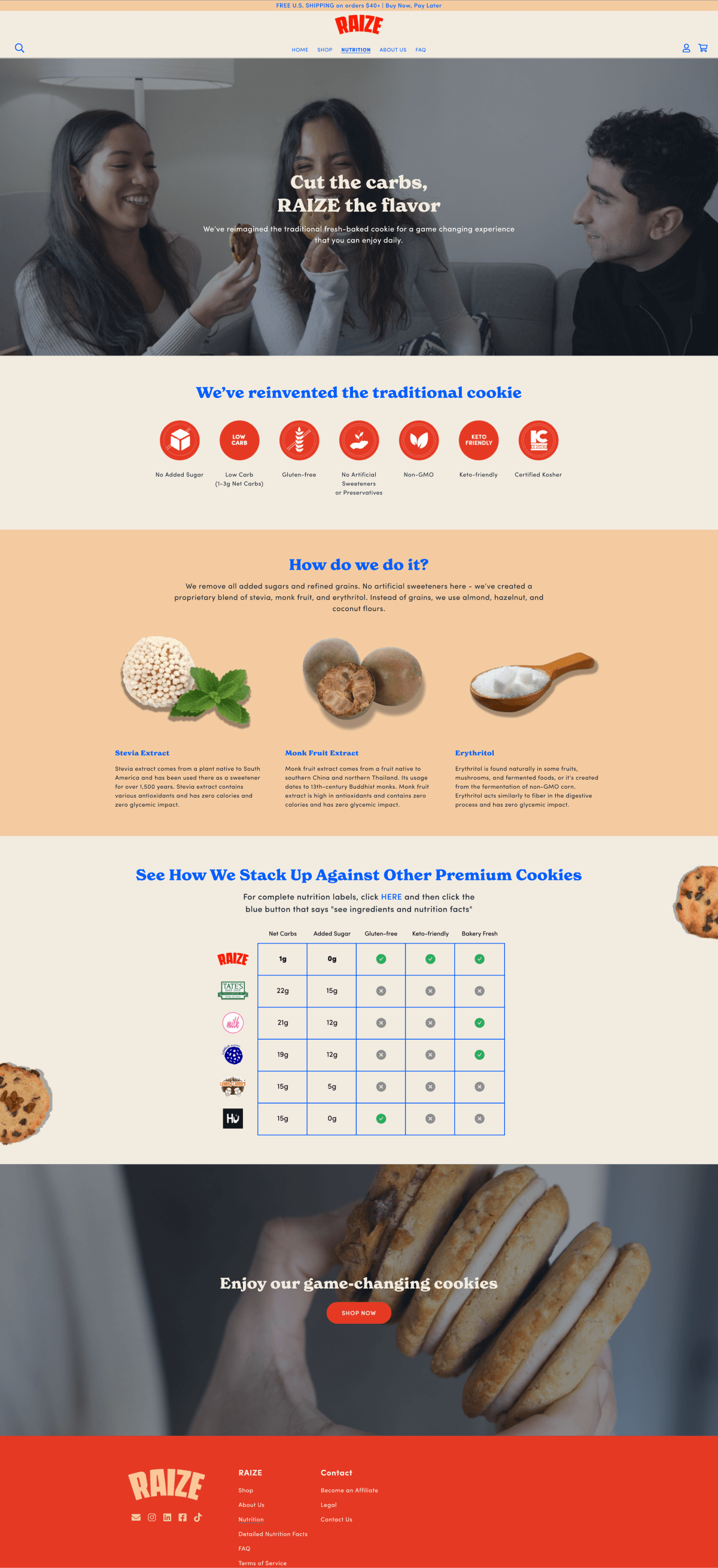
Just as important as the about us page was the nutrition page which helped to alleviate any concerns customers had about the health related aspects of the product. On the nutrition page, we included a breakdown of the ingredients, as well as a nutrition table to compare RAIZE to other bakeries.
After launching the website, RAIZE experienced great success within the first few weeks. They were featured in several publications such as Bake Magazine and Modern Retail, while continuing to gain solid traction.