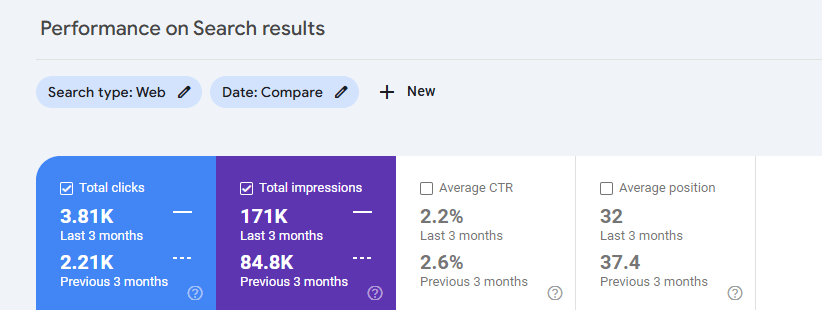
Through our SEO work, Scrubby saw a 101.6% increase in total impressions and 72.4% increase in clicks.
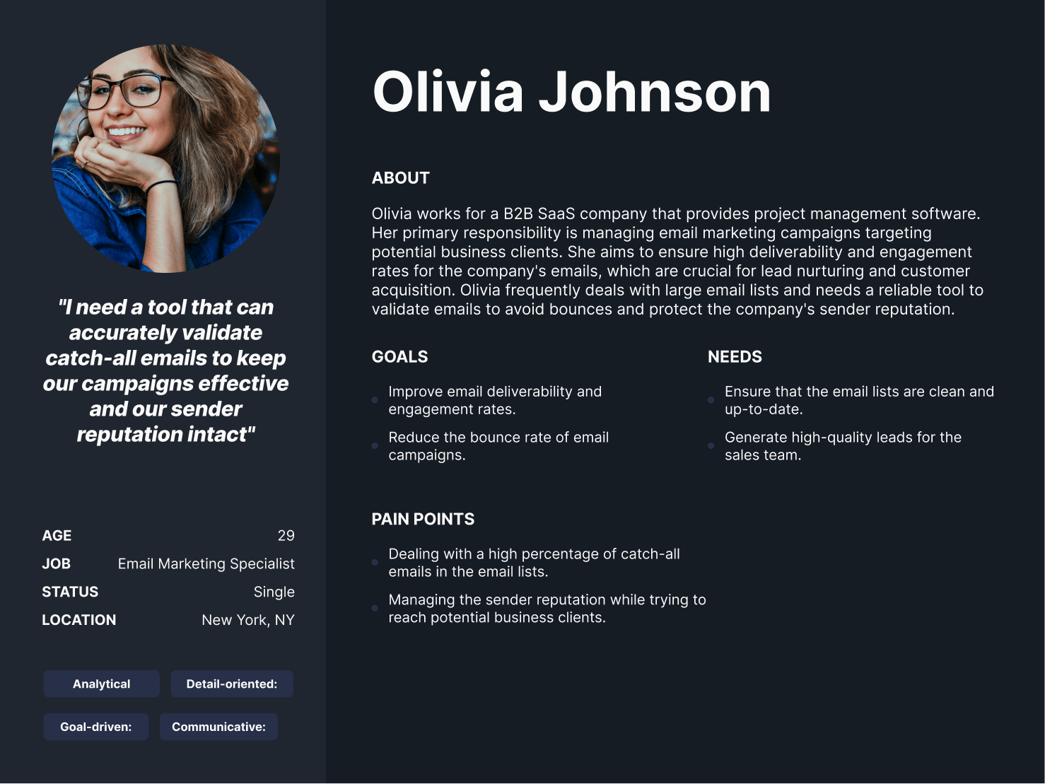
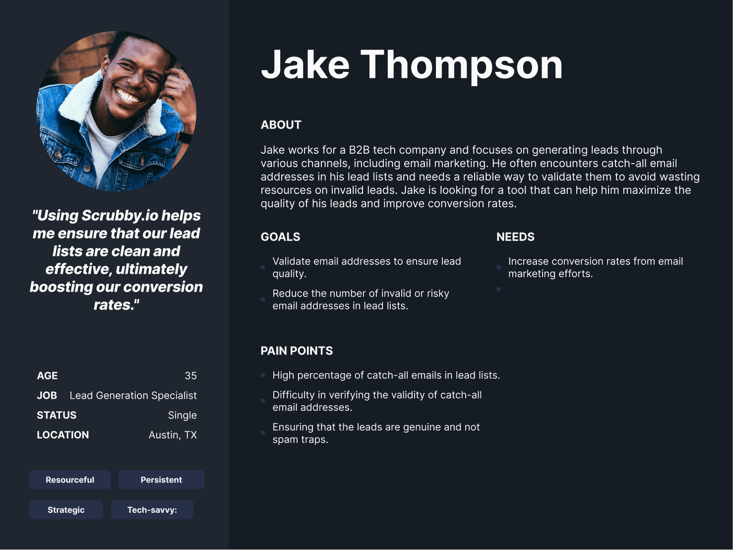
For Scrubby.io, our research and discovery process involved several key steps to understand their diverse customer segments. We began by conducting in-depth interviews with stakeholders, including small business owners, marketing executives from large enterprises, and lead generation experts from agencies. These interviews helped us uncover the unique goals, motivations, and pain points of each audience. Additionally, we conducted market research and competitive analysis to gain a deeper understanding of the industry landscape. This included studying the LinkedIn outreach strategies of competitors and identifying areas where Scrubby.io could differentiate itself and provide added value to its customers.
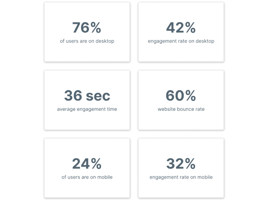
In order to better understand how users interact with the website, we compiled an overview of the main KPIs that helped drive all of our decisions for the redesign. Some high-level insights included the fact that the majority of traffic was from desktops, representing 76% of users. The average engagement time on the website was less than half the industry average of 52 seconds. Lastly, they had a very low engagement rate of only 42% on desktop and 32% on mobile.
Our team analyzed hundreds of user recordings on the old website to identify usability issues as well as areas of opportunity. Some of the patterns observed included multiple dead clicks on elements that appeared clickable but were in fact not, users getting frustrated around the pricing portion of the website, having to constantly scroll up to access the navigation menu even though it was a 1 page site (each menu item scrolled you down), etc.
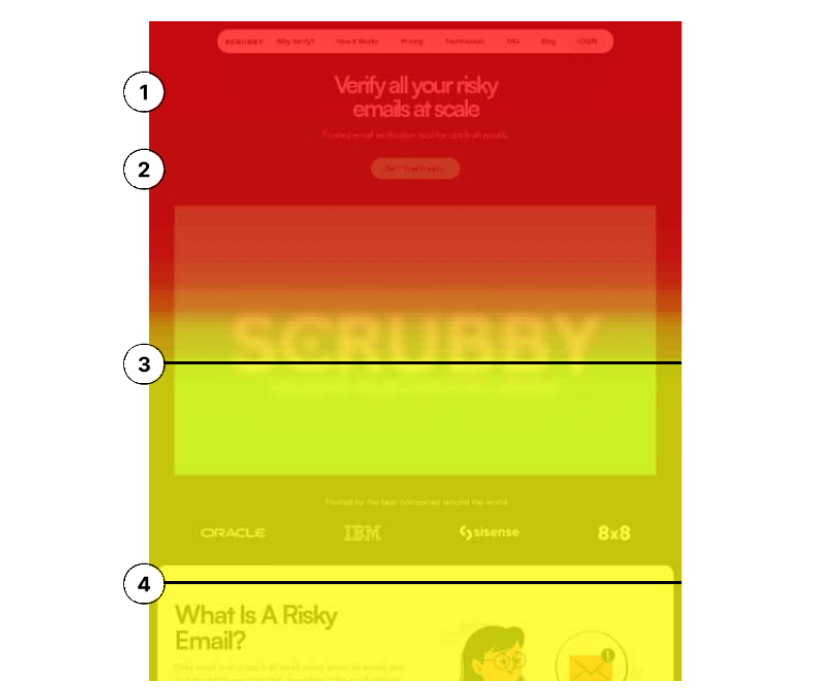
As with all websites we do, the first several weeks of our engagement were purely dedicated to a deep dive data audit. We set up a series of heatmaps, scrollmaps, and clickmaps on high-traffic pages to determine areas of opportunity to increase conversions.
1) The headline lacked a clear value prop of “what’s in it for me” and what the core value prop of Scrubby was, leading to drop-off.
2) There was no way of immediately reducing FUDs (fear, uncertainty, doubts) and building instant trust to motivate users to further engage with the website near the critical action point of signing up.
3) 84% of users reached this point (16% drop-off). This is the average fold which is the average portion of the website that is visible to users without having to scroll down.
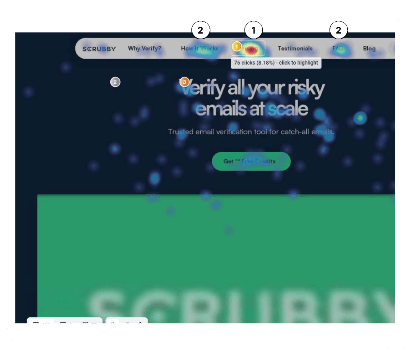
1) 8.18% of users clicked straight onto pricing from the top upon landing on the website without having any other context of the value proposition outside of the header. A potential issue and conversion blocker was that upon users clicking on one of the items and getting taken down to a section of the page, they had to scroll all the way back up just to get to another section. This was demonstrated in several user recordings. This isn’t an optimal user experience considering that the website is just one page in total. Users who scroll down to pricing and don’t have enough information to convert (skipping all of how it works, why verify, etc) may just bounce and exit from the website.
2) If a user did not convert at the top of the website where the
primary CTA is, there were no other opportunities for them to
convert in their user journey outside of the pricing section at the bottom of the page.
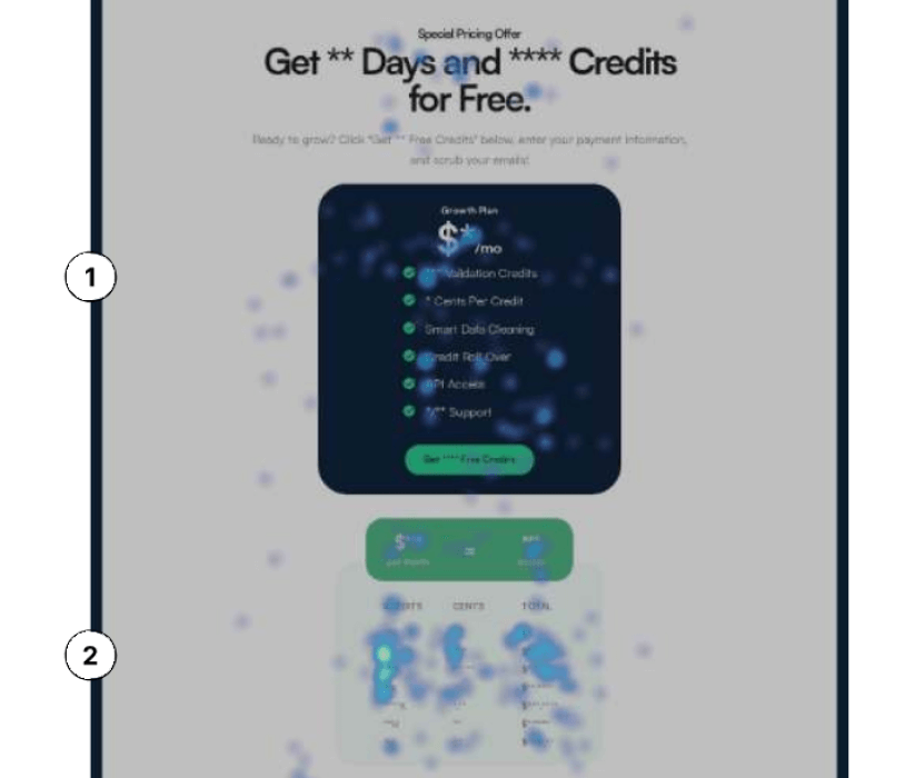
1) Lots of clicks and movement registered around the Growth Plan
box rather than the primary call to action button itself (Get 100
Free Credits).
2) Heatmaps indicated a lot of clicks and movement around the pricing and credits area. Several recordings showcased users thinking that they could click on the individual credits from the table rather than going with the growth plan. The assumption was that people thought the comparison table was a place where they could buy a specific number of credits for a specific amount, despite the table being primarily informational in nature. The first three credit options in particular (1k, 5k, and 50k) had the highest amount of movement and clicks, implying that users may have wanted to purchase a custom amount of credits.
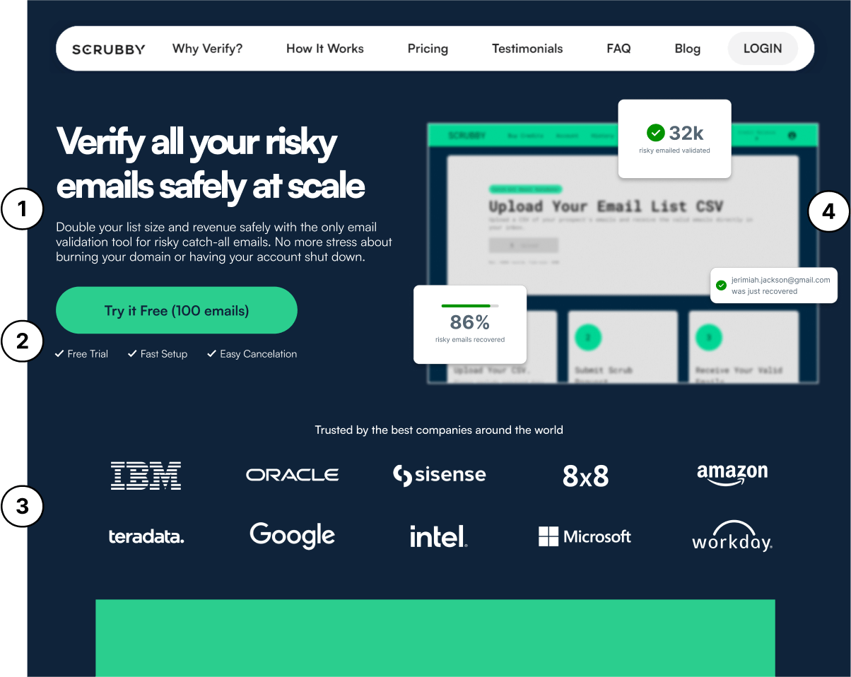
1) Headline conveys ‘safety’ aspect combined with scale for added persuasion. Subheader clearly conveys the pain point that users experience while positioning Scrubby.io as the ideal solution and fix. Value proposition now answers ‘what’s in it for me’ and adding the word ‘only’ conveys the unique competitive advantage.
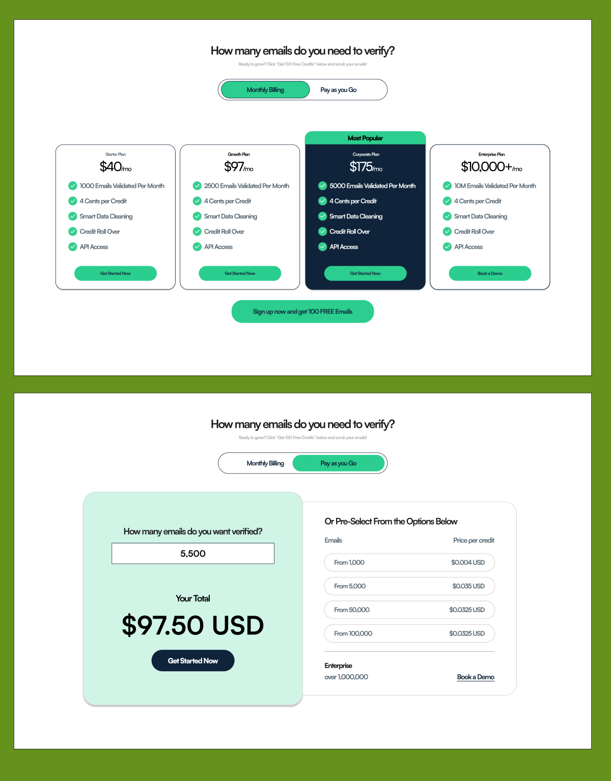
We designed and implemented two different plans, one plan which was a monthly subscription and the other which was a one-time fee for a custom amount of credits. Competitors such as Zerobounce implement this strategy and our assumption was through the click map and heatmap data was that users wanted more flexibility in the pricing options available.
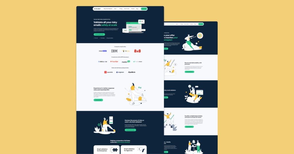
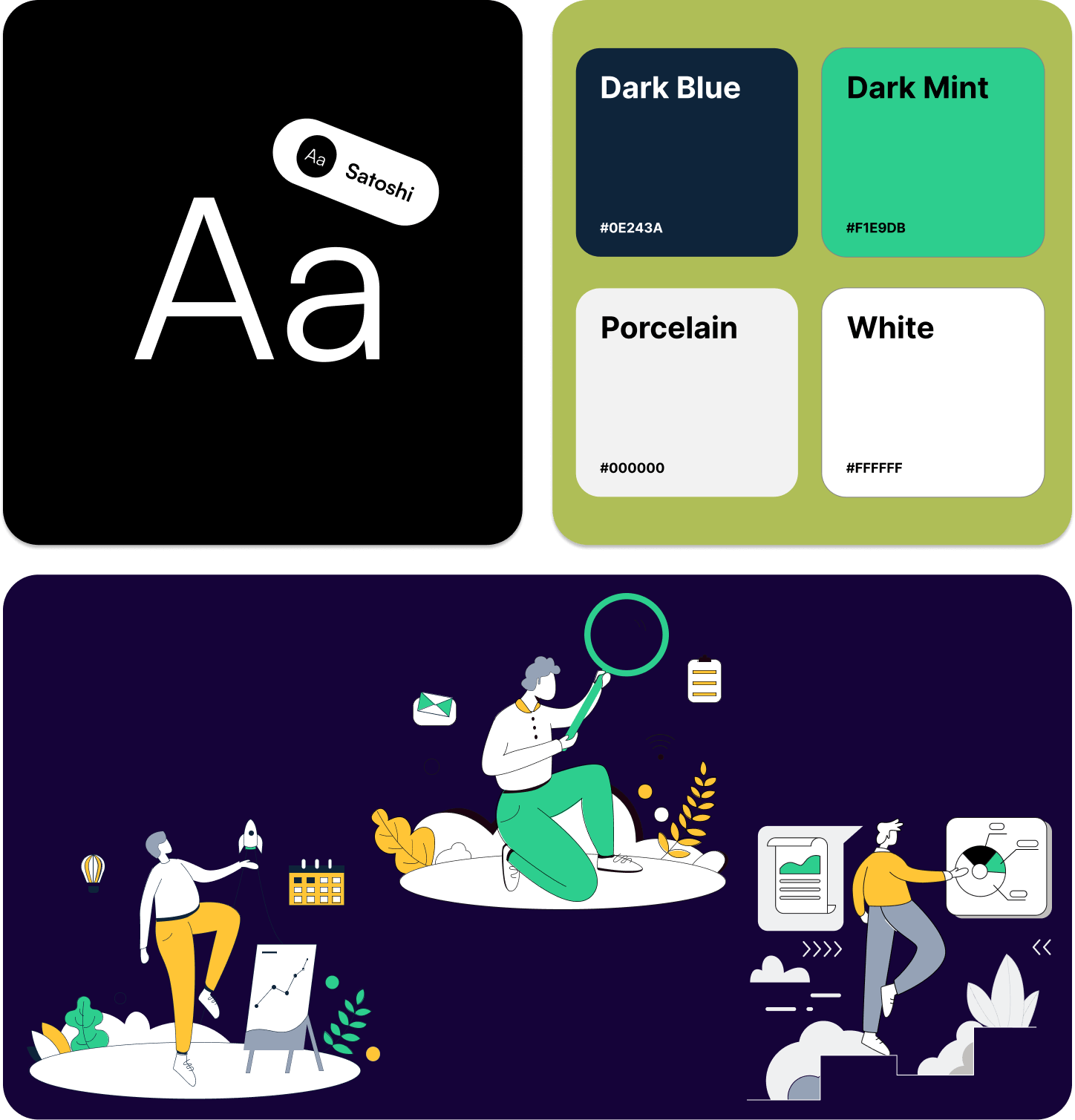
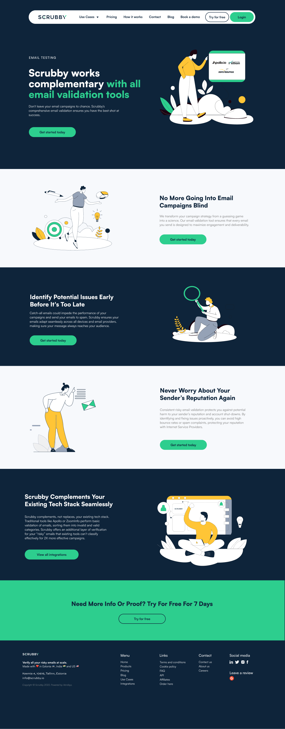
For Scrubby.io, our goal was to create a website that reflected the premium nature of their services. To achieve this, we conducted a thorough analysis of their brand and target audience. We discovered that their audience values efficiency, reliability, and professionalism. With this in mind, we chose a color scheme that reflected these qualities. The primary color, a deep, sophisticated blue, conveys trust and reliability. We complemented this with accents of vibrant green, symbolizing growth and efficiency. We also added several custom illustrations to the page to breathe life into the site.
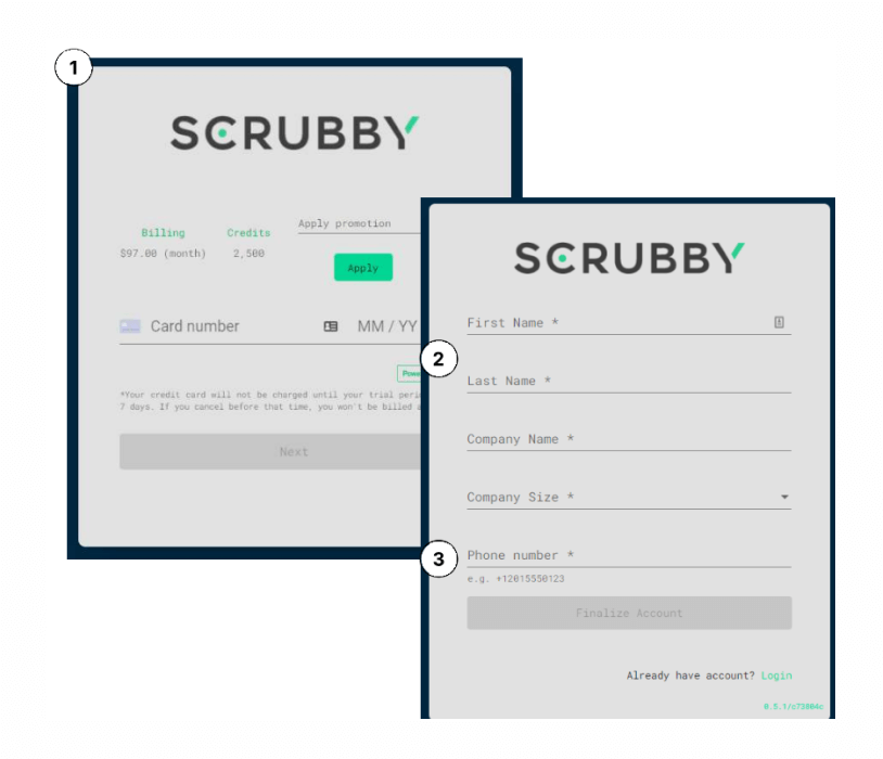
1) The old website asked people for credit card information as the first step before other personal information. This gives people the impression that the primary intention of signing up is to collect payment rather than provide a valuable service. Users are significantly less likely to give away credit card information as one of the first steps in creating an account. They are much more likely to give away less valuable information, such as their name, company name, etc. We quickly switched the two steps around.
2) The sweet point for form conversions is 4 fields or less. HubSpot
found by conducting a study that conversion rates increased by
almost 50% when reducing the # of form fields from 4 to 3. A
low-hanging fruit to simplify the sign-up experience and reduce
the # of form fields is combining first name and last name into
one form field that reads ‘Full Name’.
3) Sign-up forms that include mandatory phone number fields can
reduce conversion rates by up to 52%. Is a phone number
absolutely necessary to collect in the sign-up procedure?
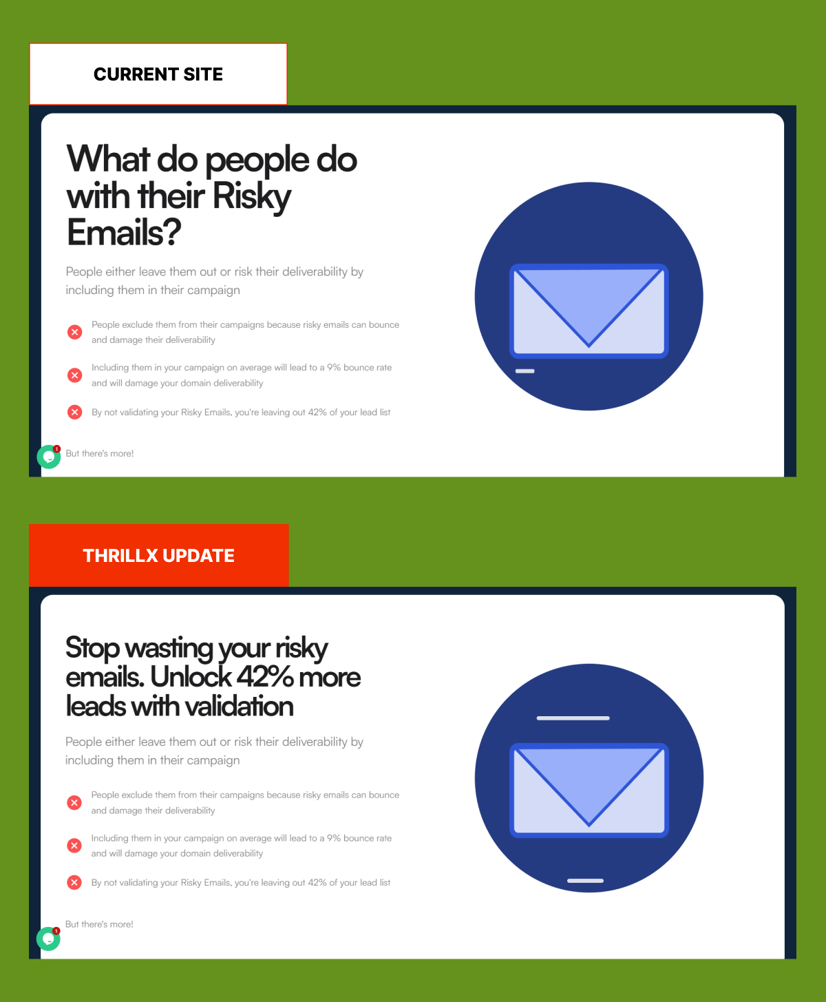
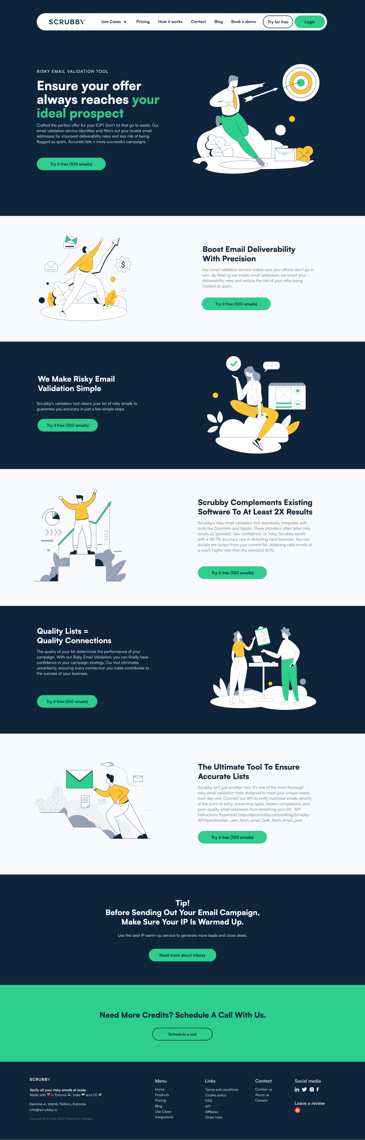
Rather than the header stating, ‘What do people do with their risky emails?” make the copy more actionable and benefit-focused. The new copy uses the contrast principle, which introduces the problem (‘stop wasting your risky emails’) and closes with the solution (‘unlock 42% more leads with validation’).
Scrubby’s website features a user-friendly interface with easy navigation, providing visitors with a seamless experience. The homepage showcases the company’s email validation services prominently, emphasizing the benefits of using their tool to improve email deliverability rates. The layout is clean and professional, with engaging visuals and clear calls to action.
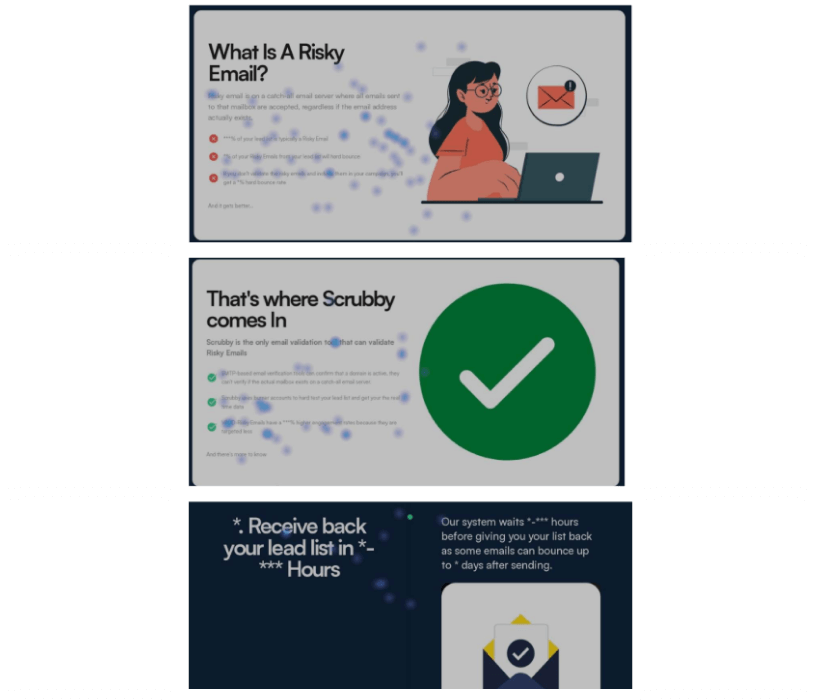
The feature page not only provides detailed information about its email validation tool but also stands out for its visually appealing design. The page features stunning illustrations that add personality and vibrancy to the content, making it more engaging for visitors. This was followed by hyper-benefit-driven copy that pulled people in and motivated them to take action.
Scrubby quickly went from purely relying on cold outbound to gradually building a thought leadership hub in-house on their website and SEO optimized pages that brought them substantial traffic, leads, and revenue. They ranked on the first page of Google for keywords in a matter of weeks through our work.