Scrubby’s main digital product used by thousands of customers was lacking solid UX/UI optimization and had low engagement across the board. Our team performed led the end-to-end strategy, research, and design process.
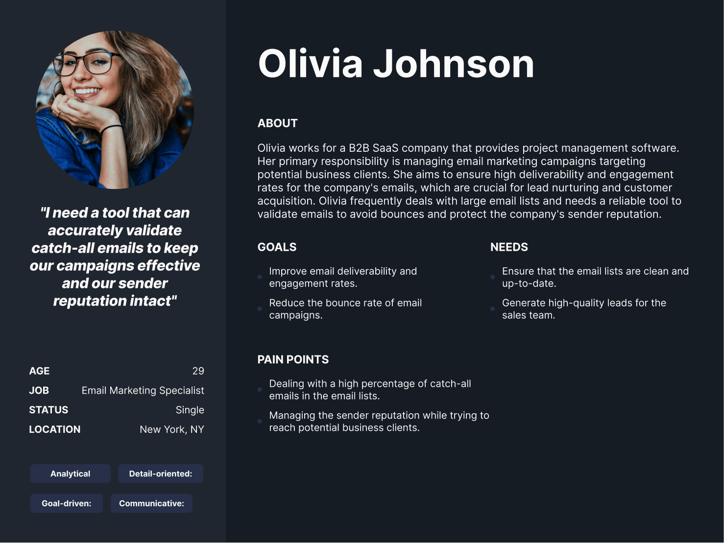
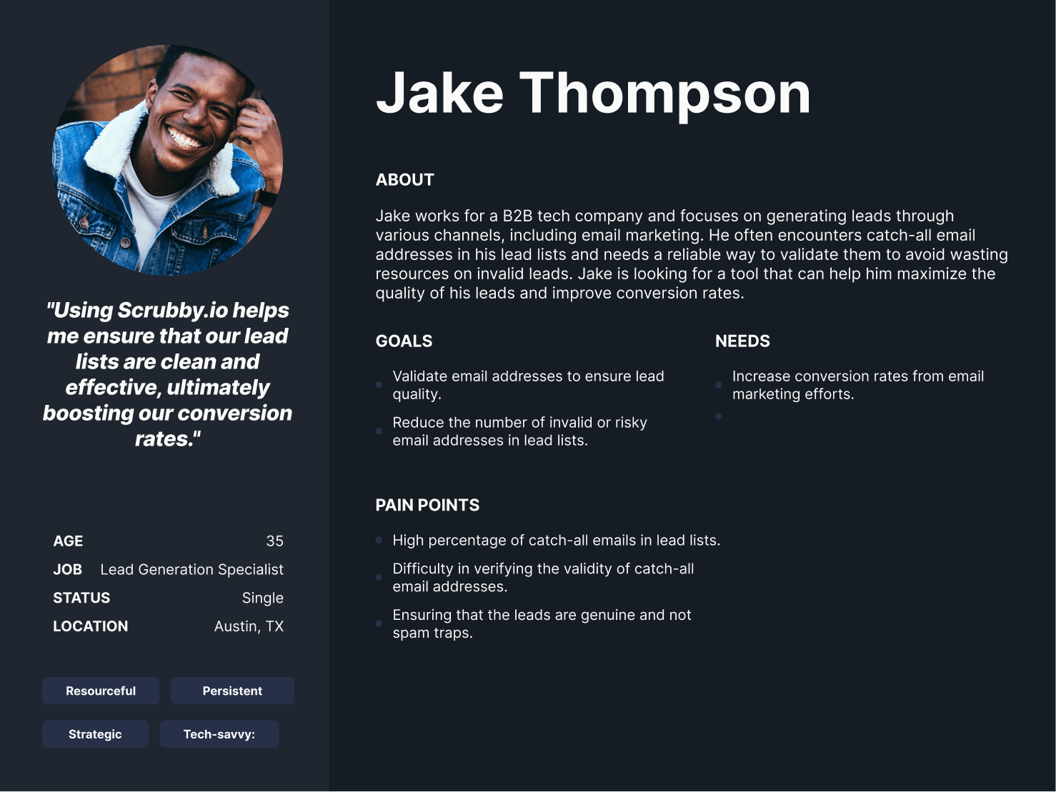
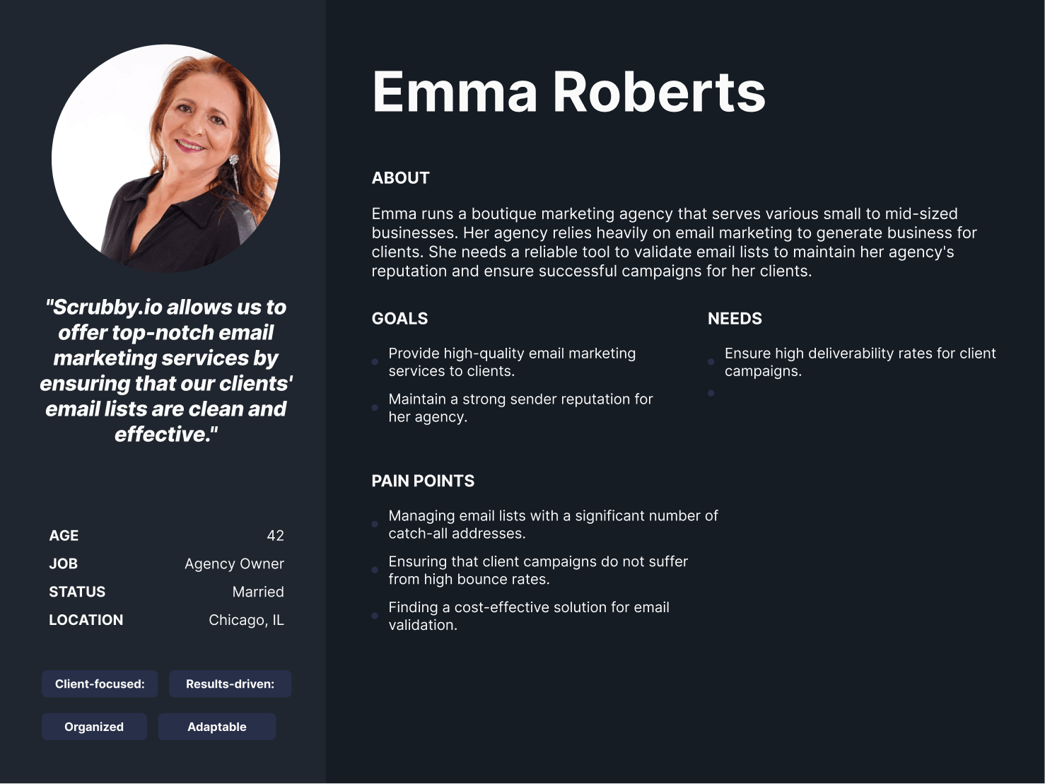
For Scrubby.io, our research and discovery process involved several key steps to understand their diverse customer segments. We began by conducting in-depth interviews with stakeholders, including small business owners, marketing executives from large enterprises, and lead generation experts from agencies. These interviews helped us uncover the unique goals, motivations, and pain points of each audience. Additionally, we conducted market research and competitive analysis to gain a deeper understanding of the industry landscape. This included studying the LinkedIn outreach strategies of competitors and identifying areas where Scrubby.io could differentiate itself and provide added value to its customers.
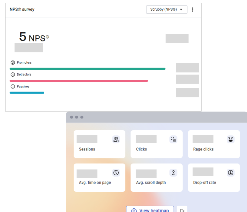
In order to better understand how users interact with the website, we compiled an overview of the main KPIs that helped drive all of our decisions for the redesign. Some high-level insights included the fact that the average time on page was less than 2 minutes, which was poor considering that it took at least 3–4 minutes just to perform the main action on the dashboard. Scrubby also had a low engagement rate and an NPS score at an all-time low of 5.
Our team analyzed hundreds of user recordings on the old and new dashboards to identify usability issues as well as areas of opportunity. Some of the patterns observed included people confused about where to navigate next, many people bouncing immediately upon landing, users rage clicking on elements that weren’t meant to be clickable, etc.
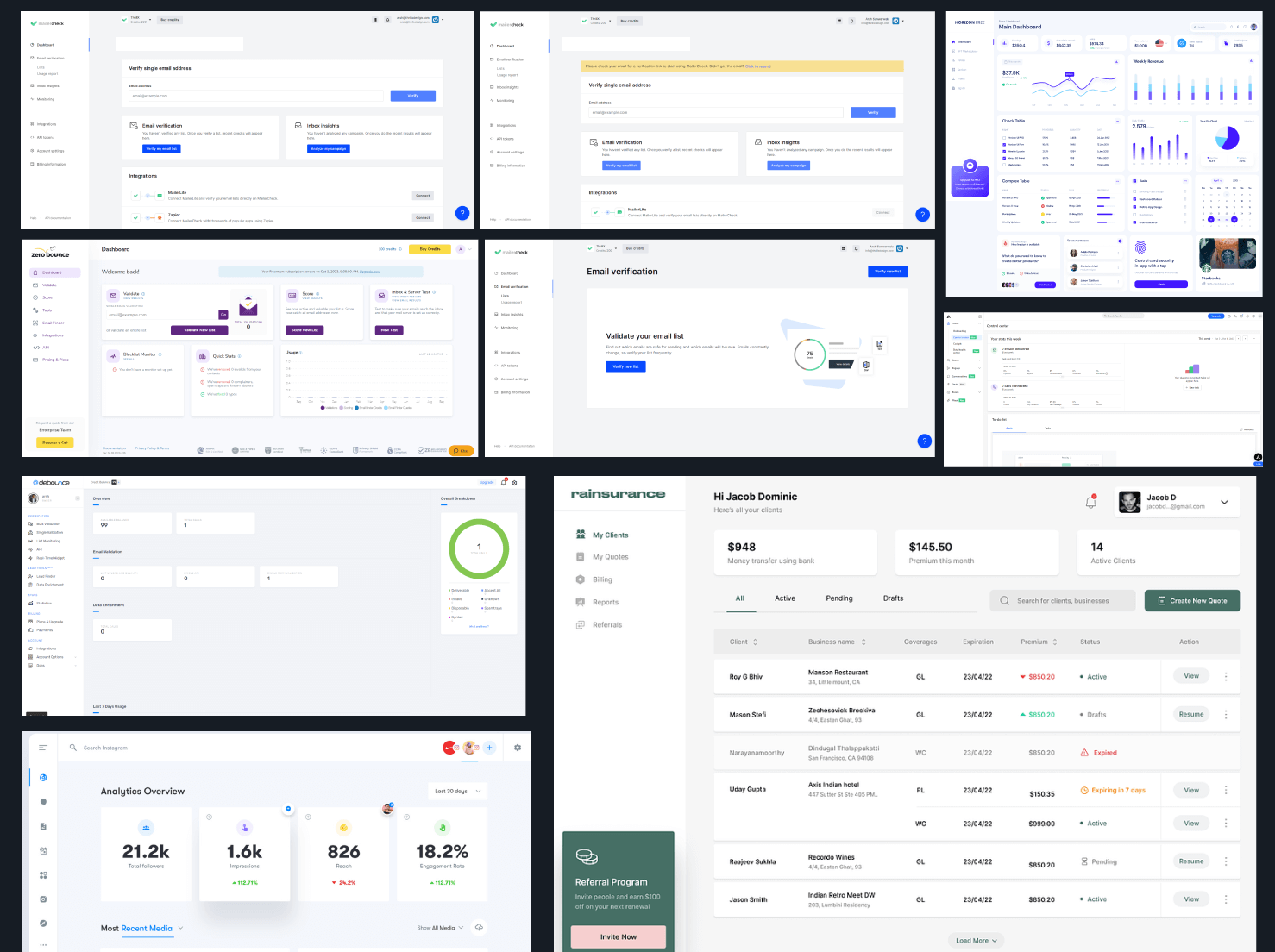
As we do with all custom design projects, we did a deep dive into the old and new website to really maximize conversions. Through heatmaps and click data, we were able to see that the vast majority of clicks were on the “validate” button to perform the core action Scrubby was designed for. However, there was very little interaction with the rest of the website on different pages, with users upgrading plans and viewing their credit and subscription details. Any successful dashboard and digital product needs to incorporate an ecosystem to bring users back multiple times and, in turn, generate revenue on autopilot, which is what we focused on in the redesign.
Looking at the original dashboard and without any data analysis, we were able to identify multiple UX/UI design and conversion issues right off the bat. Most notably, there were major areas of opportunity from a messaging, design, and navigation perspective. Below is a mini-snapshot of a more detailed audit we conducted.
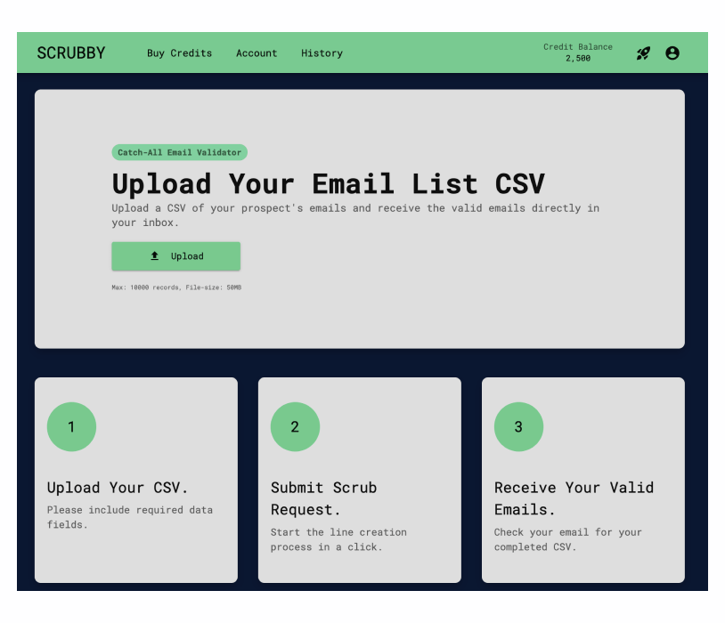
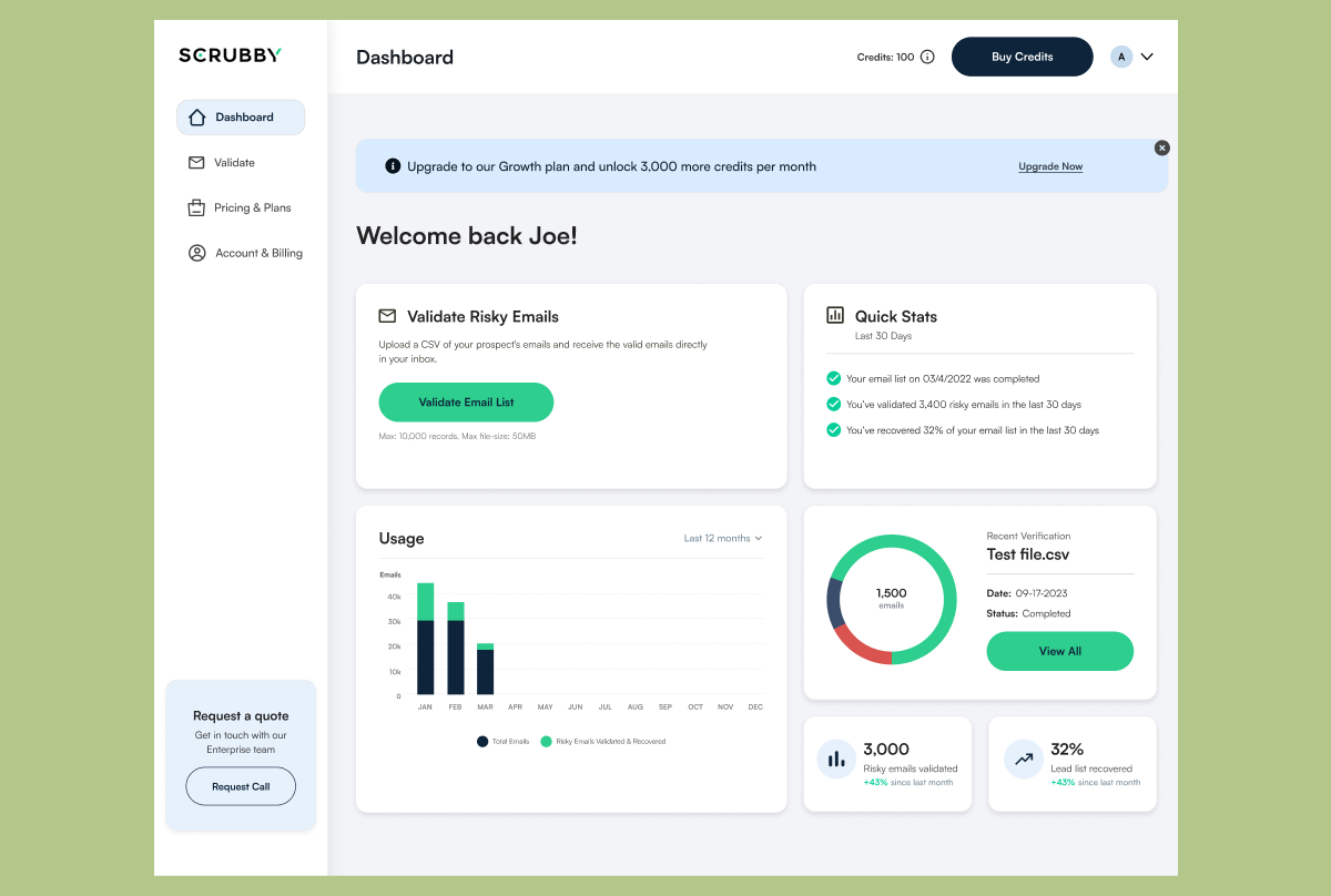
1) The old dashboard homepage was very bare bones and lacked sufficient information required to convert users. It was simply transactional and focused on the core action of validating emails, which is what Scrubby’s software primarily does. We quickly identified a major opportunity to improve the experience and treat the homepage more as a “hub” where users can see snapshots of their total risky email validations, past transactions, and high-level stats of the hours and money they have saved. This is what gets users hooked and keeps them coming back.
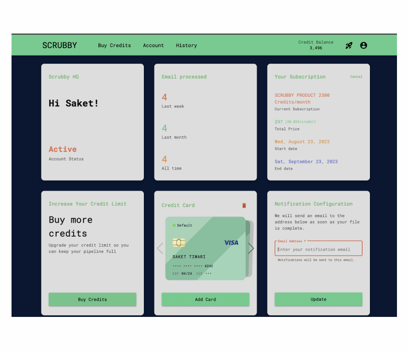
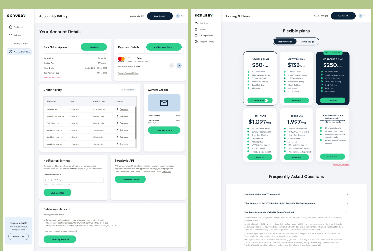
The old account page was confusing for multiple users and didn’t have the necessary information. Users wanted to see their credit history, how to cancel their account, etc. On top of that, every block competed and clashed visually with multiple colors, font types, and designs.
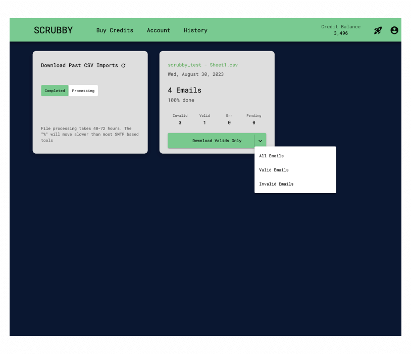
From a returning user perspective, the dashboard experience was not optimized at all. Users had to go to a separate page to view their past CSV imports and current validations to date instead of on the main dashboard page. Moreover, the functionality on the old dashboard was purely transactional in nature, meaning it just helped users perform specific actions. What we focused on in the redesign was going beyond transactional functionality and also value-based functionality, like highlighting stats of the ROI that users had made using Scrubby as opposed to not using it.
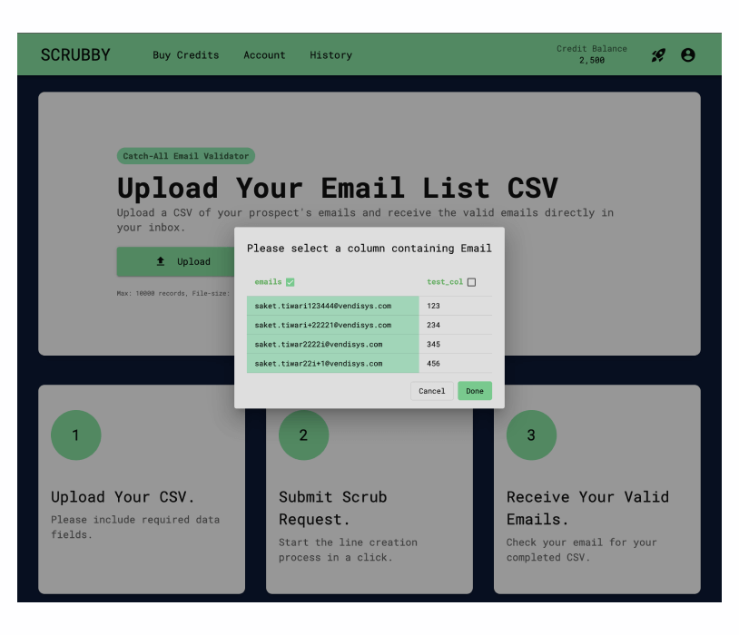
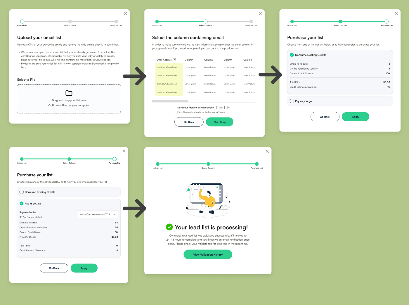
1) One of the key user flows on the dashboard is to upload your CSV list and validate emails. However, there were multiple issues in the flow, including a lack of clarity on what is required at each stage, confusing payment details and options, etc.
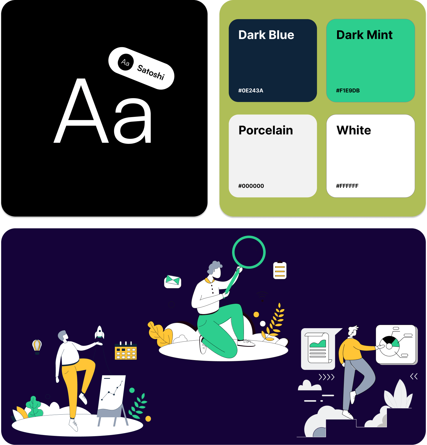
For Scrubby.io, our goal was to create a website that reflected the premium nature of their services. To achieve this, we conducted a thorough analysis of their brand and target audience. We discovered that their audience values efficiency, reliability, and professionalism. With this in mind, we chose a color scheme that reflected these qualities. The primary color, a deep, sophisticated blue, conveys trust and reliability. We complemented this with accents of vibrant green, symbolizing growth and efficiency. We also added several custom illustrations to the page to breathe life into the site.
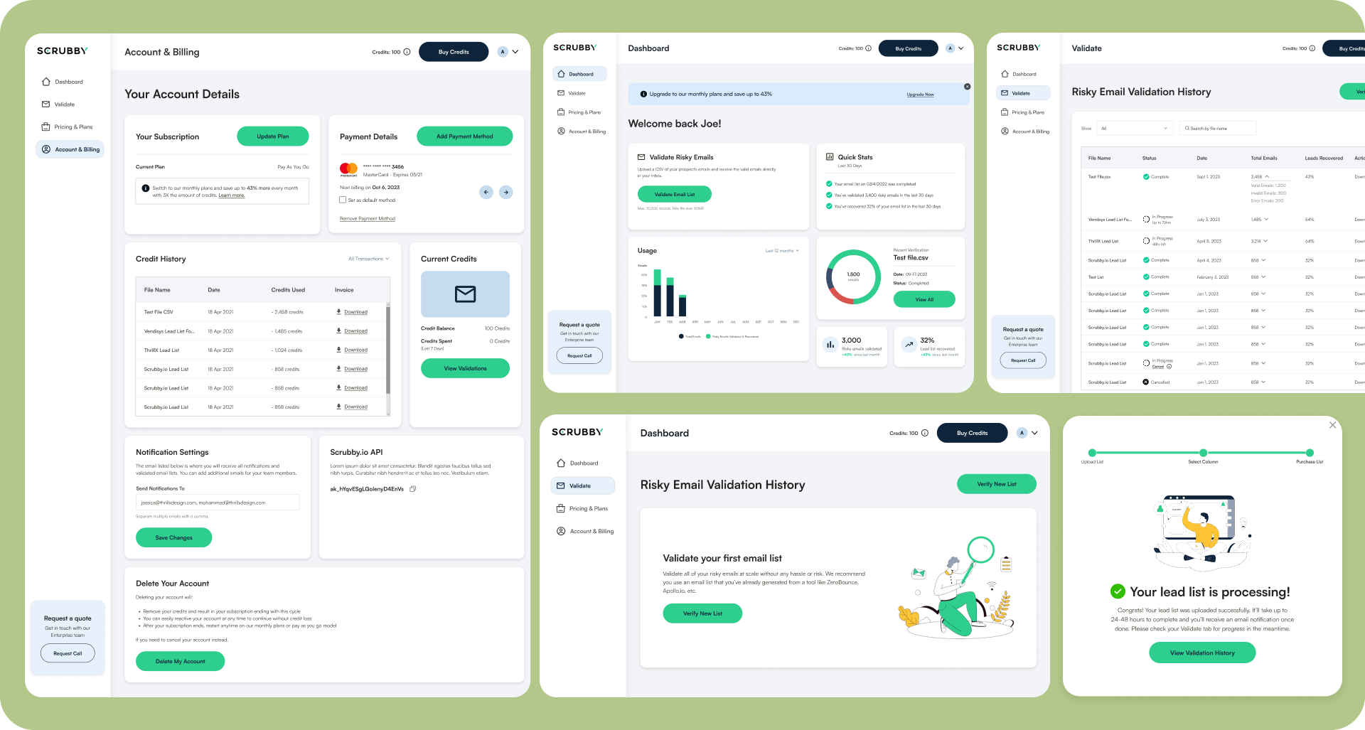
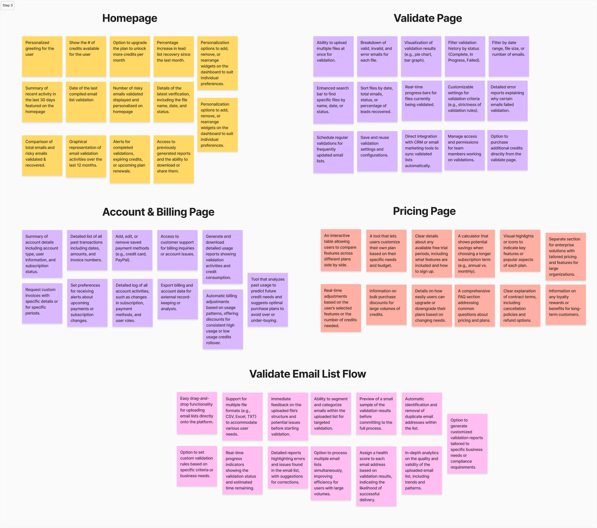
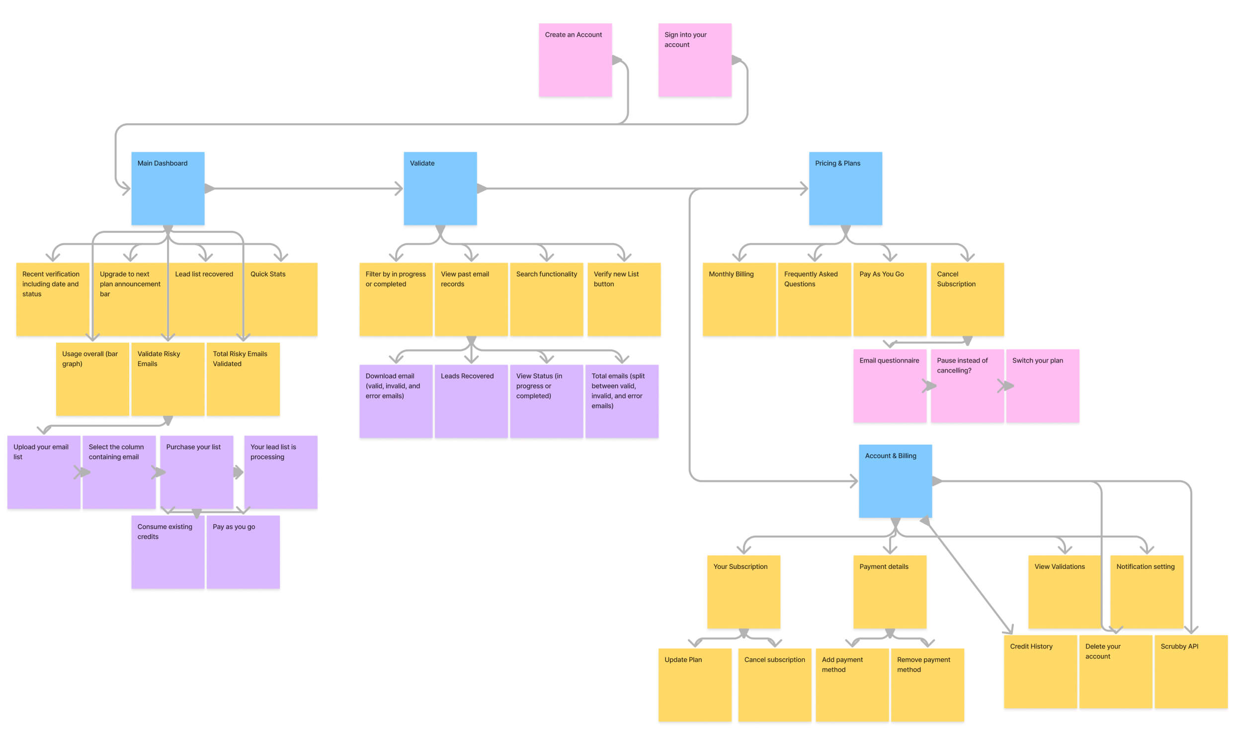
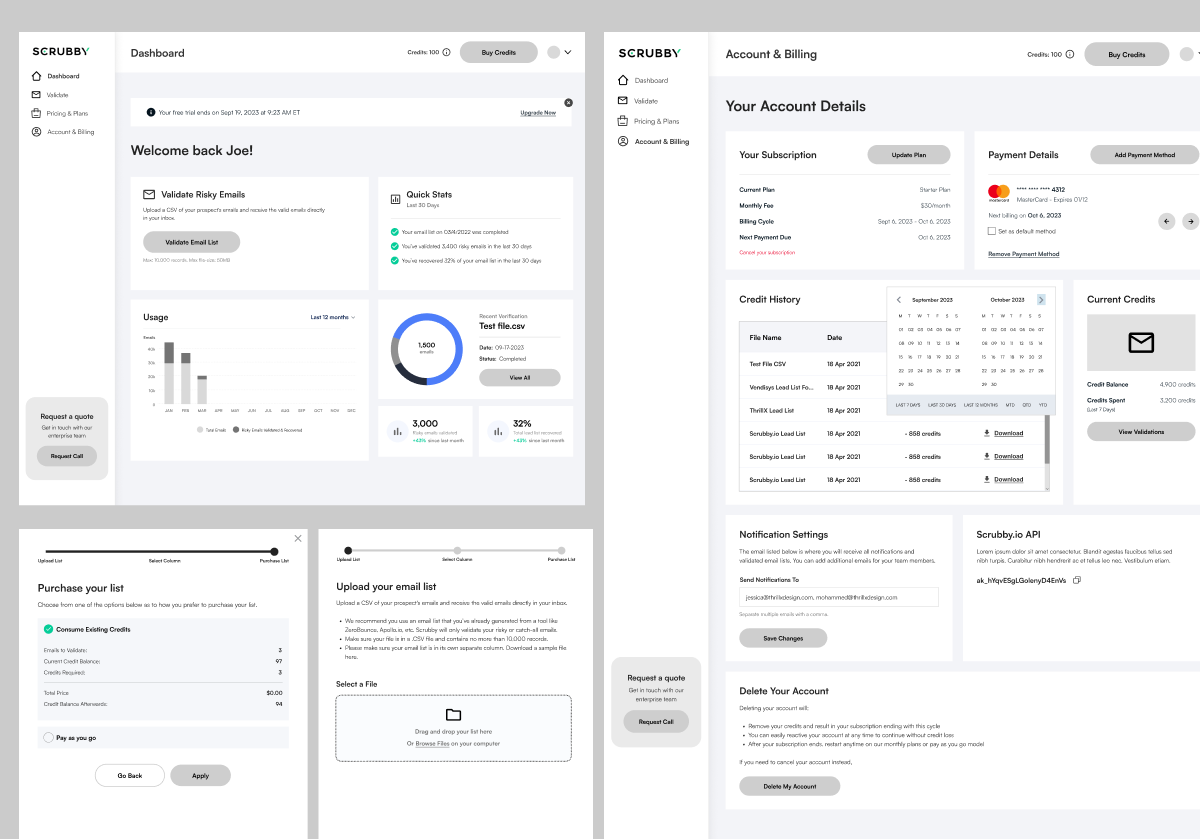
We completely reimagined the home dashboard experience. As soon as you land, you’re greeted with a personalized experience calling out your name (“Welcome back Joe!”) followed by a myriad of tailored stats. You’re presented with quick stats in the last 30 days, your usage to date to help users visualize the number of risky emails validated, and also the percentage of your total lead list recovered to date. This helps communicate the value prop of Scrubby and keeps users coming back. We also added a prompt to upgrade to the next plan at the top which helped to upsell customers and drive more revenue.
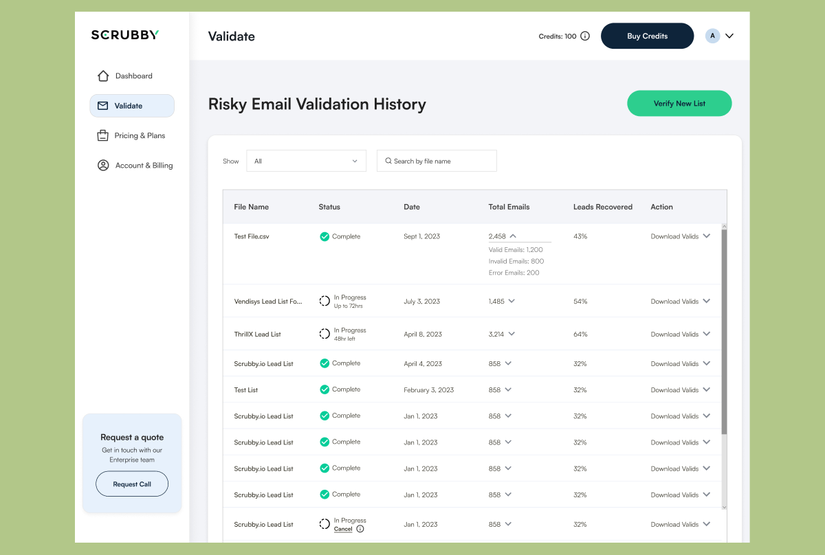
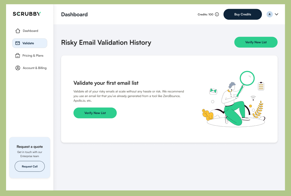
On the validation page, users are presented with a sleek and clean interface showing all of their past transactions, the status, and total emails / leads recovered. They are able to download past transactions and also verify a new list in the top right corner. One of the biggest improvements we made to this page was adding filtration options so users don’t have to scroll through thousands of entries.
The account and billing pages saw a massive uplift in terms of UX design as well as visual aesthetics. Users can see a snapshot of their current subscription, easily update or change their plan, and more.
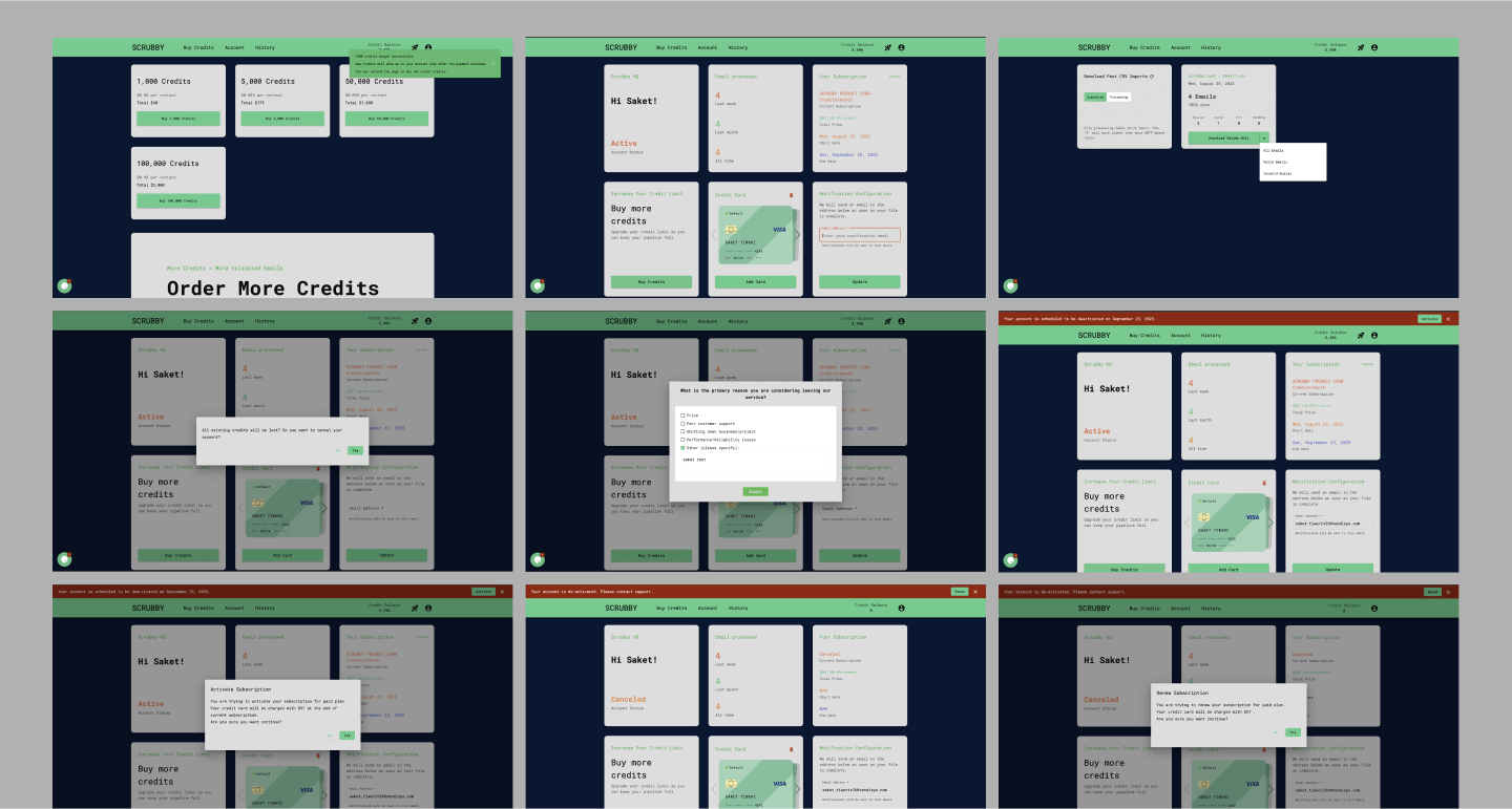
One of the most notable changes made was optimizing the end-to-end user flow of Scrubby, which validates emails. Major UX improvements include a progress bar at the top so users always know what stage of the journey they are in and helps guide them through the path, a clear two-option payment system that shows you your exact credit balance, and a gamified confirmation screen that gives you a sense of accomplishment.
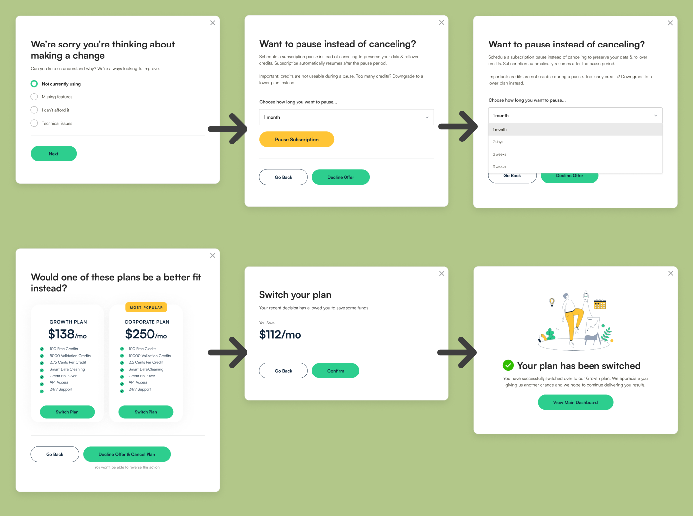
Just as important as the core user flow is creating a world-class cancellation flow that helps to make users reconsider but also collects invaluable data for the product team as to why people are leaving. Upon clicking cancel, users are presented with a survey asking them why they are looking to do so. This is followed by prompting users to pause their subscription instead to avoid losing all of their credits. If they choose not to pause, we offer them the option the option to downgrade their plan and a discount for doing so. Lastly, we have a clear confirmation screen that guides them on the next steps.