Smokeland is a CBD delivery service based in Oakland, California. We helped them with full-suite data-driven design, including conducting user tests, performing thorough heatmap analysis, and optimizing its UX end-to-end to drive substantial incremental sales.
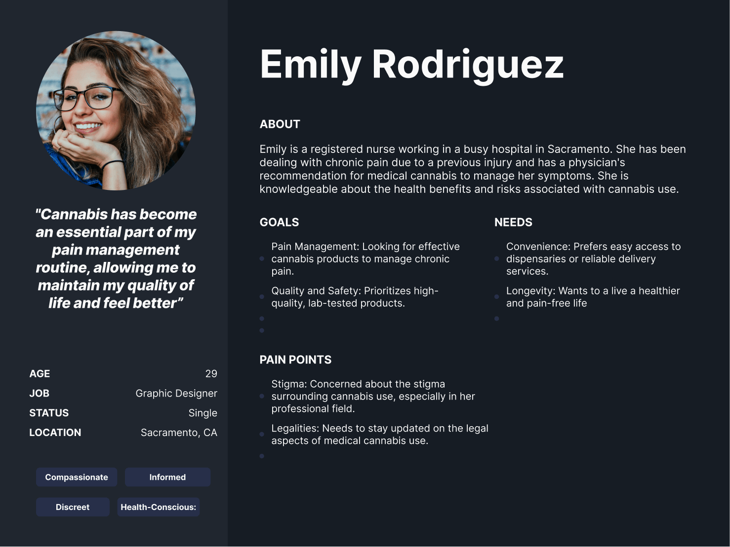
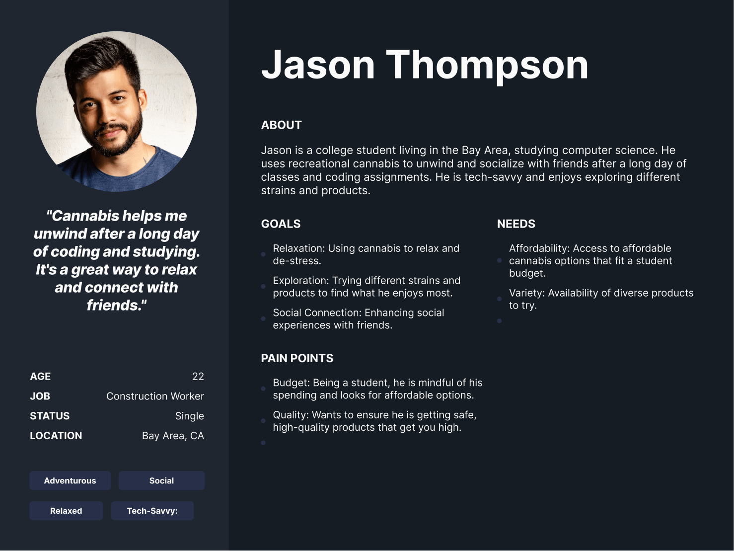
Smokeland already had an existing reputation for having the best prices in the industry with great customer service and quality. They mainly served the recretional cannabis market with several repeat and loyal customers. However, they wanted to branch out to a completely new market segment which was medicinal cannabis users as part of the project in addition to better serving their existing customer base. Our team went through a rigorous discovery phase interviewing several key stakeholders to understand the unique audience dynamics and crafting the relevant customer journey maps.
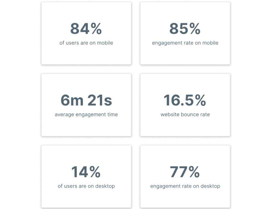
84% of users on Smokeland visited from mobile. Likewise, the average engagement time on the site was significantly higher than the industry average, with people spending close to a whopping 7 minutes on the site. This provided extremely helpful context, as users were very much in a “shopping” state of mind, looking through various options to find their desired product. We had to figure out a way to create a super-optimized user experience that helped them find their product as quickly as possible.
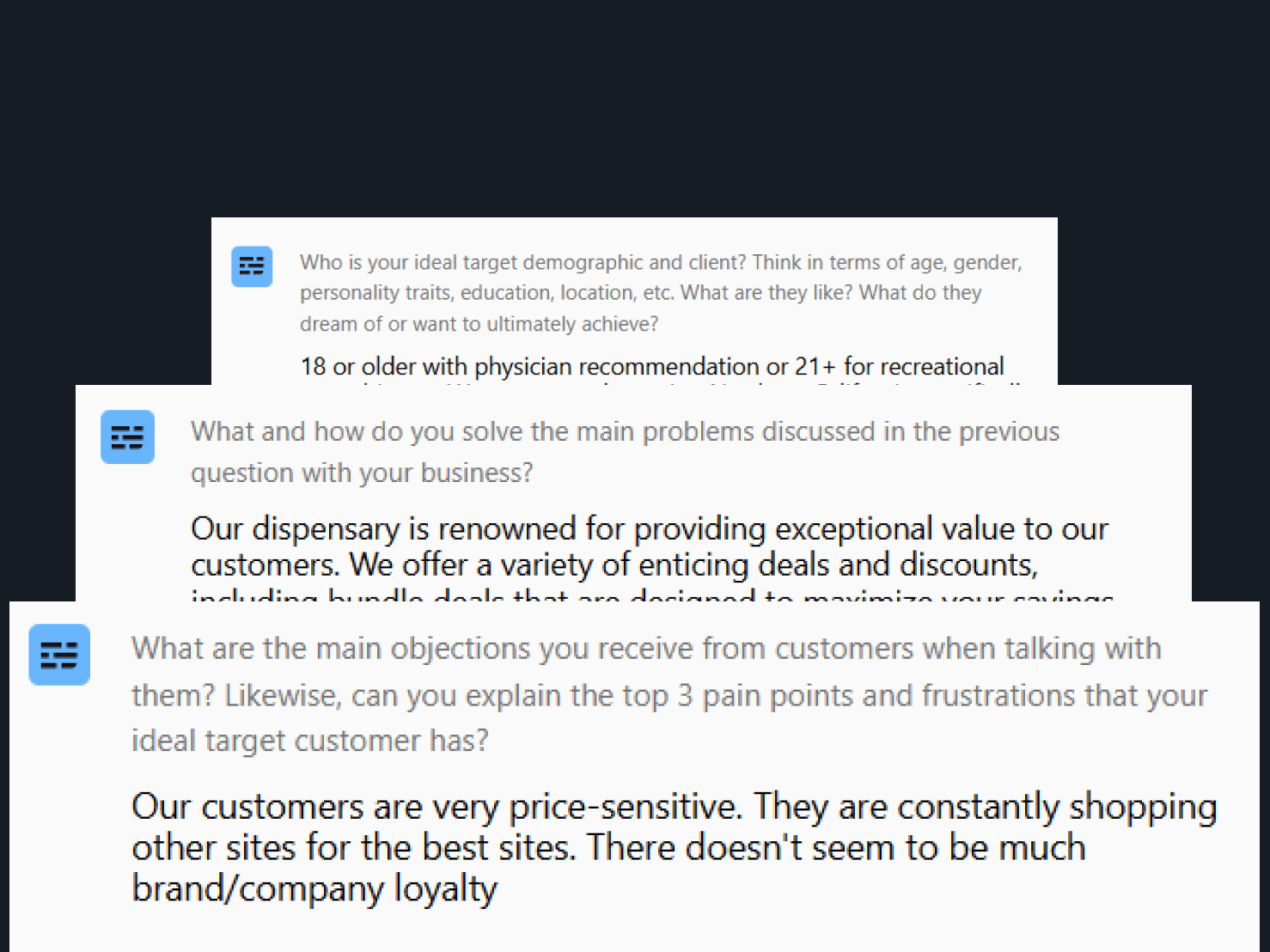
As part of our unique process, we actually interviewed Smokeland’s exact target demographic to collect direct customer feedback. We asked multiple questions, ranging from their first impressions of the site to actually getting them to complete a series of tasks such as finding specific products and going from cart to checkout. We identified a whopping 30-35 usability issues PER VIDEO that substantially informed our final design decisions. Some of these included overwhelming design, a lack of streamlined navigation, etc.
Our team analyzed hundreds of user recordings on the old website to identify usability issues as well as areas of opportunity. Some of the patterns observed included people having to constantly scroll up to switch between the on-demand and full menu, users experiencing frustration with their carts being fully cleared without warning when switching menus or filtering, etc.
The first several weeks of our engagement were purely dedicated to a deep-dive data audit. We set up a series of heatmaps, scrollmaps, and clickmaps on high-traffic pages to determine areas of opportunity to increase conversions.
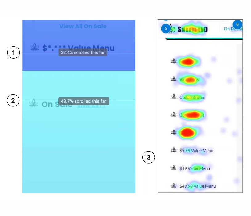
1) Only 32% of mobile
users scrolled down to access the value menu on the home page.
Given that Smoakland wanted to position itself as a value-focused brand, it was crucial to make these value menu items more visible to users to better align with the brand’s identity and goals.
2) Only 43% of users were reaching the “On Sale” items. Considering that Smoakland’s primary user base is price-conscious, we aimed to make these items more easily
accessible to users rather than burying them at the bottom,
ensuring they can readily find discounted items.
3) The value menu items,
including the $49 ounce, were not receiving many clicks on the
desktop version. Despite the side menu being easily accessible,
these options were located at the bottom of the list, which in turn was generally more likely to be overlooked by users.
1) Referencing the paradox of choice, we observed that both the product cards and above the fold section of the old website had an excessive number of options present. This led to users’ experiencing decision paralysis. We also heard directly from our user-tests that the section appeared overly cluttered and
required simplification to facilitate easier decision-making.
2) The product cards on the old website were crowded and had a significant amount of information
packed closely together. Furthermore, there was a noticeable absence of a clear hierarchy in the layout which is the process of strategically guiding users’ attention.
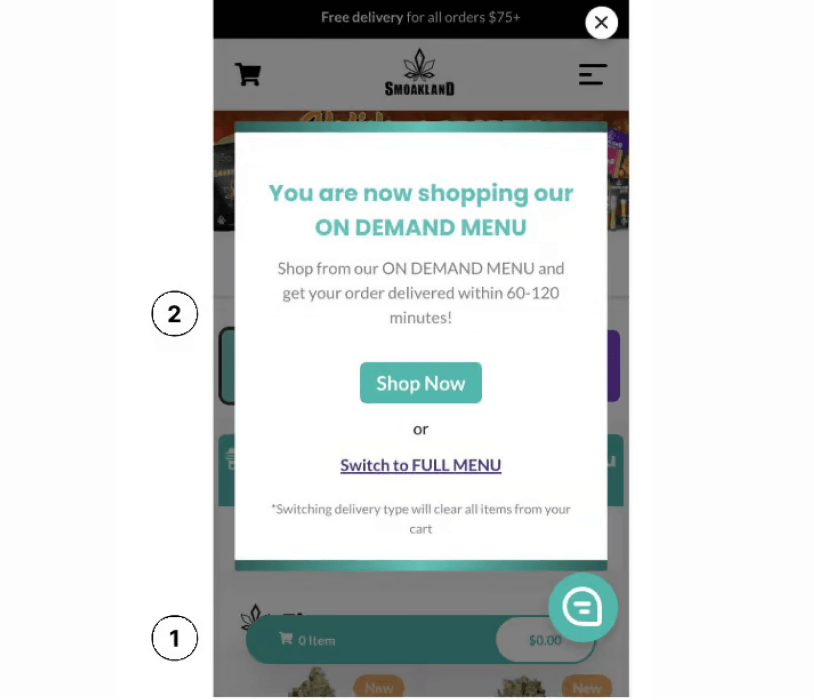
While conducting a heuristic audit of the site, we found that a user’s cart was entirely cleared when they clicked on the switch between the “On Demand” and “Full Menu” options. This deletion occurred without any warning and was highly frustrating for users, especially if a user had already spent a lot of time selecting items in their cart.
2) Although users got the message pop-up on the left, the switch to the other menu and the cart being deleted already happened whether or not they agreed to the switch or not. This is where effective copywriting and user experience are crucial to helping guide and inform the user.
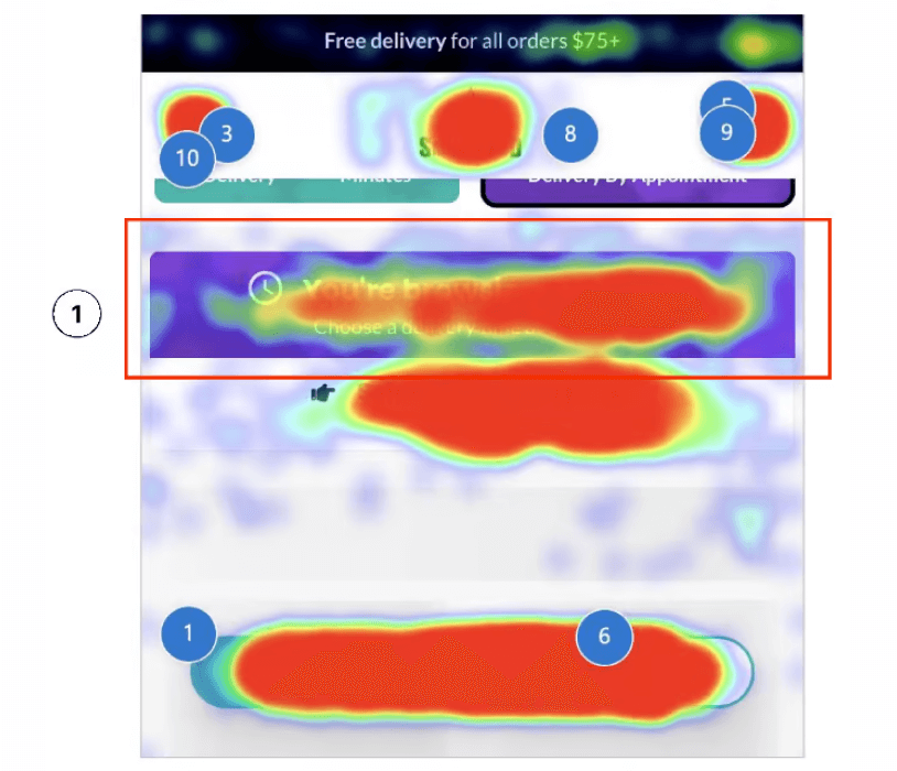
1) The “You’re Browsing Full” section in purple had the visual treatment and appearance of a button, when it was actually not clickable at all and was meant to be informational. As shown in the heatmap, this led to an extremely high frequency of clicks, which presented a major usability issue. We also saw recordings of users rage-clicking on this section in frustration.
2) Traditionally, on e-commerce websites, the cart is positioned on the left and the menu is on the right. However, on Smoakland, this arrangement was reversed. The hamburger menu ICON was located on the right, but the actual MENU popped up on the left when clicked, which proved to be disorienting for users.
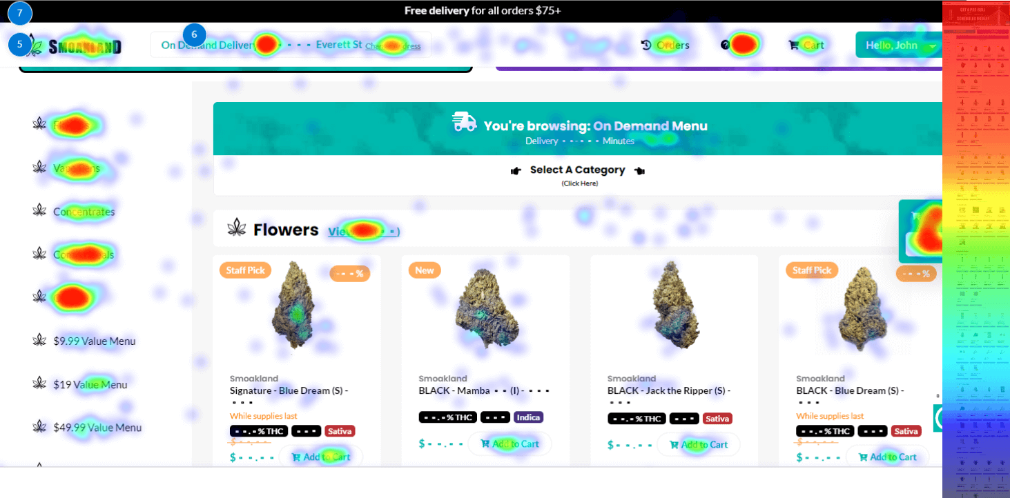
One of the simple quick wins we were able to achieve and that is often overlooked (or not even conceived as possible) by e-commerce companies is evaluating click map data on navigational items. Through this, we were able to evaluate what categories were getting the most clicks, which helped us quickly reorganize elements based on the most profitable and popular items that Smokeland wanted to sell to its customers.
Redesigning the Smokeland website was an extremely challenging task for our team, given the complexity of user flows and customer journeys. As part of our detailed discovery and research process, we analyzed several competitor websites as well as well-recognized delivery websites outside of the CBD space to help pull multiple inspiration pieces from a design, features, and user-experience perspective. We grouped each of these inspiration screenshots into buckets based on features and page type. This helped everyone align on a cohesive vision that integrated the best elements and user- experiences across various industries.
As part of the redesign process, Smokeland sought help refining its brand identity and visual aesthetic. We explored multiple color and typography combinations to help convey the brand values of quality, affordability, and value. We ultimately landed on a combination that balanced professionalism with a friendly personality.
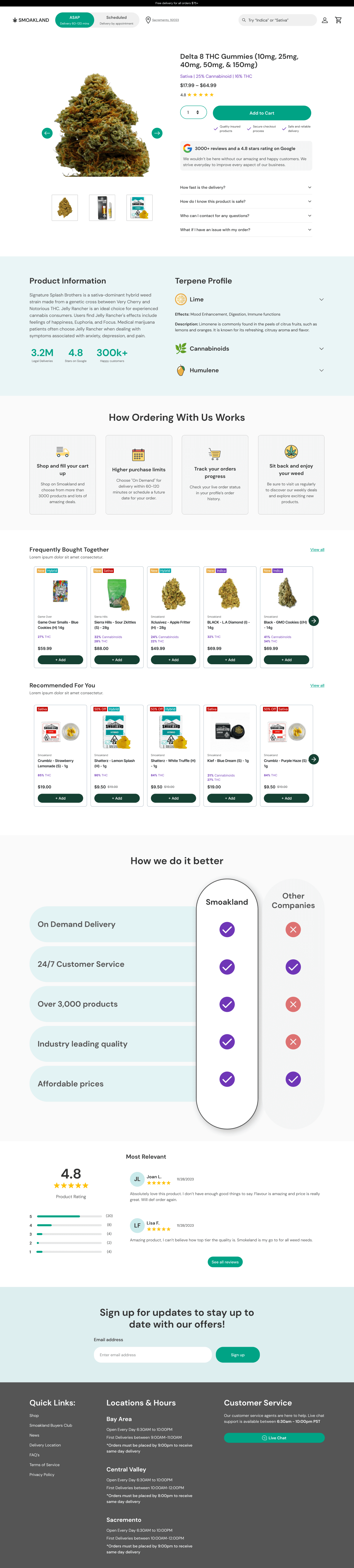
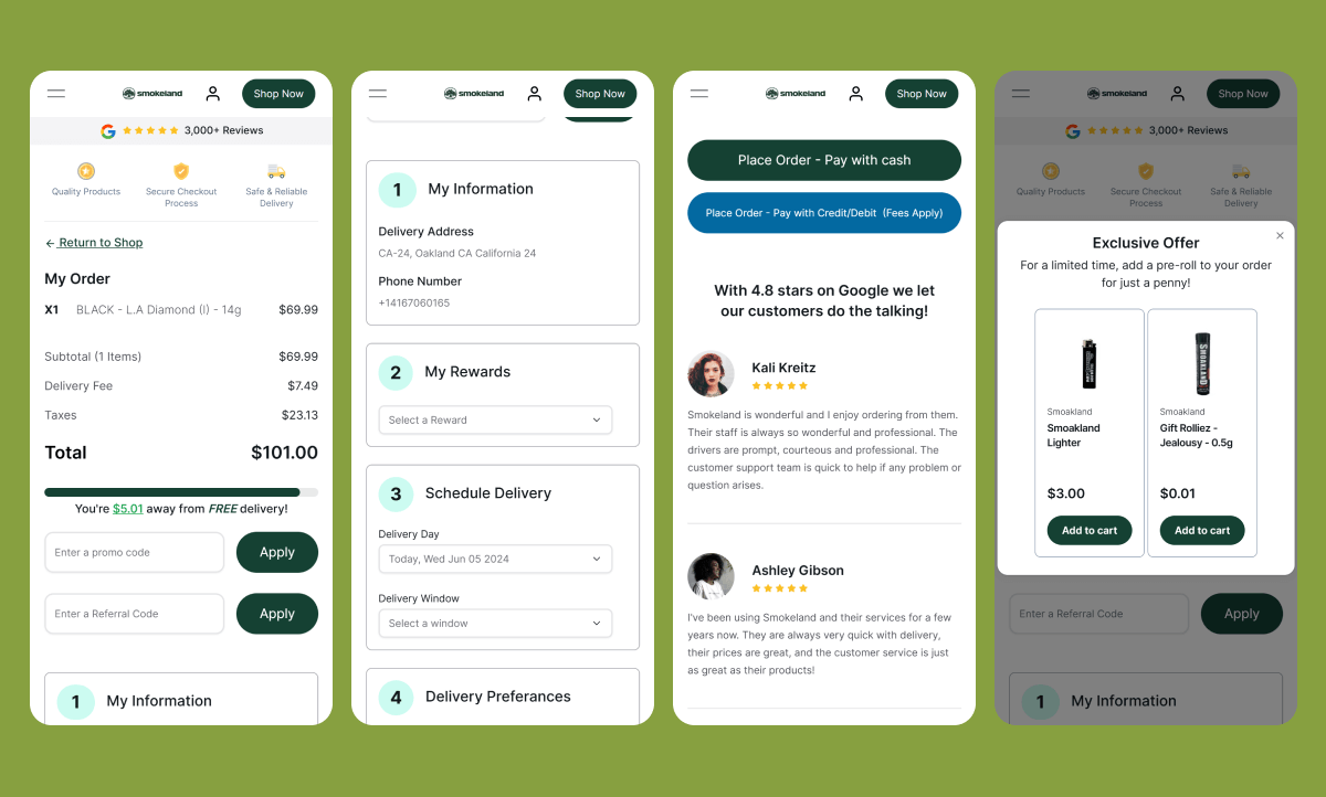
Smokeland’s old product page was bare bones and lacked many conversion-focused elements to motivate users to buy. We designed a hyper-optimized PDP, including a reduction of FUDs (fear, uncertainty, doubts) under the add-to-cart button, highlighting the 3,000+ reviews to build credibility and trust, and using comparison charts to clearly articulate the core value proposition. We also strategically placed recommended products and frequently bought-together items to help increase transactional value for each customer.
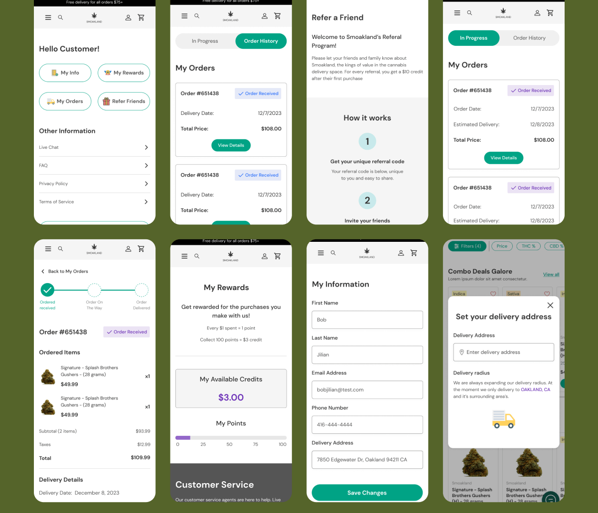
Given that Smokeland’s audience was primarily returning customers, the backend login and profile page were equally important to optimize from a UX perspective as the frontend shopping experience. We performed a thorough usability and heuristic audit on the old website to identify areas for more streamlined navigation. The revamped flow now allows users to seamlessly access and track past and upcoming orders, view their rewards points, and create an account within seconds.
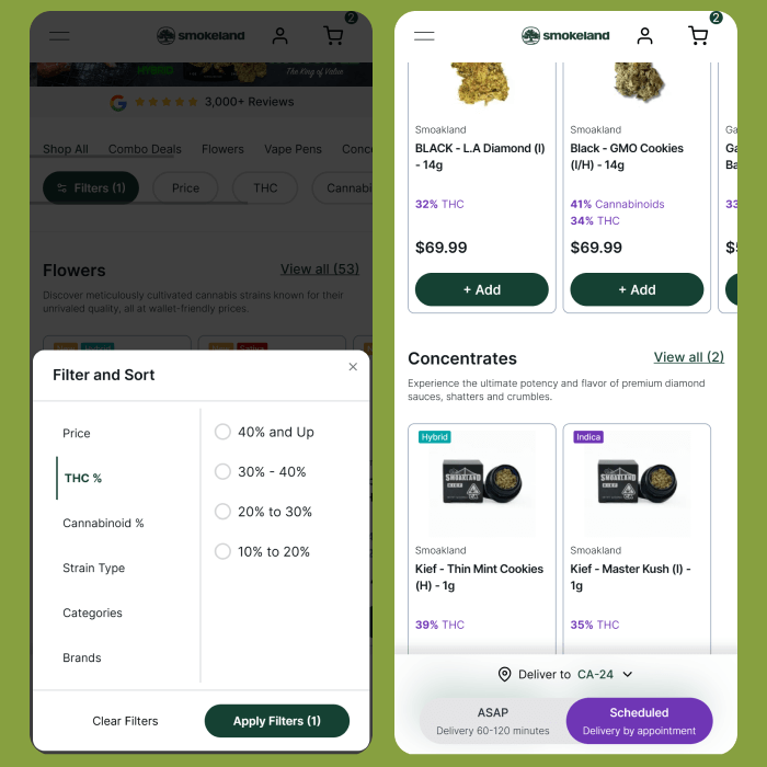
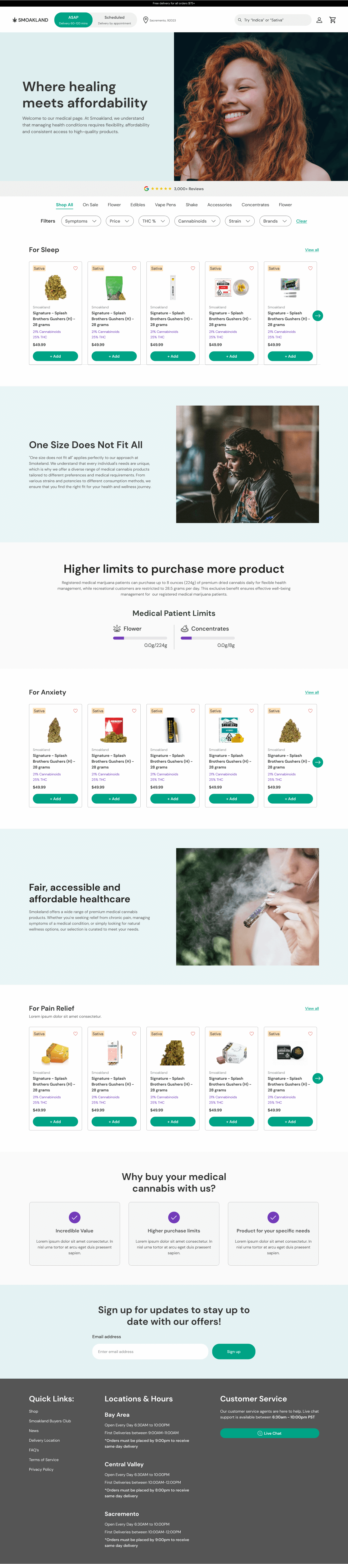
Since users spent a long time on the website, having streamlined filter navigation was essential. Users can now seamlessly filter and sort by price, THC%, cannabinoid%, strain type, and by brand, which was not possible ever before. Also, users are now able to quickly switch between the on-demand and scheduled menus on mobile with a sticky filter at the bottom of the screen, so they don’t have to constantly go up and down like on the old site.
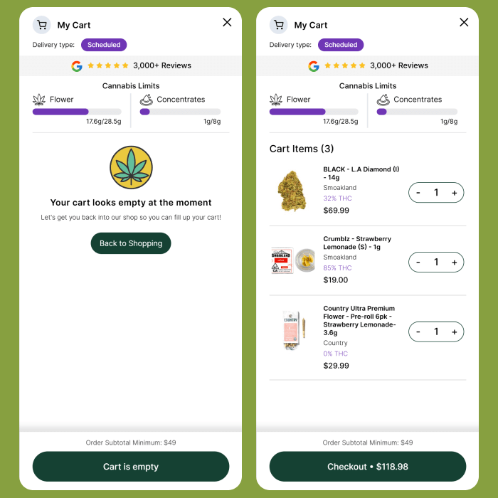
We completely revamped the sliding cart menu with several conversion-focused elements. It featured the 3,000+ brand reviews at the top to establish trust and push people over the edge to get to checkout, while also showing the products in the cart in a very clean manner. It also features the cannabis limits clearly at the top, which was a major pain point on the old site.
After spending all this effort getting people to checkout, we wanted to ensure that we weren’t losing users at this stage due to simple and fixable mistakes. We optimized the checkout experience from top to bottom with social proof, reducing FUDs at the top and bottom, guiding the user through the various steps they needed to complete by clearly numbering them, etc.
One of the more challenging yet interesting parts of this project for our team was creating a medical page for a brand new customer segment of medicinal cannabis users. Based on the deep empathy and customer journey maps we created, we helped craft a tailored experience for the medical page. We enabled users to filter by symptoms and organized products accordingly, categorizing items for sleep, anxiety, etc.