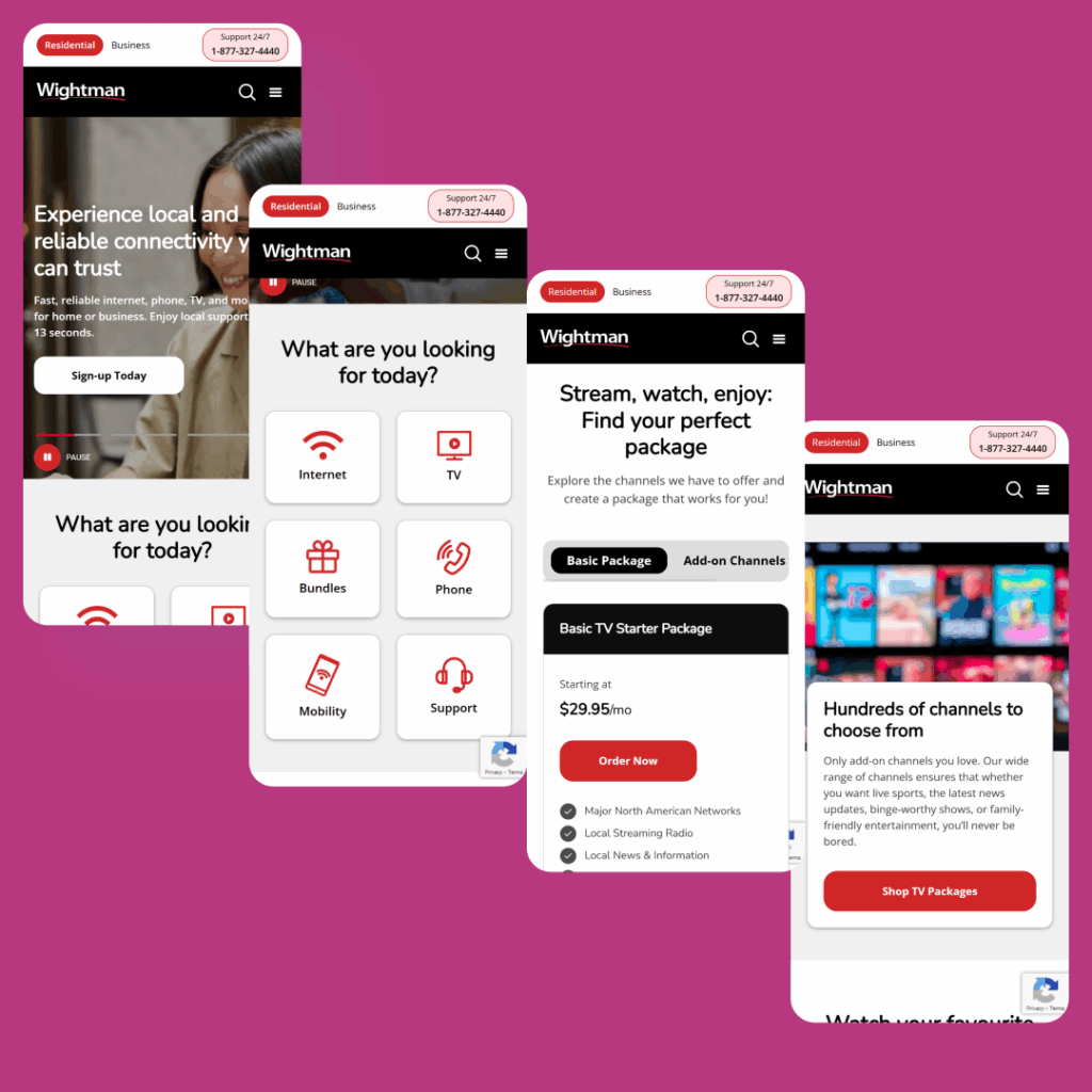
Wightman, a telecom company with over 100 years in business, approached us with an outdated website that made it difficult for users to navigate their TV, internet, and phone packages. We redesigned the site with a focus on clarity, usability, and conversion optimization, creating a seamless experience that positions them to scale their digital marketing efforts and drive measurable growth.
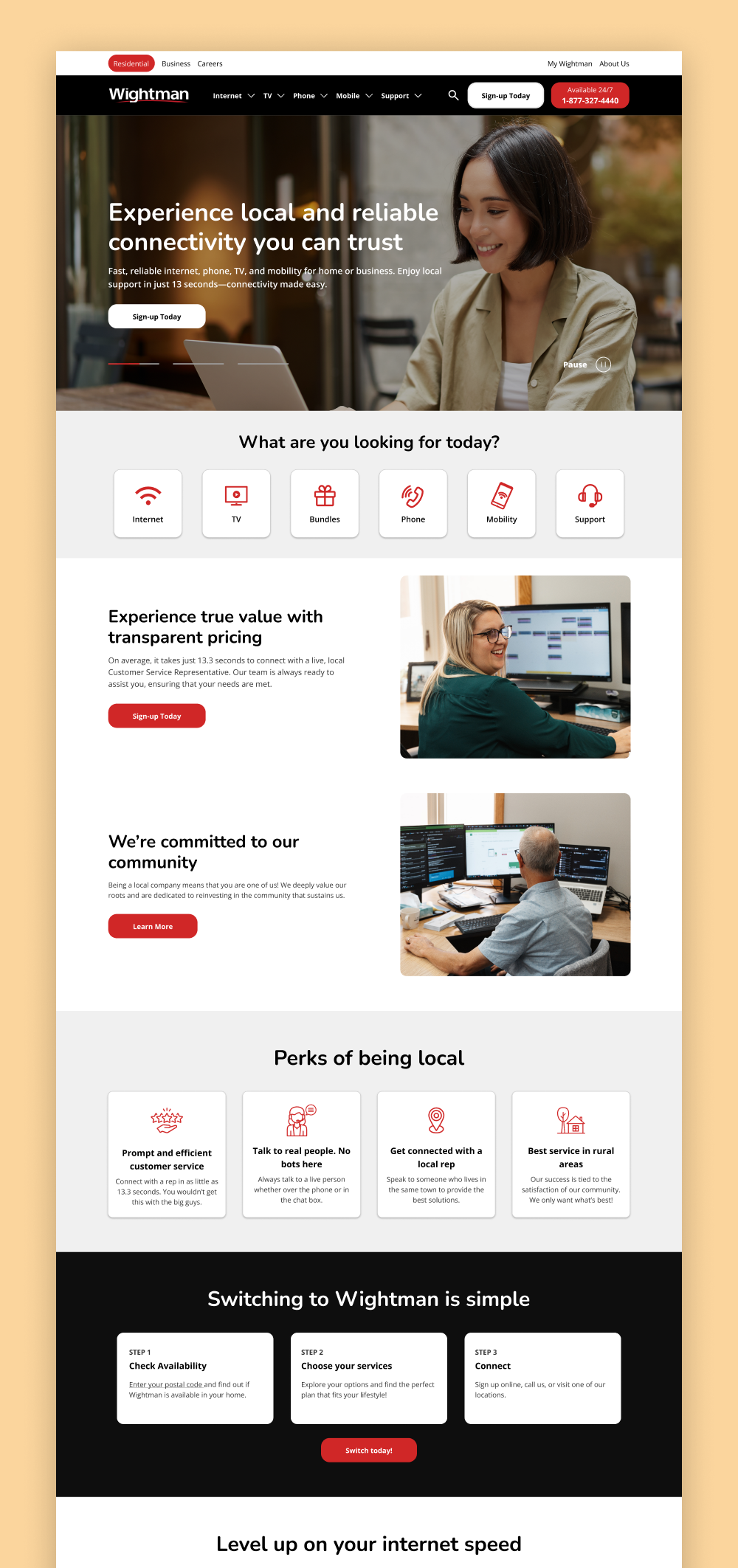
Wightman’s previous website and branding no longer reflected the company’s century-long legacy of trusted service or its growing role as a modern telecom provider across Ontario. While deeply rooted in community, the outdated design made it harder to connect with today’s digital-first audience. Wightman needed a fresh, approachable aesthetic that conveyed reliability, local warmth, and professionalism. We developed a clean visual identity that incorporated friendly visuals, warm tones, and intuitive layouts—creating a modern digital experience that stays true to Wightman’s community-focused values while supporting future growth.
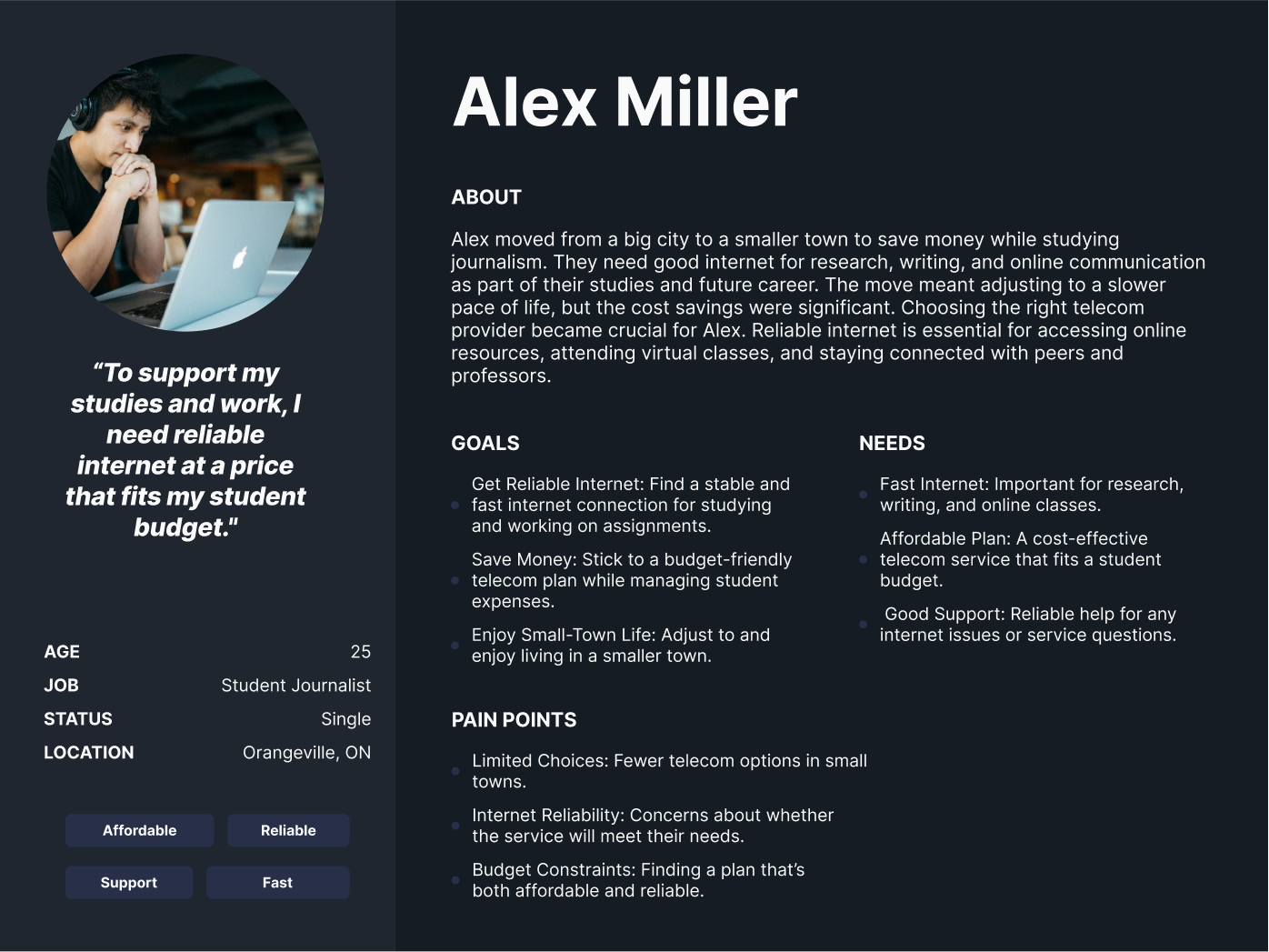
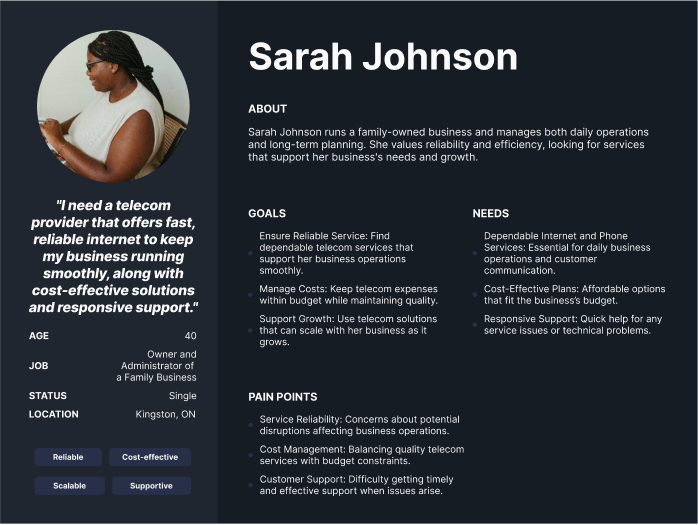
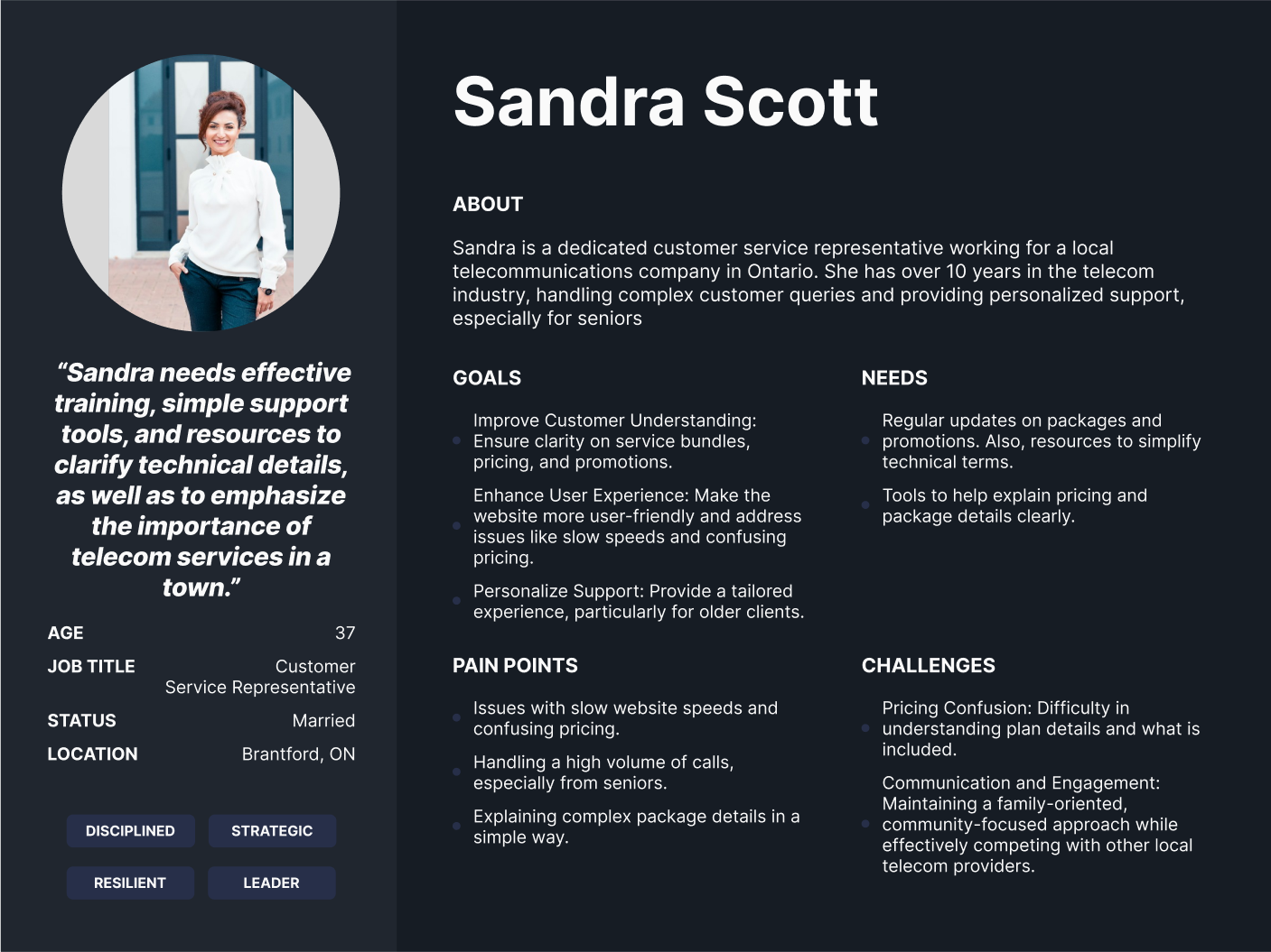
Wightman serves a broad audience—from older customers who value personalized service to younger, tech-savvy users who expect fast, self-serve digital experiences. They also offer business solutions for internet, phone, and TV, requiring distinct journeys for commercial users. Through stakeholder interviews and discovery sessions, we uncovered the needs of each group, helping us design a site that’s intuitive, accessible, and effective for every customer segment.
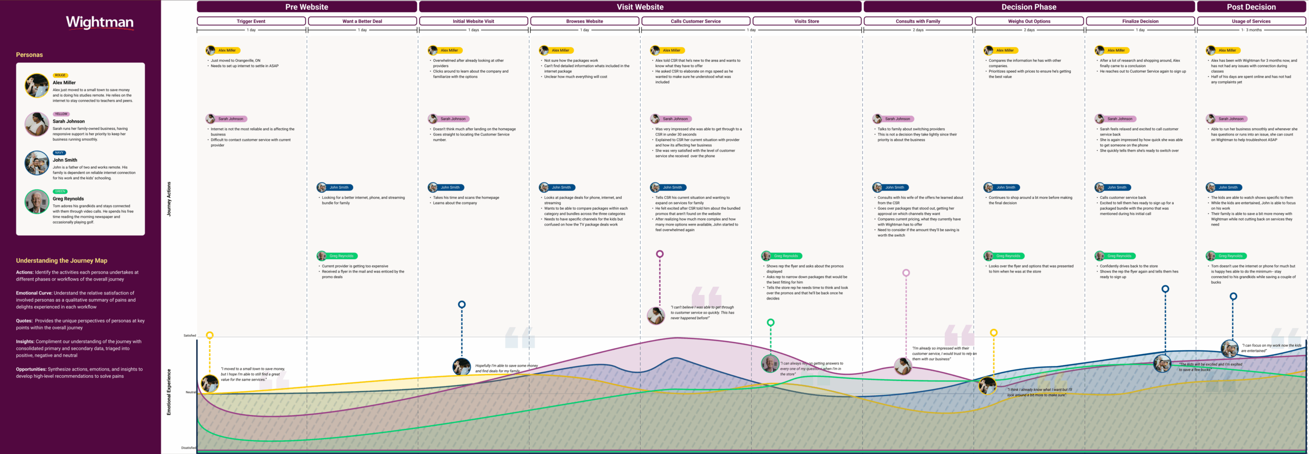
As part of our process, we created a detailed user journey map that outlined the emotions, needs, and pain points across each key stage—from the moment users became aware of Wightman, to browsing the website, making a decision, and post-purchase engagement. This helped us identify opportunities to build trust early, streamline decision-making, and ensure continued support after conversion.
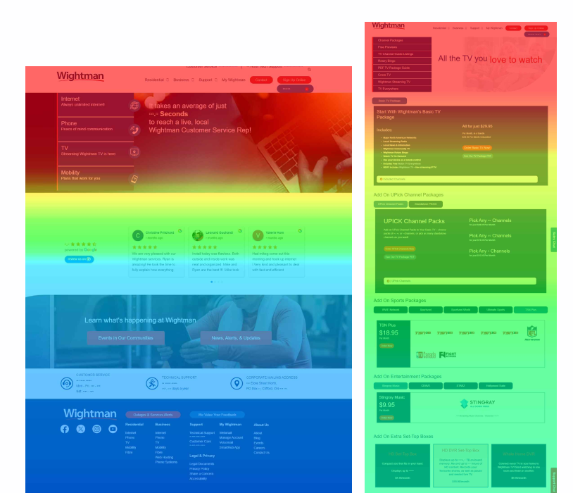
Before touching a single pixel of design or code, we analyzed Wightman’s website analytics to understand user behavior and engagement patterns. One key finding from the scroll map was that the majority of visitors weren’t scrolling past the fold—meaning critical information was being missed entirely. Combined with data on traffic sources and page performance, this insight helped us rethink content hierarchy and ensure the most important information was immediately visible and actionable to users.
We discovered through click maps that the key calls to action on Wightman’s site, particularly in the hero section, were underperforming. Very few users interacted with the “Get Started” button, while a large portion of clicks were directed at non-interactive elements, suggesting confusion or poor design clarity. Additionally, similar to the scroll map findings, we saw that around 70% of visitors didn’t scroll past the top fold. This pointed to a need for better placement of critical actions and more intuitive user flows to guide visitors through the journey.
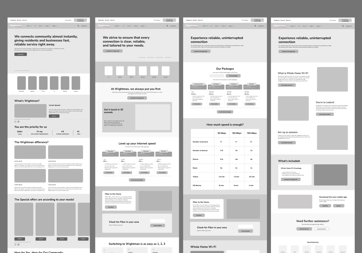
As we do for all custom design projects, our team created a rough mockup of the website in a prototyping tool first before it was developed. This helped The Lion Group team see the layout of the website at every stage and provide feedback iteratively. We also hosted weekly meetings with the team so they could see the mockups converted to full-fledged designs firsthand. It also enabled our internal design team to plan the information architecture, visual hierarchy, and overall design of the site quickly without getting too bogged down in the details, which are more relevant for the development phase.
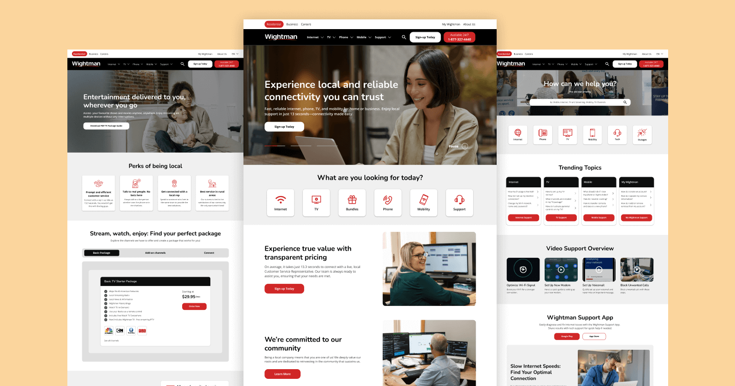
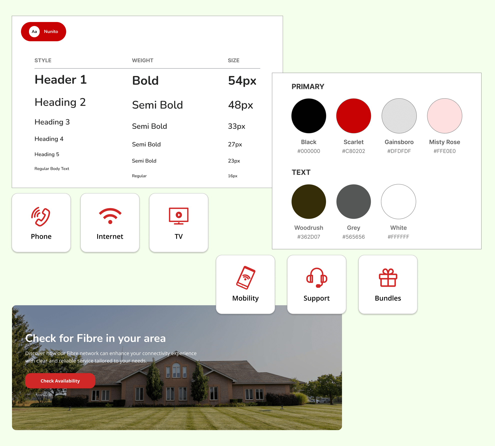
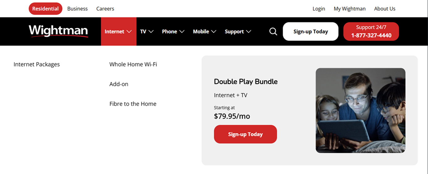
We focused on creating a streamlined navigation experience that clearly highlighted the main offerings: internet, TV, phone, mobile, and support. To ensure easy access for both residential and business customers, we included a secondary navigation menu that allowed quick toggling between these categories. We also catered to additional user needs by incorporating login, “My Wightman,” and career options in the secondary nav. Given the variety of services and products offered, we designed a mega menu to organize everything by category, ensuring users could easily find what they needed.
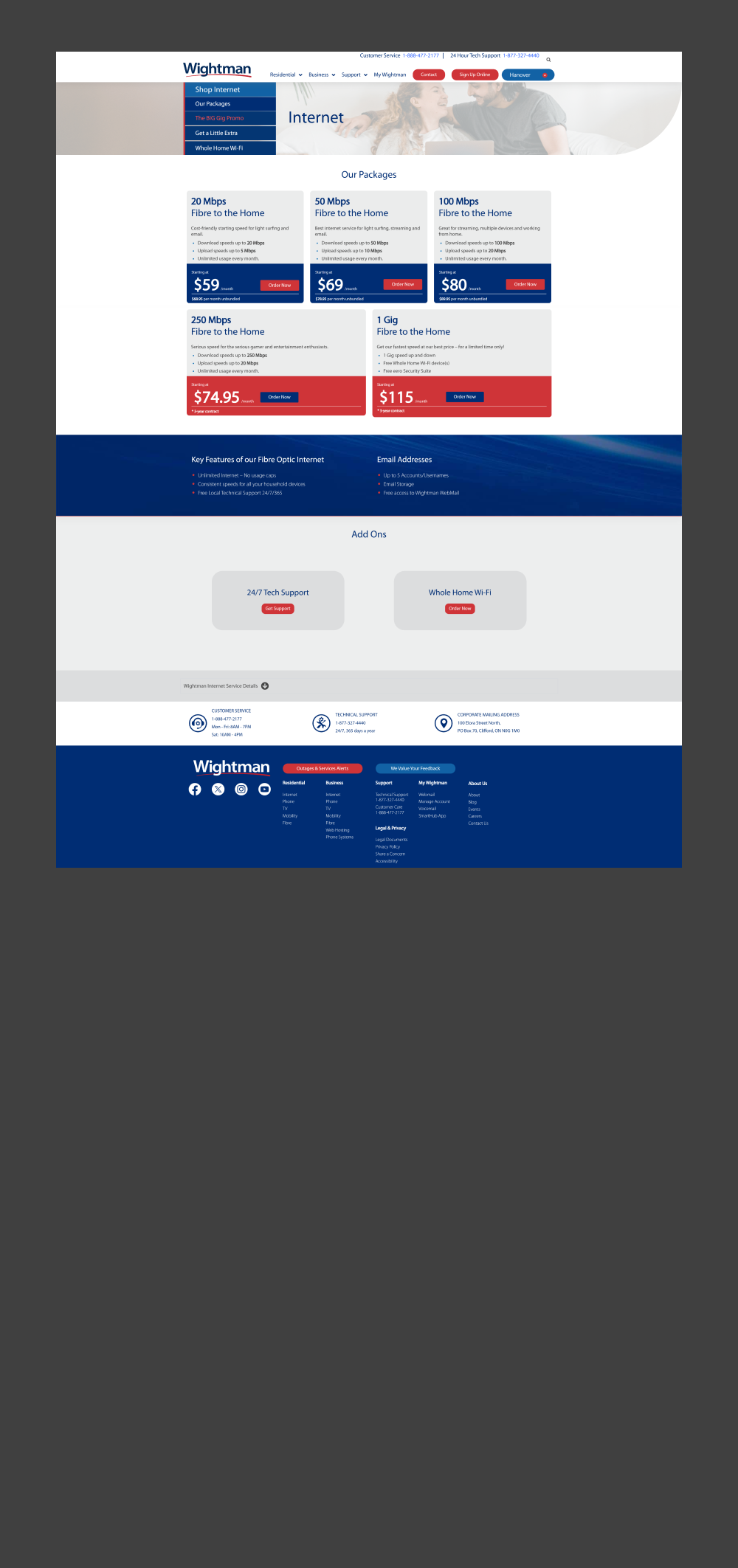
The internet packages section was one of the most critical and important services for Wightman, so we focused on creating a robust, user-friendly experience. We developed a backend system that tailored package options and pricing based on the user’s postal code, ensuring relevance and accuracy for each visitor. Each package was clearly labeled according to its category, with multiple selling points prominently displayed, making it easy for users to compare and choose the best option for their needs. This approach helped simplify the decision-making process and ensured that users found the most suitable package quickly and easily.
For the TV packages page, we created a seamless user experience that clearly displayed different package options, including details on add-on channels and what’s included. We also added a “Search Channels” feature, allowing users to quickly find specific channels and see their availability with Wightman. This made it easy for users to explore and customize their TV service options with ease.
For the internet packages page, we simplified decision-making with a clear comparison table—addressing a major confusion point from user interviews. Visitors could easily compare speeds, features, and pricing. We also included key value props throughout the page to help new users understand the benefits of switching to Wightman, like local support, reliability, and easy setup. Packages were personalized based on postal code for relevant, accurate options.
We completely transformed the support page into a true resource hub for Wightman customers. It now features quick link navigation, trending topics powered by backend data on top-viewed articles, helpful video content, and a comprehensive user guide section—making it easier than ever for users to find answers and support on their own.
With 40% of users viewing the website on mobile, ensuring the mobile experience was as good as the desktop was essential. We created mobile specific designs and style guides in Figma that made hand-off to our internal development team seamless.
To support Wightman’s growth, we built a website designed not just to inform—but to convert. From clear value propositions for first-time visitors to streamlined journeys for returning users, every element was crafted with performance in mind. The result is a digital experience that positions Wightman to attract and engage new audiences while supporting long-time customers with ease.


