
Helping WMDC more than DOUBLE its conversion rate
Wild Man Drinking’s leading product, “The Krak’in”, is the ultimate drinking tool for party goers. With its TikTok videos garnering millions of views and consistently reaching virality, they needed a high-converting website that was going to deliver results.
Connecting football fans with their favorite athletes
Optimal Sports is an L.A based football sports marketing firm working with some of the world’s best athletes and players. As their athletes started landing huge brand deals and endorsements, Optimal needed an e-commerce website to start selling merchandise. They required a custom membership portal where users can get access to exclusive perks and prizes such as monthly raffle entries, private Snapchat stories, and more.
Platforms
Web (Responsive)
Shopify
Roles
UX/UI Design
Digital Strategy
Icon/Illustration
Shopify Development
Deliverables
Responsive Web Design
Shopify Development
The Results
126%
Increase in conversions
41%
Increase in average order value
+57%
Increase time on page
Research and Discovery
Fiddler’s Green CBD sells premium products, and they needed a premium website to match. To do this, we redesigned the website utilizing a beautiful marigold yellow to elicit emotions of joy, happiness, and premium products. We complemented this with the brand color of a scarlet red for the call to action buttons to encourage users to make a prompt action, helping conversions. The branding and colors work seamlessly with the website copy and imagery.
Deep-dive into the current state
Prior to the redesign, Fiddler’s Green had a separate product for each strength variation of their CBD Tinctures. For example, they had 3 separate products for Tinctures which included a product for 750mg, 1500mg, and 3000mg. We discovered that users found this frustrating and not intuitive. We combined any products with different strength amounts into one single product which is shown on the left. Users can then select their desired strength and flavor through the radio buttons which is much more intuitive.
User tests (volume up)
During our strategy consultation with Fiddler’s Green, we discovered that their best selling product was their Tinctures which came in 3 different strengths. Similarly, we determined that one of Fiddler’s main value propositions is that they are able to offer triple the dose than competitors at a much lower price. We decided to combine these two aspects perfectly into a product slider on the homepage. The title reads “Triple the dose at a lower price” while users can physically switch through the various strengths and see the respective value prices in action.
User recordings and tests for qualitative feedback
Statistics and research show that animation and motion, when done correctly, can help significantly increase user engagement, comprehension, and ultimately lead to conversions. For these card designs on the left, we added animated icons to complement the copy which focused on benefits that users can receive such as better sleep, less aches and pains, etc. We noticed an increase in the scroll rate (how far people scroll down a page) and a decrease in the bounce rate from small changes like these.
Full Data-Driven Audit
Fiddler’s Green CBD sells premium products, and they needed a premium website to match. To do this, we redesigned the website utilizing a beautiful marigold yellow to elicit emotions of joy, happiness, and premium products. We complemented this with the brand color of a scarlet red for the call to action buttons to encourage users to make a prompt action, helping conversions. The branding and colors work seamlessly with the website copy and imagery.
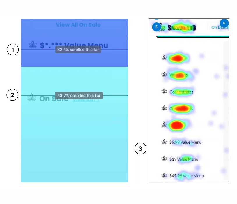
Value items being missed
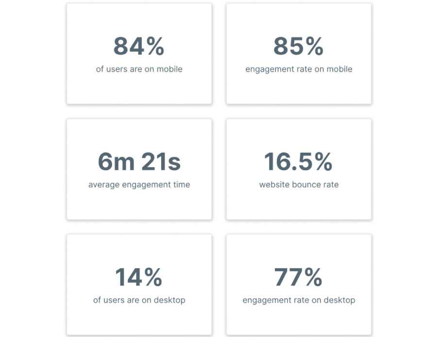
1) Only 32% of mobile
users scroll down to access the value menu on the home page.
Given that Smoakland is positioning itself as a value-focused brand, it’s crucial to make these value menu items more visible to users to better align with the brand’s identity and goals.
2) Only 43% of users are reaching the “On Sale” items. Considering that Smoakland’s primary user base is price-conscious, we should aim to make these items easily
accessible to users rather than burying them at the bottom,
ensuring they can readily find discounted items.
3) The value menu items,
including the $49 ounce, are not receiving many clicks on the
desktop version. Despite the side menu being easily accessible,
these options are located at the bottom of the list, and as per
best practices, they are more likely to be overlooked by users.

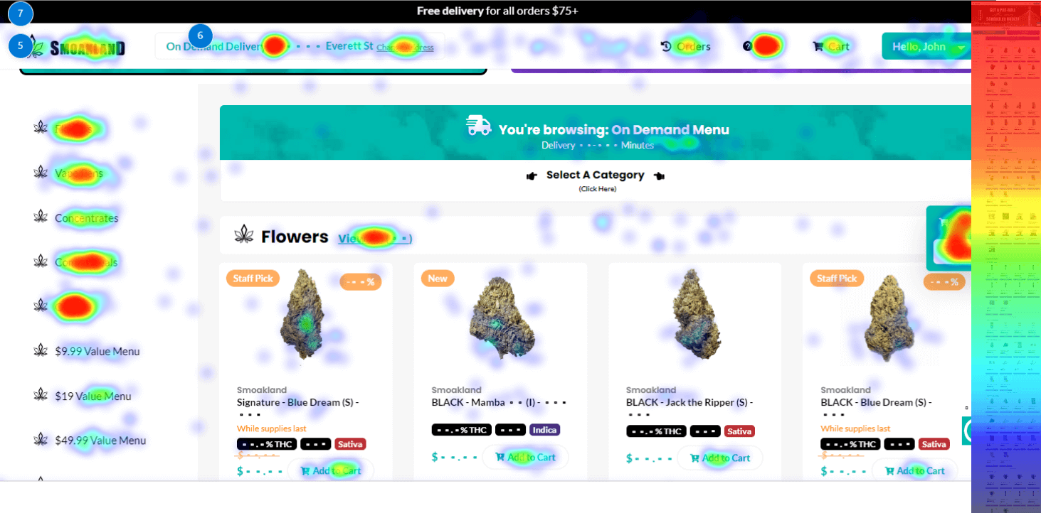
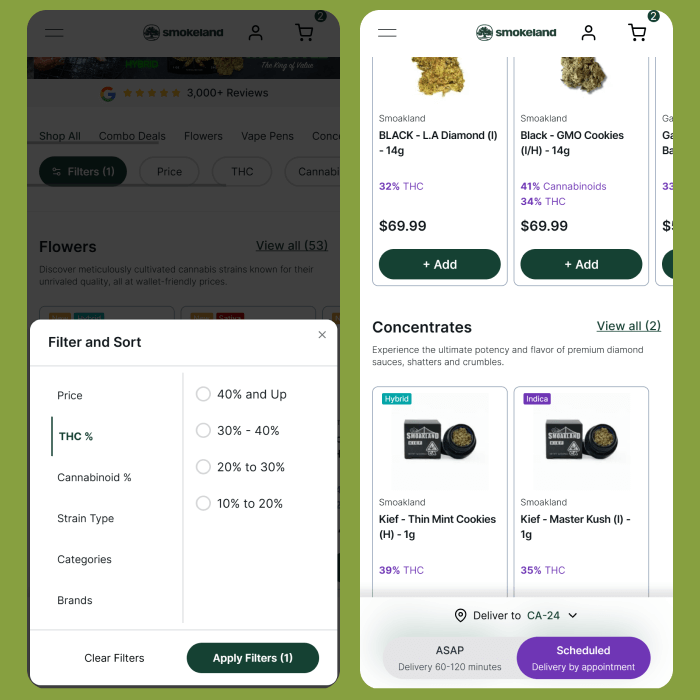
Crowded Sections
1) Referencing the paradox of choice, we observe that an excessive
number of options can lead to users experiencing decision
paralysis. Moreover, this section appears overly cluttered and
requires simplification to facilitate easier decision-making. Lastly,
there is a notable absence of hierarchy in the top section.
2) The cards are crowded with a significant amount of information
packed closely together. Furthermore, there is a noticeable absence of a clear hierarchy in the layout.

User recordings and tests for qualitative feedback
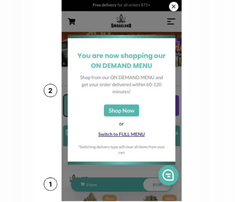
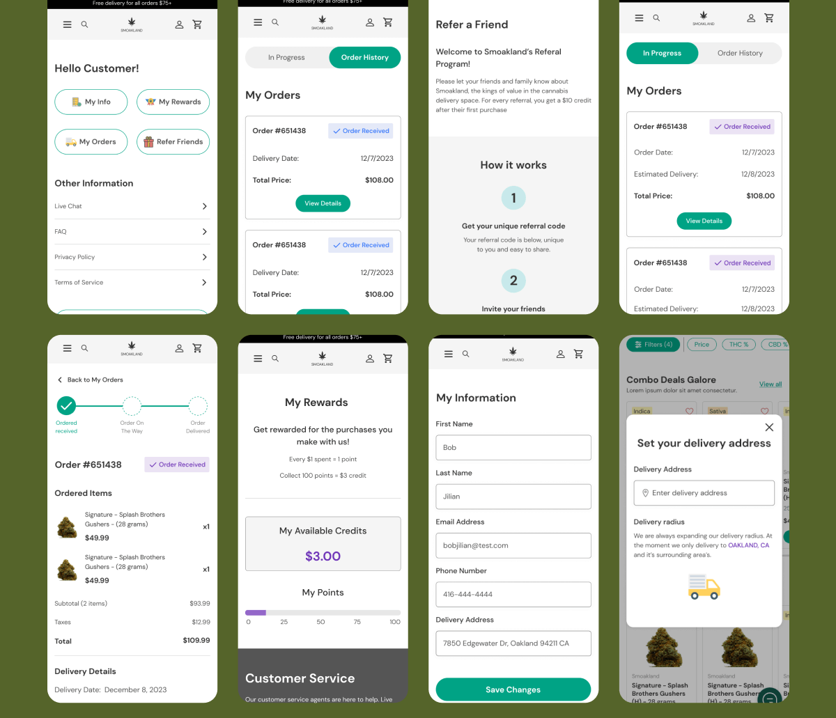
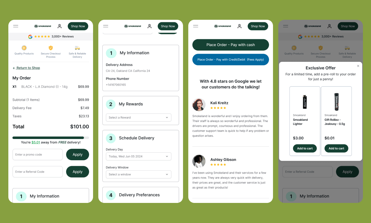
1) A user’s cart is entirely cleared when they click on the switch
between the “On Demand” and “Full Menu” options. This deletion
occurs without any warning and can be highly frustrating,
especially if a user has meticulously selected items in their cart.
2) Though users do get this message pop-up, the switch has
already happened. The switch to the other menu and the cart
being deleted happens whether or not they agree to the switch
or not.
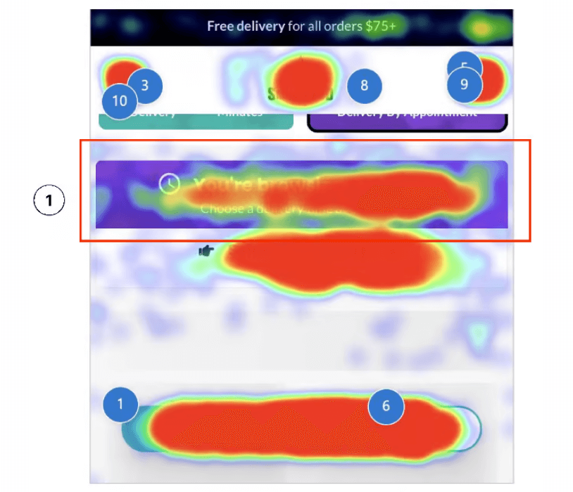
Crowded Sections
1) The “You’re Browsing Full” section has the appearance of a
button, which has led to frequent user clicks, as evident from the
Microsoft Clarity heat map. Additionally, in user recordings, we
have observed users rage-clicking on this section in frustration
2) Traditionally, on e-commerce websites, the cart is positioned on the left, and the menu is on the right. However, on Smoakland,
this arrangement is reversed. The “Hamburger” menu comes out on the left but is located on the right which can be disorienting for users.
Reorganization of content
Lorem ipsum dolor sit amet, consectetur adipiscing elit. Ut elit tellus, luctus nec ullamcorper mattis, pulvinar dapibus leo.
Inspiration Gathering
Optimal Sport’s homepage featured an interactive slider of all its athletes, several sections dedicated to explaining its membership program, and a quickly accessible best sellers product carousel. The page is full of high-quality shots of its athletes on the playing field.
Global Design System
Fiddler’s Green CBD sells premium products, and they needed a premium website to match. To do this, we redesigned the website utilizing a beautiful marigold yellow to elicit emotions of joy, happiness, and premium products. We complemented this with the brand color of a scarlet red for the call to action buttons to encourage users to make a prompt action, helping conversions. The branding and colors work seamlessly with the website copy and imagery.
Home and Product Pages
Optimal Sport’s homepage featured an interactive slider of all its athletes, several sections dedicated to explaining its membership program, and a quickly accessible best sellers product carousel. The page is full of high-quality shots of its athletes on the playing field.
Home
Optimal Sport’s homepage featured an interactive slider of all its athletes, several sections dedicated to explaining its membership program, and a quickly accessible best sellers product carousel. The page is full of high-quality shots of its athletes on the playing field.
CRO Optimized Product Pages
Optimal Sport’s homepage featured an interactive slider of all its athletes, several sections dedicated to explaining its membership program, and a quickly accessible best sellers product carousel. The page is full of high-quality shots of its athletes on the playing field.
Login and profile page
Optimal Sport’s homepage featured an interactive slider of all its athletes, several sections dedicated to explaining its membership program, and a quickly accessible best sellers product carousel. The page is full of high-quality shots of its athletes on the playing field.
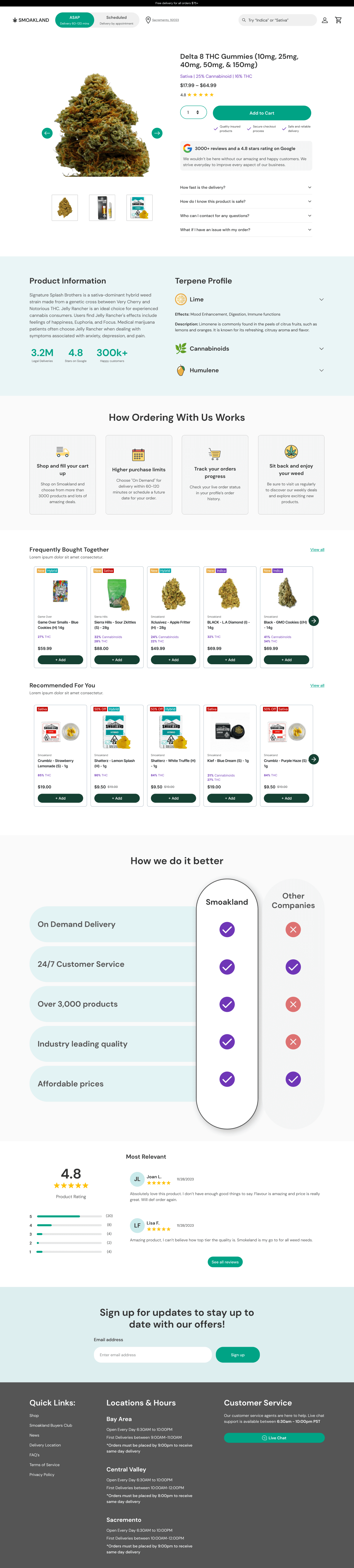
Filter
1) Only 32% of mobile
users scroll down to access the value menu on the home page.
Given that Smoakland is positioning itself as a value-focused brand, it’s crucial to make these value menu items more visible to users to better align with the brand’s identity and goals.
2) Only 43% of users are reaching the “On Sale” items. Considering that Smoakland’s primary user base is price-conscious, we should aim to make these items easily
accessible to users rather than burying them at the bottom,
ensuring they can readily find discounted items.
3) The value menu items,
including the $49 ounce, are not receiving many clicks on the
desktop version. Despite the side menu being easily accessible,
these options are located at the bottom of the list, and as per
best practices, they are more likely to be overlooked by users.
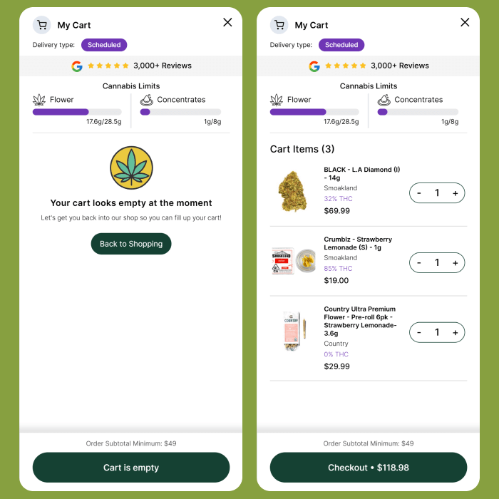
Slliding cart
1) Referencing the paradox of choice, we observe that an excessive
number of options can lead to users experiencing decision
paralysis. Moreover, this section appears overly cluttered and
requires simplification to facilitate easier decision-making. Lastly,
there is a notable absence of hierarchy in the top section.
2) The cards are crowded with a significant amount of information
packed closely together. Furthermore, there is a noticeable absence of a clear hierarchy in the layout.
Optimizing checkout
Lorem ipsum dolor sit amet, consectetur adipiscing elit. Ut elit tellus, luctus nec ullamcorper mattis, pulvinar dapibus leo.
Medical Page
We categorized and separated Optimal’s products by athlete due to the nature of their audience wanting to purchase merchandise specifically for their favorite athlete. The product page featured a user-friendly filter menu to sort through the products.
Helping Optimal scale its digital marketing
The average person would look at the new Fiddler’s Green website as just a visually aesthetic interface. But what they don’t see is the multiple hours put towards strategy, world-class UX, and an optimized shopping experience that allows Fiddler’s Green to uniquely position itself in the marketplace like never before.
Scale your business faster with proven strategies
Whether you need help developing your first MVP, proceeding from concept to financing, building a website or digital product, or scaling your business, we’ve got you covered. Get in touch and we’ll show you how we can help you reach your business goals.