
How Effective Website Messaging Can Skyrocket Your Conversions
Have you ever gone on a website recently where after scrolling for 20-30 seconds, you have absolutely no idea what the company does, what services/products they offer, or what value they actually provide to you (what’s in it for me?).
They are missing a lack of crystal-clear messaging on their website which is costing them thousands of dollars.
And chances are, you’re probably making the same fatal mistake.
You’ve put in lots of time and/or money towards your website already. It would be devastating if no one understood what your business actually does and exits your site as a result.
We see it all the time at our agency. Businesses like yours invest thousands of dollars into their marketing budgets whether it’s Facebook/Instagram Ads, SEO, Social Media Marketing – you name it. But when we go and check their analytics and data, they’re converting all the traffic at very low or average numbers.
Thankfully, we are here to help you avoid these errors. We’ve shared several data-driven strategies below that we’ve personally used on our client’s websites and have managed to double and even triple conversion rates.
How to Implement Crystal Clear Messaging on Your Website
Messaging on your website is simple. We like to use a 3-step proven formula. You want to make it crystal clear:
1) Who you are
2) What it is you do
3) Why you do it better than anyone else (also known as the value you provide to users)
You’re probably thinking, okay, I mean isn’t that obvious? Well, here’s the catch.
You need to be able to do all of this in 7 seconds or less, typically within the hero section which is the top-most area of any website that users first see upon landing.
That’s how long statistically you have to make a positive first impression on a user entering your site before they exit. Combining that with the fact that the average user only spends 15 seconds on average on your website, we can’t stress how important it is to get this principle right.
Let’s break down each step and go through some examples to help illustrate this for you:
Step 1 of Crystal-Clear Messaging on Your Website) Who you are:
Ever been approached by a friend or family member who hears about your business for the first time and asks you what it’s all about? Do they understand immediately within a sentence or two, or do you have to explain it further for them to understand? Ideally, it should be the former.
You have to start treating the top hero-section of your website in the same way – like an elevator pitch. Make it crystal clear what your business is about and clearly communicate the value you create for your end user. Many people overlook this as simple as it sounds.
Want to have some fun? Ask your friends/family or even your ideal target market if accessible to go on your website. After 7 seconds, ask them what your company does. If they don’t have the answer, you need to revisit your homepage hero-banner copy.
Let’s take a look at Aspire.io. Right off the bat, I know that Aspire is an ‘influencer marketing platform for high-growth e-commerce brands’ as indicated in their sub-copy.
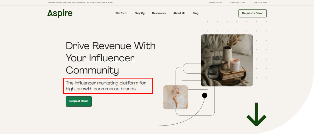
Crystal-clear website messaging, no questions asked. They have communicated to me exactly who they are and who their ideal target user is.
Not in 3 sentences. Not in one giant paragraph.
Just one clear sentence.
Another great example is Fitness Blender.
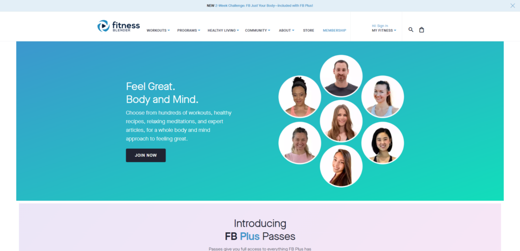
Immediately, at the very top of the website, I know that they are a Fitness application that allows me to ‘choose from hundreds of workouts, healthy recipes, relaxing meditations, and expert articles.’
Boom. Crystal-clear website messaging in one sentence that tells me who they are.
In order to start implementing this step, just imagine yourself again in the situation of talking to a friend or family member. How would you explain your business to them in one or two sentences?
Then it’s just a matter of translating that over to your website hero header copy.
Step 2 of Crystal-Clear Messaging on Your Website) What it is you do:
This is often confused with Step 1. The main difference is that Step 2) focuses on a deeper explanation of who you are. For example, if you provide accounting software for your users, what does that software specifically entail? Maybe it’s automated spreadsheets or software that allows you to file your taxes with the click of a button.
If you provide snow-shoveling services, questions to answer would be what locations you serve, how quickly does your service take, what are the logistics and operations?
These are questions that users may potentially have and so it’s important to have them clearly communicated at the top of your website
Example 1)
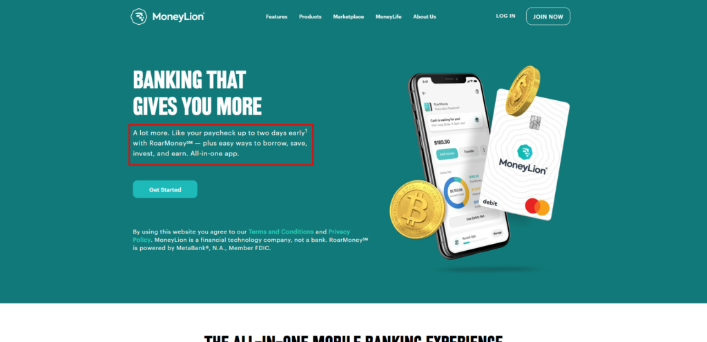
Money Lion answers the question of ‘who you are’ by mentioning an ‘all-in-one’ banking app within their sub-text. Then to answer the question of ‘what it is you do’, they mention ‘easy ways to borrow, save, invest, and earn’. This is explaining in more detail the ‘who’ aspect of their company.
Example 2)

In order to start implementing this strategy, take a notepad + pen and start jotting down all of the ideas that come to your mind about your business. You want to take only the most important pieces of information that are relevant and impactful for your end user.
Step 3 of Crystal-Clear Messaging on Your Website) Why you do it better than anyone else (also known as the value you provide to users)
This is arguably the most important step that I see 99% of people forget to include at our agency. How many times have you gone on a website and been presented with the information you don’t really care about?
I know that I personally scream out of frustration in my head asking the question of ‘what the heck is in it for me’?
We live in a competitive landscape. No matter how great you say your product or service is, customers want to know quickly and efficiently what makes it different from other competitors in the market.
What value are you providing to your user? What is the tangible benefit they are receiving from your product or service? Are they saving time, saving money, feeling better, feeling more empowered?
Whatever the unique selling point is for your business, it needs to be clearly communicated at the top of your website immediately upon a user landing on it. Let’s go through some examples.
Example 1 of a Poor Website:
An example (that many will resonate with) is this travel agency website. They tell me at the very top of the website that they’re ‘The most impressive travel agency around just ask our clients’. But what actually makes you the most impressive travel agency?
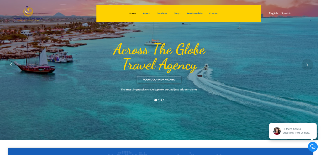
They’ve provided no context to me as a user as to what value they provide or what separates them from other travel agencies in the market. Is it faster service? Is it better prices or deals?
That value proposition needs to be communicated clearly on the website.
For example, they could say ‘The most impressive travel agency providing world-class service and unbeatable deals.’
Example 2 of a Poor Website:
This example may surprise people because FreshBooks is actually a very large and successful enterprise. But unfortunately, they still fail to incorporate the ‘what’s in it for me’ aspect in their header copy. The only reason they get away with it is because of how large and reputable of a company they already are in the industry.
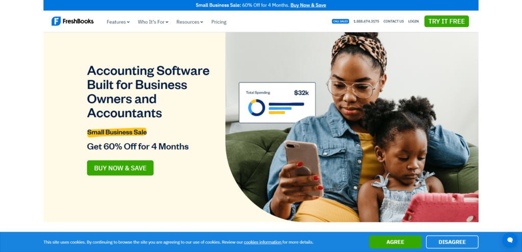
Although they answer the question of ‘who you are’, they fail to provide the actual value that I get as a user. What makes their accounting software different? Is it improved efficiency? Is it faster processing?
If I scroll down the page, I can find more information about the value they provide. But that doesn’t matter and it’s pointless.
Why? Because it’s not at the very top of the website where it needs to be communicated. Remember, the average person is only going to spend 15 seconds on your website at most, so you need to maximize every opportunity to keep users engaged and prevent them for exiting the site by implementing the value you provide at the very top, not further down the page.
Example 1 of Crystal-Clear Messaging on Website: Neuro
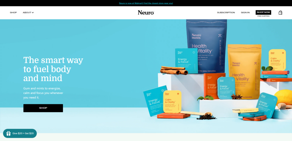
Right off the bat upon landing on the Neuro website, they use the 3-step formula mentioned previously. We know immediately:
1) Who you are:
Neuro is an e-commerce company offering several products as shown in the high-quality image.
2) What it is you do:
Neuro offers ‘gums and mints’ as indicated in the sub-copy.
3) Why you do it better than anyone else (also known as the value you provide to users)
Neuro helps you ‘fuel your body and mind’ as well as ‘energize, calm, and focus you whenever you need it’. That’s the tangible benefit and value I receive as a user and answers the question of ‘what’s in it for me’.
Notice how Neuro is able to establish this messaging in 7 seconds or less. They don’t have a long header and several paragraphs of sub-text just to explain their business.
Instead, they have brilliantly prioritized the most important selling points of their product into short, easy-to-understand copy that resonates with their target audience.
Example 2 of Crystal-Clear Messaging on Website: ExtensisHR
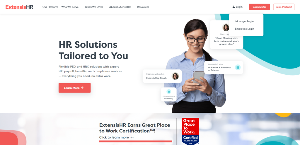
Let’s use our 3-step framework once again.
1) Who you are:
I know immediately that Extensis provides tailored HR solutions.
2) What it is you do:
ExtensisHR offers ‘flexible PEO and HRO solutions with expert HR, payroll, benefits, and compliance services.
3) Why you do it better than anyone else (also known as the value you provide to users)
ExtensisHR offers ‘everything you need, no extra work’. That’s the actual value that I’m receiving as a user.
It’s the time aspect. The convenience of managing everything in one central spot. This is going to motivate me as a user, statistically, to further scroll down the page and engage with the website.
Example 3 of Crystal-Clear Messaging on Website: RyDan
Example 3 is actually a website that we designed for one of our clients, Rydan Private Lending. They clearly communicate their value proposition in 7 seconds or less.
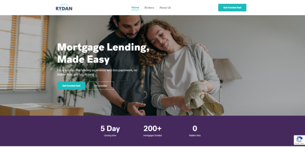
“Mortgage Lending, Made Easy. Enjoy a stress-free lending experience with less paperwork, no hidden fees, and fast closing”. As a user, I am packed with unbelievable value right upon landing on the website.
They’ve clearly told me directly what’s in it for me. That is once again going to motivate me to further scroll down the website.
Visuals Must Complement Website Messaging
Outside of the 3-step framework, you need to make sure the imagery you use in the top hero section complements your copy.
We see a lot of websites at our agency where they may have great messaging, but the accompanying image doesn’t complement and do justice to the messaging.
They are both integral components that work in synergy together to convey the message you ultimately want to convey to your end user.
Example #1 of Great Website Visuals:
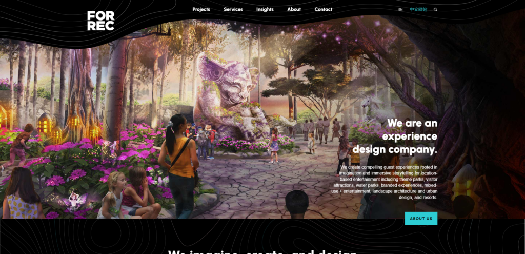
A great example of imagery is Forrec. They are an experience design company that creates immersive experiences for theme parks, visitor attractions, waterparks, branded experiences, and entertainment parks.
They include this beautiful image of one of the theme parks that they’ve designed to ‘show their work’ to a user and build trust that they know what they are doing. The image complements the copy, clearly establishing a visual connection in a user’s mind that they are an experience design company creating compelling experiences.
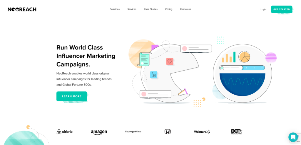
Another great example is NeoReach. They showcase tons of illustrations and animations of graphs, reporting, social media graphics, and more to illustrate that they are an influencer marketing agency.
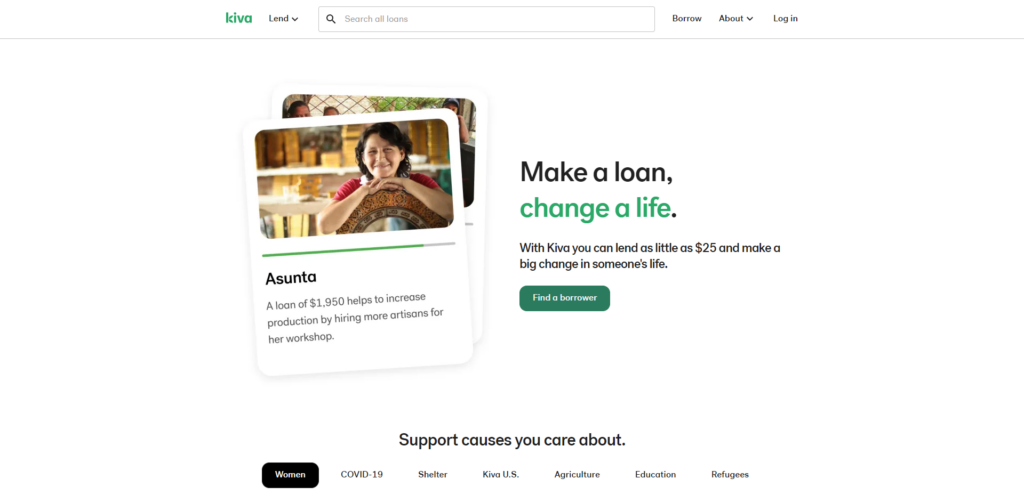
Kiva’s header reads ‘Make a loan, change a life’. They brilliantly complement the copy with a photo of a happy women named Asunta and provide the exact scenario of how her life could be changed with a loan of $1,950.
The last example is a website we designed for Influence Hunter. Their hero section showcases this beautiful display of the content they’ve produced as a result of running influencer marketing campaigns. This complements and reinforces the notion that they are an influencer marketing agency creating social proof at scale which is mentioned in the sub-copy.
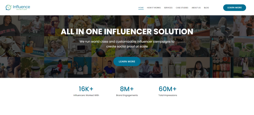
What better way to show social proof at scale than tons of images of the content?
This change amongst many others led to a whopping 385% increase in conversions for Influence Hunter. Check out the case study here and how exactly we did it.
In order to implement this strategy, I recommend first coming up with the copy and text you want to use. Afterward, you want to start thinking of the images that best portray that copy.
How to come up with the website copy?
I highly recommend you use a notepad or open up a Word Document and simply list out all of the ideas that come to your mind that answers the questions of who, what, why, and how.
The biggest hurdle that people often face when doing this is getting too stuck in their head. Improvise and reiterate afterwards, don’t worry if what your writing doesn’t make sense at the time.
Write down all of your ideas first and then combine, remove, or add elements of all the headers and sub-text.
You want your main header title to be ideally 7 words or less as that comes with the most optimal results. Your sub-header should be no more than 1 or 2 sentences.
Don’t forget to test, test, test
At the end of the day, you can write all the copy you want and think it’ll be perfect for your website but you’ll never really know unless you actually test it with users and ask for what they think.
We personally use platforms like UserBrain to source and test users of an ideal target market demographic for our clients.
We ask them to share their screen and navigate on the website as we watch. We ask questions like ‘what do you think this company is about’, ‘what do you think makes this company unique from other competitors’, ‘is this a website you would want to further scroll down based on what you see in the top hero section’, or ‘is there something else you wish the company would have included at the top here’.
By watching how your target market navigates and feels about your website, you are able to eliminate all of the guesswork and implement concrete improvements to your site to boost its performance.
It’s tough but its worth it
We know first-hand how difficult it is to come up with crystal clear messaging on your website. However, it is incredibly important for not only your website’s performance but also just your brand as a whole.
After all, your website is your company’s best salesperson that works 24/7 for you while you sleep. Therefore, it’s important to get your messaging clear and make sure it resonates with your target audience.
If you are struggling with coming up with crystal-clear messaging on your website, book a call with our team for a free website audit where we can provide you and your business with actual concrete improvements you can make instantly. No obligations at all!

Author: Arsh Sanwarwala
Arsh Sanwarwala is the Founder and CEO at ThrillX. He is passionate about UX/UI Design, conversion optimization, and all things digital.